AlertDialog macro
A modal that asks for a confirmation and ignores clicks outside; fires confirm or cancel.
Preview
createSurface + updateComponents, A2UI v0.9.
json
[
  {
    "version": "v0.9",
    "createSurface": {
      "surfaceId": "preview",
      "catalogId": "https://ui.exponential.at/catalogs/core/v1"
    }
  },
  {
    "version": "v0.9",
    "updateComponents": {
      "surfaceId": "preview",
      "components": [
        {
          "id": "root",
          "component": "Stack",
          "direction": "vertical",
          "align": "stretch",
          "children": [
            "example"
          ]
        },
        {
          "id": "example",
          "component": "AlertDialog",
          "title": "Delete board?",
          "description": "This cannot be undone.",
          "destructive": true,
          "open": false,
          "slots": {
            "trigger": "c0-trigger"
          }
        },
        {
          "id": "c0-trigger",
          "component": "Button",
          "label": "Delete board",
          "variant": "destructive"
        }
      ]
    }
  }
]
This surface through a MemoryTransport. Install and transports: React guide.
This surface through a MemoryTransport. Install and transports: SwiftUI guide.
This surface through a MemoryTransport. Install and transports: Compose guide.
This surface through a MemoryTransport. Install and transports: gpui guide.
Platforms
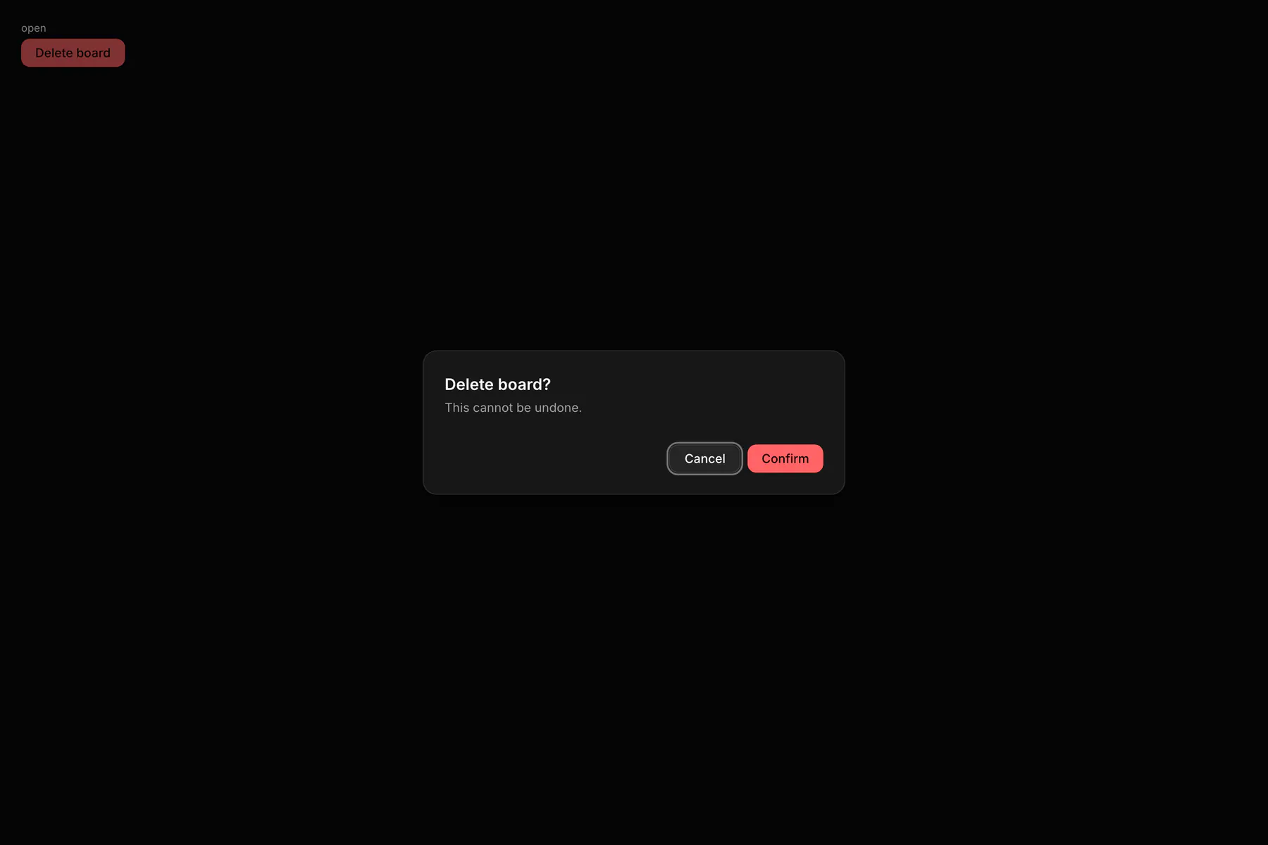
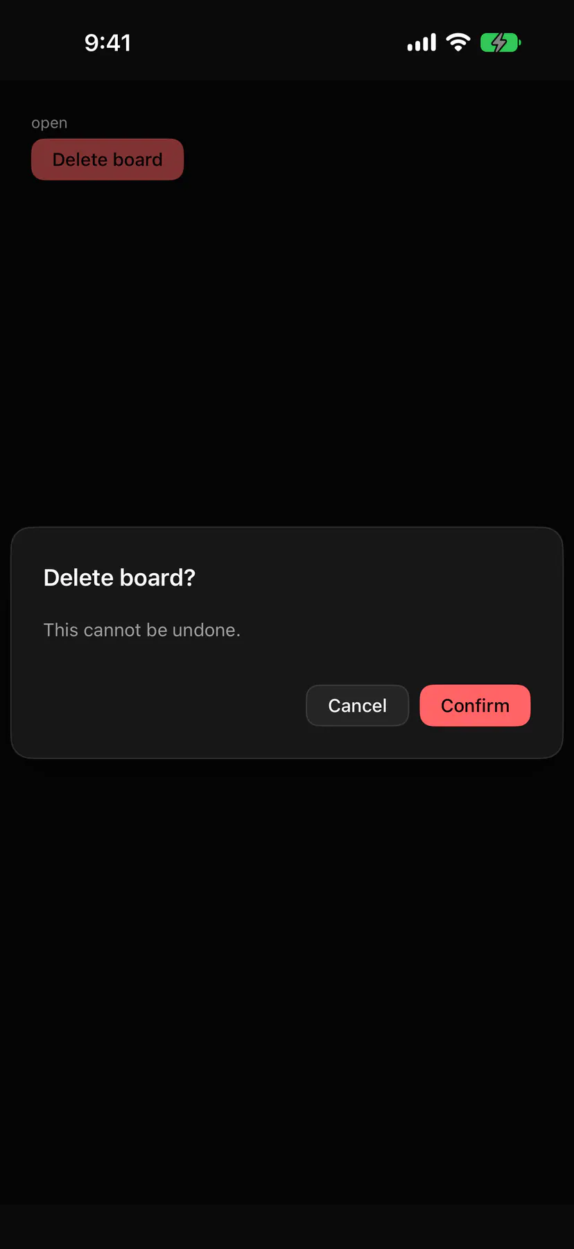
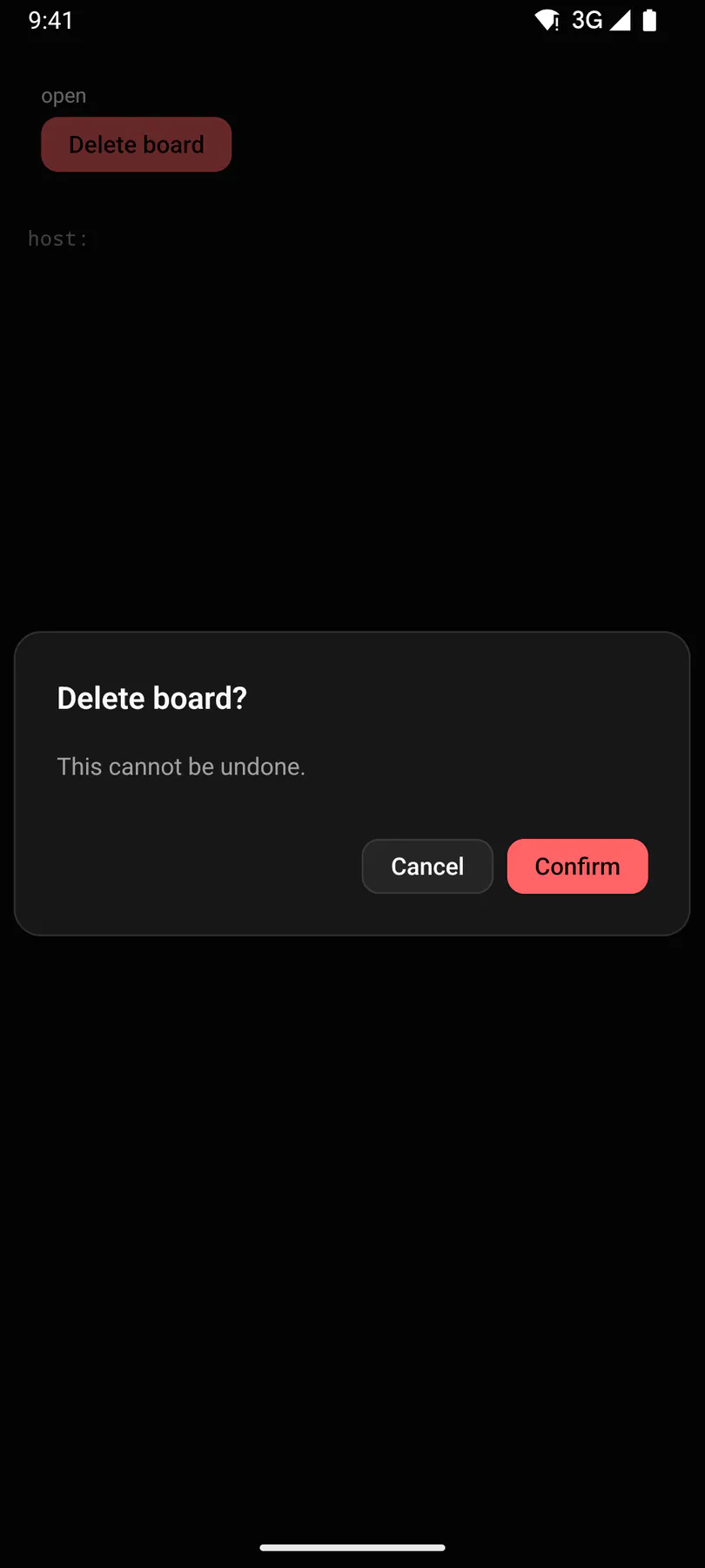
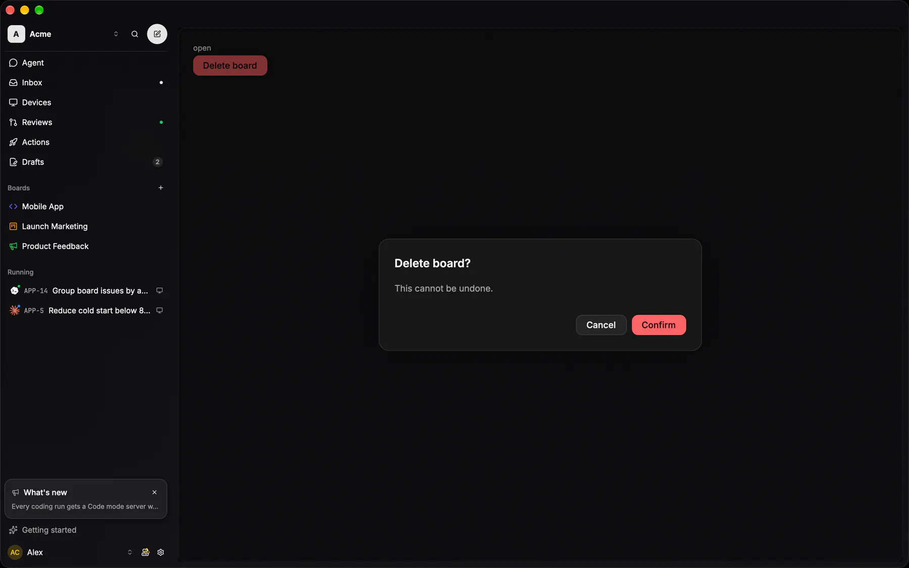
View exponential-ui-alert-dialog, painted by each native renderer.
Props
| Prop | Type | Default | Description |
|---|---|---|---|
titlerequired | string | – | The question. |
description | string | – | What will happen. |
confirmLabel | string | "$string.confirm" | The confirming button's text. |
cancelLabel | string | "$string.cancel" | The cancelling button's text. |
destructive | boolean | false | Styles the confirming button as dangerous. |
openbind | boolean | false | Whether it shows; bind it. |
Events and slots
| Name | Kind |
|---|---|
on.confirm | event: runs an action |
on.cancel | event: runs an action |
on.change | event: runs an action |
trigger | slot: one component by id |
Accessibility
- Role
alertdialog- Semantics
- alertdialog. The cancel button takes focus on open (
autoFocus, $a11y).
| Keys | Action |
|---|---|
| – | Opening focuses the cancel button |
| Escape | cancel; clicks outside are ignored |
Theming
- Recipe parts
AlertDialog/rootAlertDialog/footerAlertDialog/cancelAlertDialog/confirm- Keyed by
destructive:hover:pressed:focus:disabled:checked:open:selected:invalid:dragover