TimePicker nativelite
A time-of-day field (HH:mm) picked from a list every step minutes, or typed.
Preview
Loading the renderer…
createSurface + updateComponents, A2UI v0.9.
json
[
  {
    "version": "v0.9",
    "createSurface": {
      "surfaceId": "preview",
      "catalogId": "https://ui.exponential.at/catalogs/core/v1"
    }
  },
  {
    "version": "v0.9",
    "updateComponents": {
      "surfaceId": "preview",
      "components": [
        {
          "id": "root",
          "component": "Stack",
          "direction": "vertical",
          "align": "stretch",
          "children": [
            "example"
          ]
        },
        {
          "id": "example",
          "component": "TimePicker",
          "label": "Starts",
          "name": "startsAt",
          "value": "09:30"
        }
      ]
    }
  }
]
This surface through a MemoryTransport. Install and transports: React guide.
This surface through a MemoryTransport. Install and transports: SwiftUI guide.
This surface through a MemoryTransport. Install and transports: Compose guide.
This surface through a MemoryTransport. Install and transports: gpui guide.
Platforms
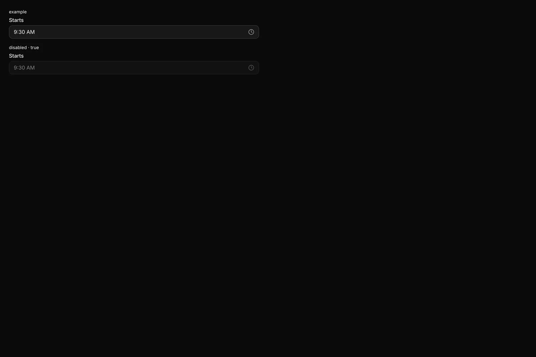
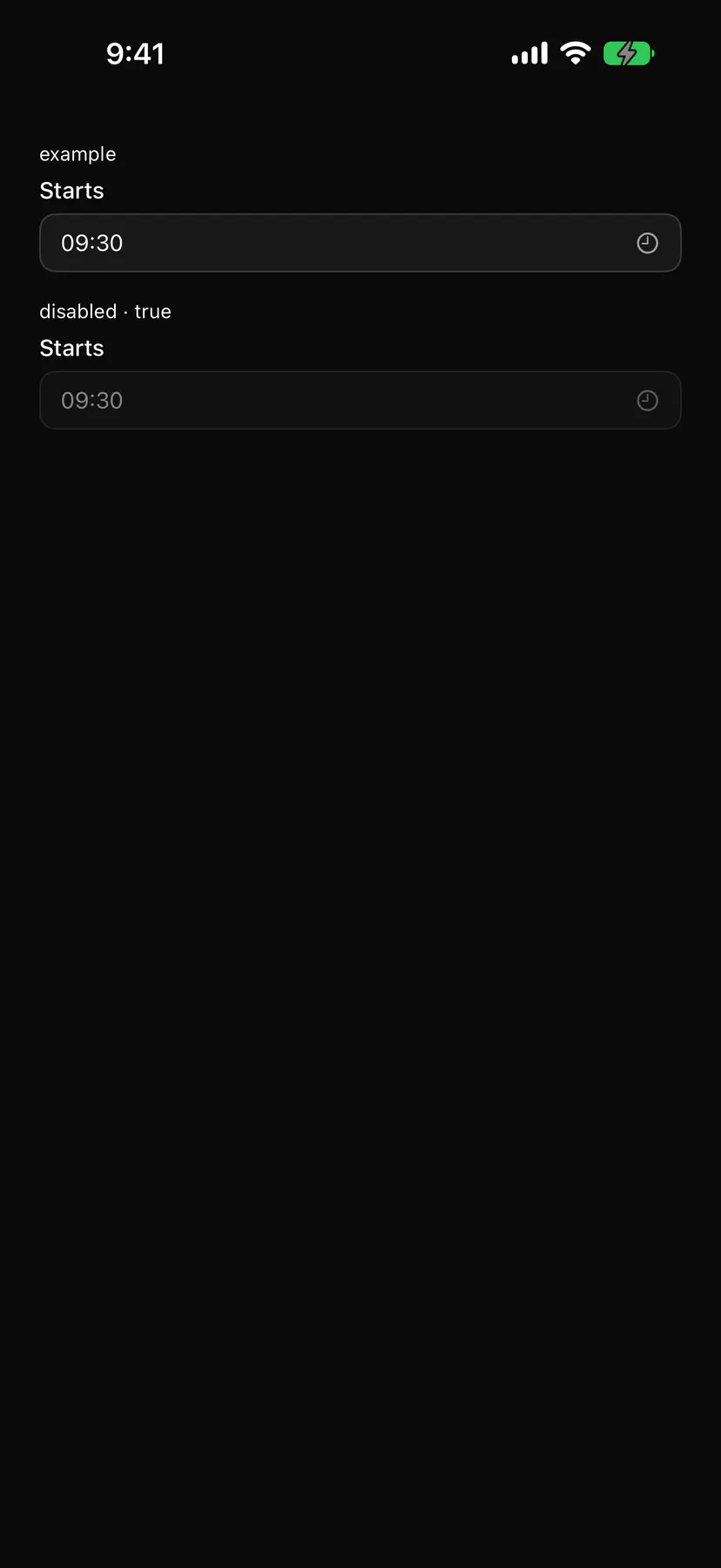
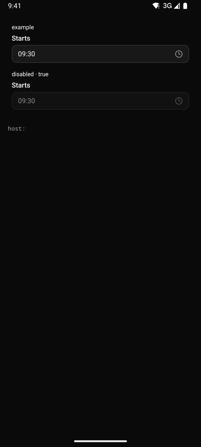
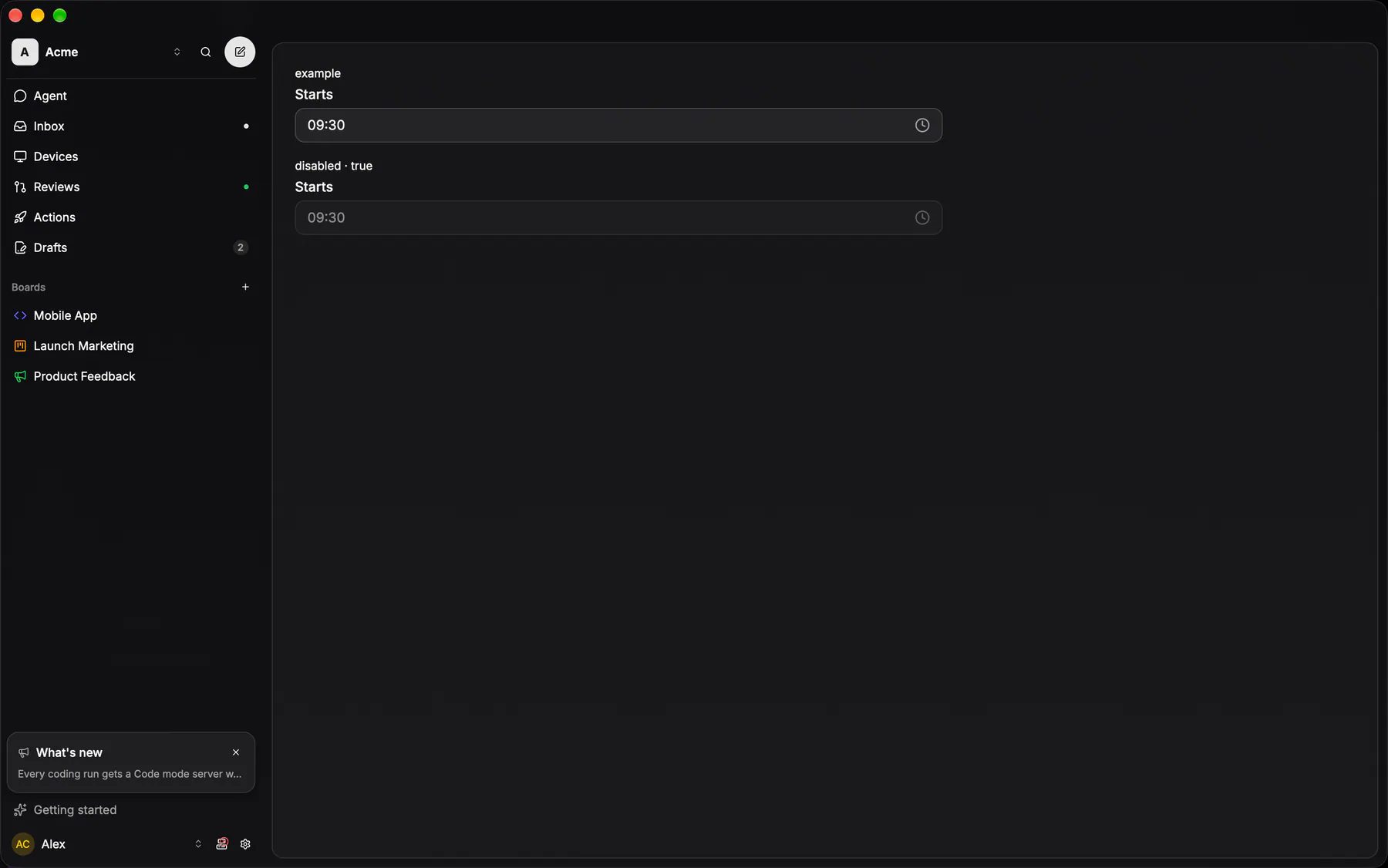
View exponential-ui-time-picker, painted by each native renderer.
Variants
disabledProps
| Prop | Type | Default | Description |
|---|---|---|---|
label | string | – | The field label. |
namerequired | string | – | The field's key in the submitted data. |
valuebind | string | – | The time as HH:mm, or empty. |
min | string | – | The earliest time, HH:mm. |
max | string | – | The latest time, HH:mm. |
step | number | 15 | Minutes between list entries. |
placeholder | string | – | Shown while empty. |
disabled | boolean | false | Shows it inert. |
Events and slots
| Name | Kind |
|---|---|
on.change | event: runs an action |
Accessibility
- Role
combobox- Semantics
- combobox + listbox
| Keys | Action |
|---|---|
| – | As Select; typing HH:mm into the field commits on Enter or blur |
Theming
- Recipe parts
TimePicker/rootTimePicker/labelTimePicker/triggerTimePicker/placeholderTimePicker/listTimePicker/item- Keyed by
disabled:hover:pressed:focus:disabled:checked:open:selected:invalid:dragover