DatePicker nativelite
A calendar date field (ISO yyyy-mm-dd).
createSurface + updateComponents, A2UI v0.9.
[
  {
    "version": "v0.9",
    "createSurface": {
      "surfaceId": "preview",
      "catalogId": "https://ui.exponential.at/catalogs/core/v1"
    }
  },
  {
    "version": "v0.9",
    "updateComponents": {
      "surfaceId": "preview",
      "components": [
        {
          "id": "root",
          "component": "Stack",
          "direction": "vertical",
          "align": "stretch",
          "children": [
            "example"
          ]
        },
        {
          "id": "example",
          "component": "DatePicker",
          "label": "Due",
          "name": "due",
          "value": "2026-10-14"
        }
      ]
    }
  }
]
This surface through a MemoryTransport. Install and transports: React guide.
This surface through a MemoryTransport. Install and transports: SwiftUI guide.
This surface through a MemoryTransport. Install and transports: Compose guide.
This surface through a MemoryTransport. Install and transports: gpui guide.

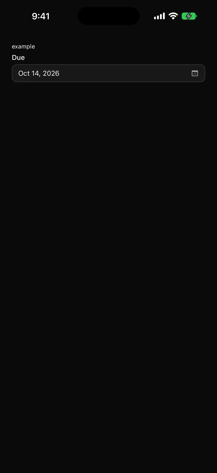
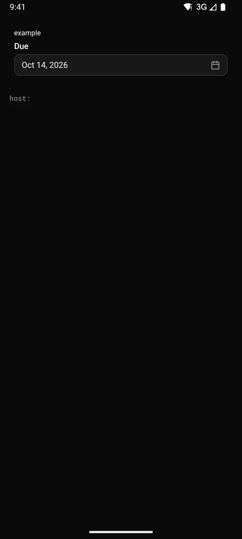
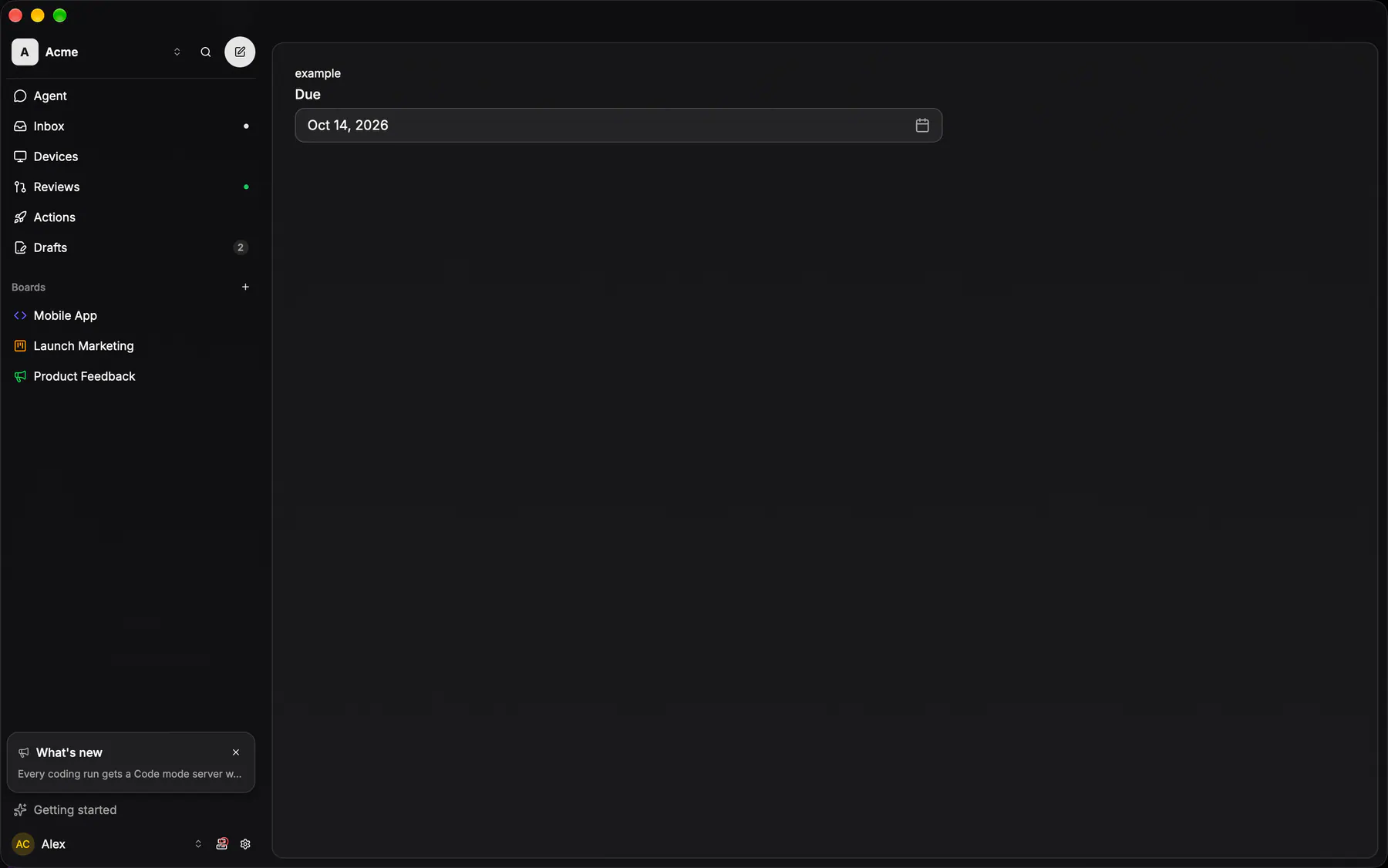
View exponential-ui-date-picker, painted by each native renderer.
| Prop | Type | Default | Description |
|---|---|---|---|
label | string | – | The field label. |
namerequired | string | – | The field's key in the submitted data. |
valuebind | date | – | The chosen day as yyyy-mm-dd, or empty. |
min | date | – | The earliest allowed day. |
max | date | – | The latest allowed day. |
placeholder | string | – | Shown while empty. |
firstDayOfWeek | number | – | 0 (Sunday) to 6; else the locale's. |
| Name | Kind |
|---|---|
on.change | event: runs an action |
- Role
combobox- Semantics
- combobox opening a dialog with a grid of days
| Keys | Action |
|---|---|
| EnterSpaceArrowDown | open on the selected (else today's) day |
| Arrow keys | ± 1 day / ± 1 week |
| PageUpPageDown | previous/next month (Shift: year) |
| HomeEnd | start/end of the week (locale week start) |
| EnterSpace | choose; Escape: close |
- Recipe parts
DatePicker/rootDatePicker/labelDatePicker/triggerDatePicker/calendarDatePicker/day- Keyed by
:hover:pressed:focus:disabled:checked:open:selected:invalid:dragover
Date picker
The ONE date picker.
More
Popover + Calendar was inlined three times — the properties panel, the editor chips, the mobile tray — and each copy converted between a Date and the wire's YYYY-MM-DD its own way, two of them through new Date(value), which the spec parses as UTC and which therefore shows the PREVIOUS day west of Greenwich. This one speaks the wire format on both sides and converts in exactly one place. A due date is a DATE, never an instant (REV2-49), so there is no time arm; the trigger is a Pill showing the short form, and Clear is a row under the grid rather than a second control beside it.
DatePickerpackages/ui/src/date-picker.tsxparseDateValue / formatDateLabel are the only place the wire date becomes a Date
DueDateSheetapps/ios/Exponential/UI/Issue/Sheets/DueDateSheet.swiftCreateIssueView keeps a second unfoldable form, UI/Issue/DueDatePicker.swift
DueDateSheetapps/android/app/src/main/java/com/exponential/app/ui/issue/DueDateSheet.ktthe grid itself is IssueDatePickerDialog.kt