Popover native
A small panel anchored to its trigger, opened on press.
createSurface + updateComponents, A2UI v0.9.
[
  {
    "version": "v0.9",
    "createSurface": {
      "surfaceId": "preview",
      "catalogId": "https://ui.exponential.at/catalogs/core/v1"
    }
  },
  {
    "version": "v0.9",
    "updateComponents": {
      "surfaceId": "preview",
      "components": [
        {
          "id": "root",
          "component": "Stack",
          "direction": "vertical",
          "align": "start",
          "children": [
            "example"
          ]
        },
        {
          "id": "example",
          "component": "Popover",
          "side": "bottom",
          "open": true,
          "children": [
            "c0-p"
          ],
          "slots": {
            "trigger": "c0-trigger"
          }
        },
        {
          "id": "c0-p",
          "component": "Text",
          "text": "Popover content.",
          "variant": "body"
        },
        {
          "id": "c0-trigger",
          "component": "Button",
          "label": "Open popover",
          "variant": "outline"
        }
      ]
    }
  }
]
This surface through a MemoryTransport. Install and transports: React guide.
This surface through a MemoryTransport. Install and transports: SwiftUI guide.
This surface through a MemoryTransport. Install and transports: Compose guide.
This surface through a MemoryTransport. Install and transports: gpui guide.

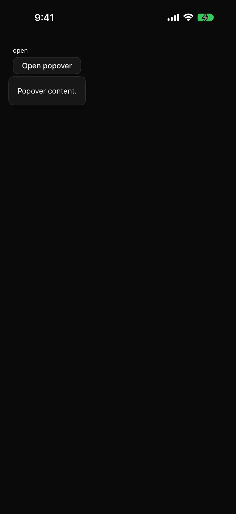
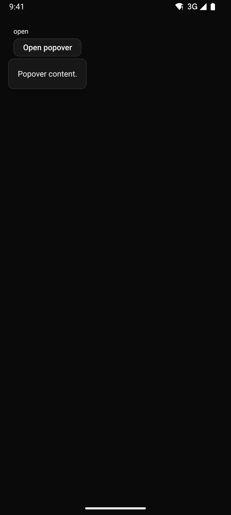
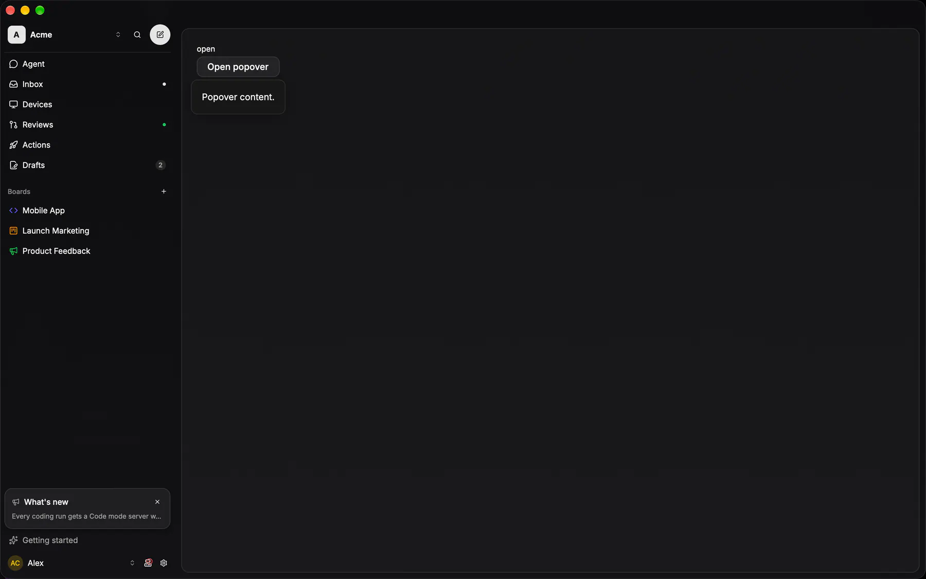
View exponential-ui-popover, painted by each native renderer.
| Prop | Type | Default | Description |
|---|---|---|---|
openbind | boolean | false | Whether it shows; bind it. |
side | top | right | bottom | left | "bottom" | Preferred side of the trigger. |
openOn | press | hover | "press" | Press, or hover over the trigger (press on touch). |
| Name | Kind |
|---|---|
on.change | event: runs an action |
trigger | slot: one component by id |
- Role
dialog- Semantics
- dialog (non-modal)
| Keys | Action |
|---|---|
| EnterSpace on the trigger | open |
| Escape | close and return focus to the trigger |
| – | openOn hover also opens on trigger focus |
- Recipe parts
Popover/contentPopover/arrow- Keyed by
sideopenOn:hover:pressed:focus:disabled:checked:open:selected:invalid:dragover
Hover card
EXP-760: the pointer's preview (the catalog `Popover openOn: hover`): the opaque menu card (12 radius, card hairline, no blur, no shadow), 320 wide, padding 12, opening after 400 ms so a pointer crossing a dense list of #IDENT chips never flashes one, closing after 100 ms so the pointer can travel into it.
More
It carries the issue preview body (status · identifier · title · the first lines) and the account picker's usage preview; a tap on touch just activates the trigger, so the phones have none.
touch: a tap opens the issue, there is no hover preview
touch: a tap opens the issue, there is no hover preview