Tooltip native
A short hint shown on hover or long-press over its children.
createSurface + updateComponents, A2UI v0.9.
[
  {
    "version": "v0.9",
    "createSurface": {
      "surfaceId": "preview",
      "catalogId": "https://ui.exponential.at/catalogs/core/v1"
    }
  },
  {
    "version": "v0.9",
    "updateComponents": {
      "surfaceId": "preview",
      "components": [
        {
          "id": "root",
          "component": "Stack",
          "direction": "vertical",
          "align": "start",
          "children": [
            "example"
          ]
        },
        {
          "id": "example",
          "component": "Tooltip",
          "content": "Copy link",
          "children": [
            "c0-b"
          ]
        },
        {
          "id": "c0-b",
          "component": "Button",
          "label": "Hover me",
          "variant": "outline"
        }
      ]
    }
  }
]
This surface through a MemoryTransport. Install and transports: React guide.
This surface through a MemoryTransport. Install and transports: SwiftUI guide.
This surface through a MemoryTransport. Install and transports: Compose guide.
This surface through a MemoryTransport. Install and transports: gpui guide.

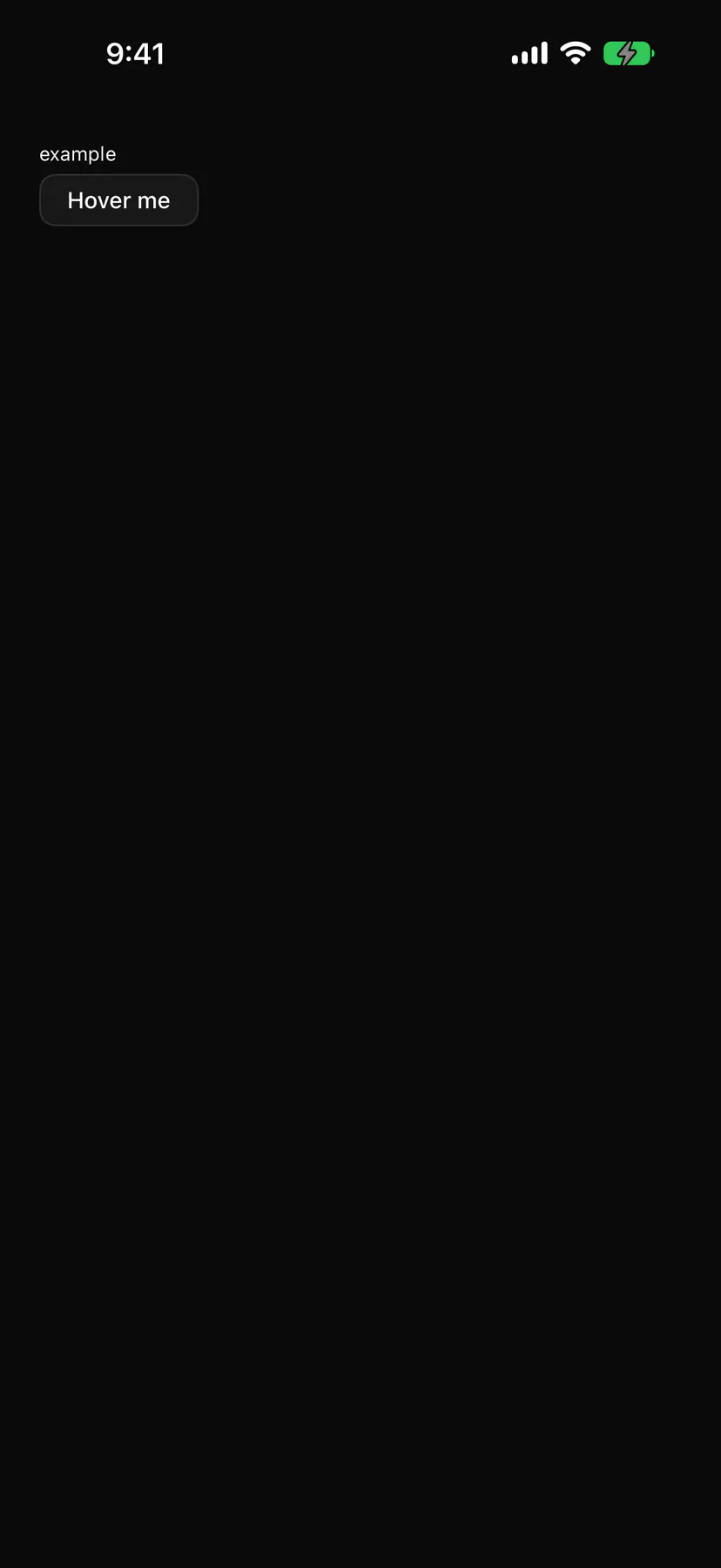
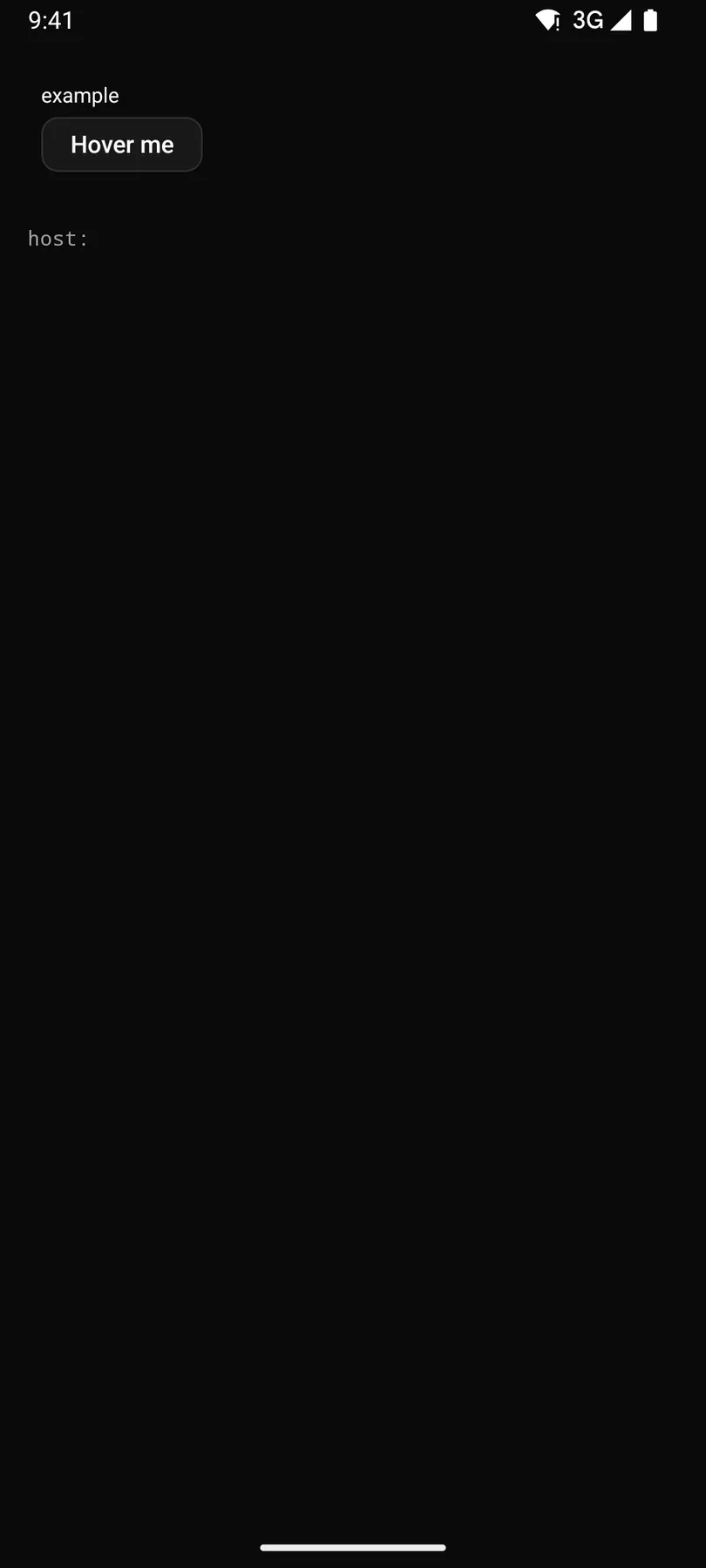
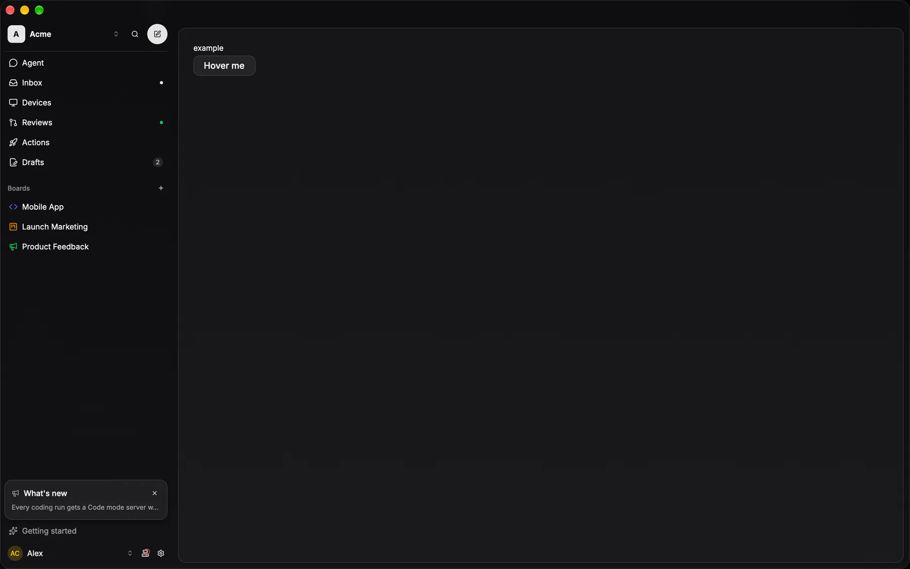
View exponential-ui-tooltip, painted by each native renderer.
| Prop | Type | Default | Description |
|---|---|---|---|
contentrequired | string | – | The hint text. |
side | top | right | bottom | left | "top" | Preferred side of the anchor. |
No events, no slots. Children: many.
- Role
tooltip- Semantics
- tooltip describing its anchor
| Keys | Action |
|---|---|
| – | Shows on hover AND keyboard focus of the anchor (after the platform delay); Escape hides |
- Recipe parts
Tooltip/contentTooltip/arrowTooltip/anchor- Keyed by
side:hover:pressed:focus:disabled:checked:open:selected:invalid:dragover
Tooltip
The pointer's one-line label: a glass panel (12 radius, 12px text, padding 6 × 12, no arrow: a translucent arrow double-renders against the blurred panel) that opens at once on hover or focus and never holds a control.
More
`IconTooltip` is the common arm: a ghost glyph button whose tooltip IS its accessible name, so an icon-only control can never ship unlabelled. Touch has no hover, so the phones carry no tooltip: the label is the control's accessibility name there.
Tooltip / TooltipContentpackages/ui/src/tooltip.tsxIconTooltip (icon-tooltip.tsx) = the glyph-button arm
touch: no hover tooltips; the label is the accessibility name
touch: no hover tooltips; the label is the content description
gpui-component's Tooltip::new on .tooltip(); no app wrapper