Input nativelite
A single-line text field.
createSurface + updateComponents, A2UI v0.9.
[
  {
    "version": "v0.9",
    "createSurface": {
      "surfaceId": "preview",
      "catalogId": "https://ui.exponential.at/catalogs/core/v1"
    }
  },
  {
    "version": "v0.9",
    "updateComponents": {
      "surfaceId": "preview",
      "components": [
        {
          "id": "root",
          "component": "Stack",
          "direction": "vertical",
          "align": "stretch",
          "children": [
            "example"
          ]
        },
        {
          "id": "example",
          "component": "Input",
          "label": "Email",
          "name": "email",
          "type": "email",
          "placeholder": "you@example.com"
        }
      ]
    }
  }
]
This surface through a MemoryTransport. Install and transports: React guide.
This surface through a MemoryTransport. Install and transports: SwiftUI guide.
This surface through a MemoryTransport. Install and transports: Compose guide.
This surface through a MemoryTransport. Install and transports: gpui guide.
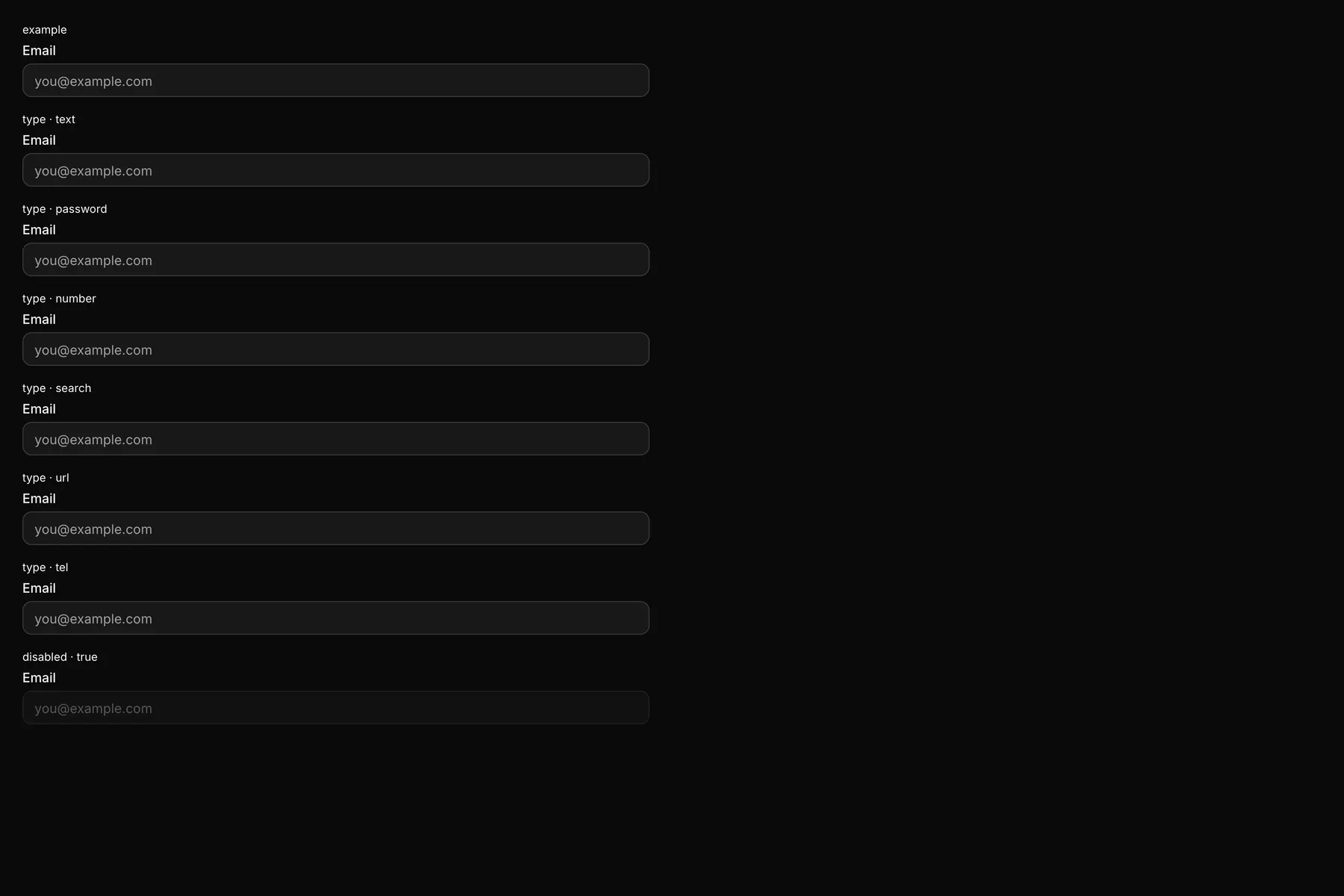
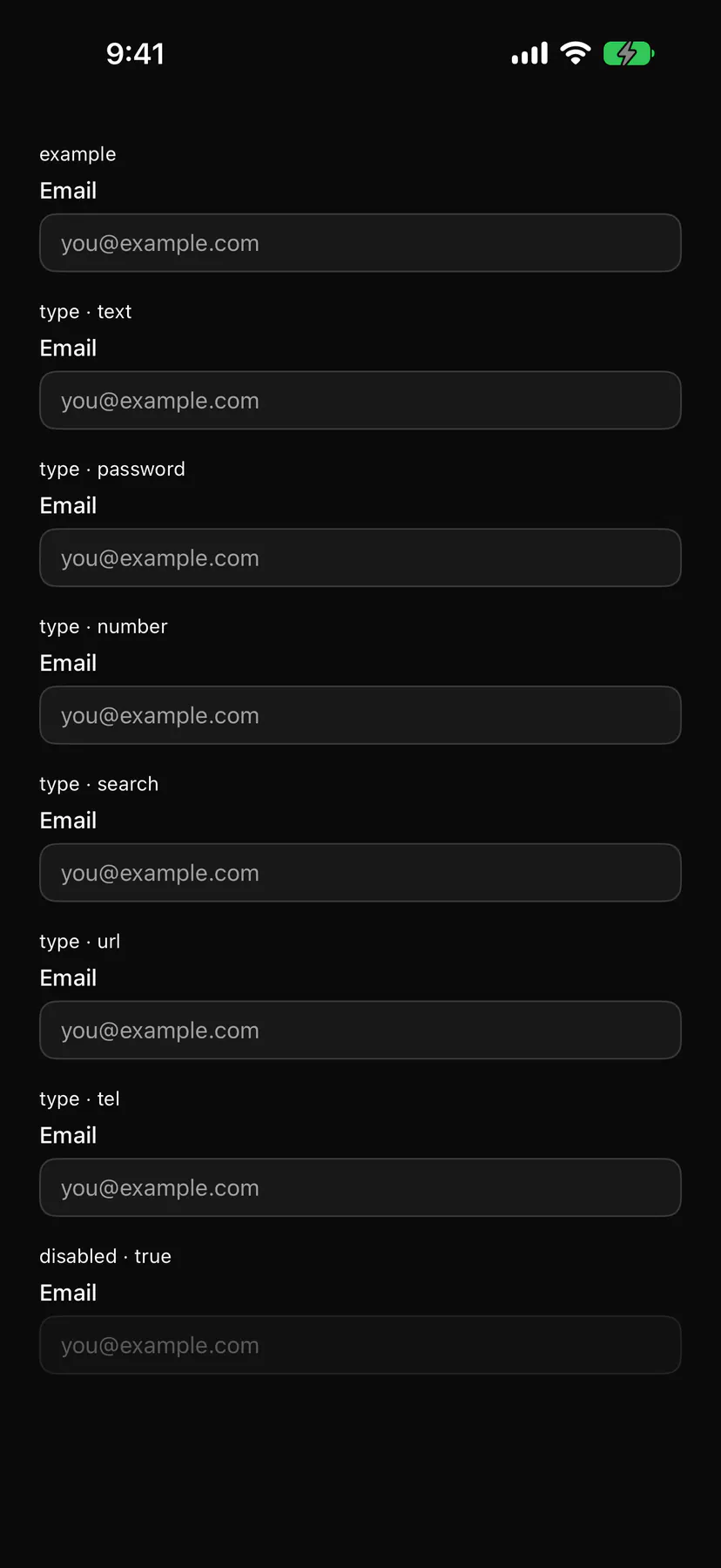
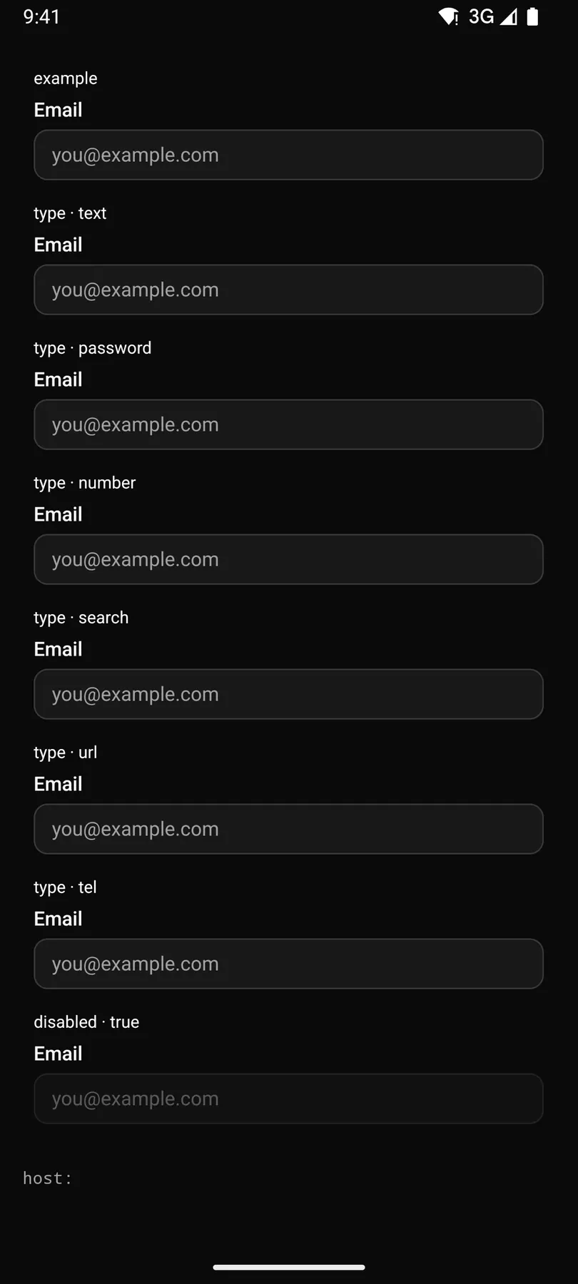
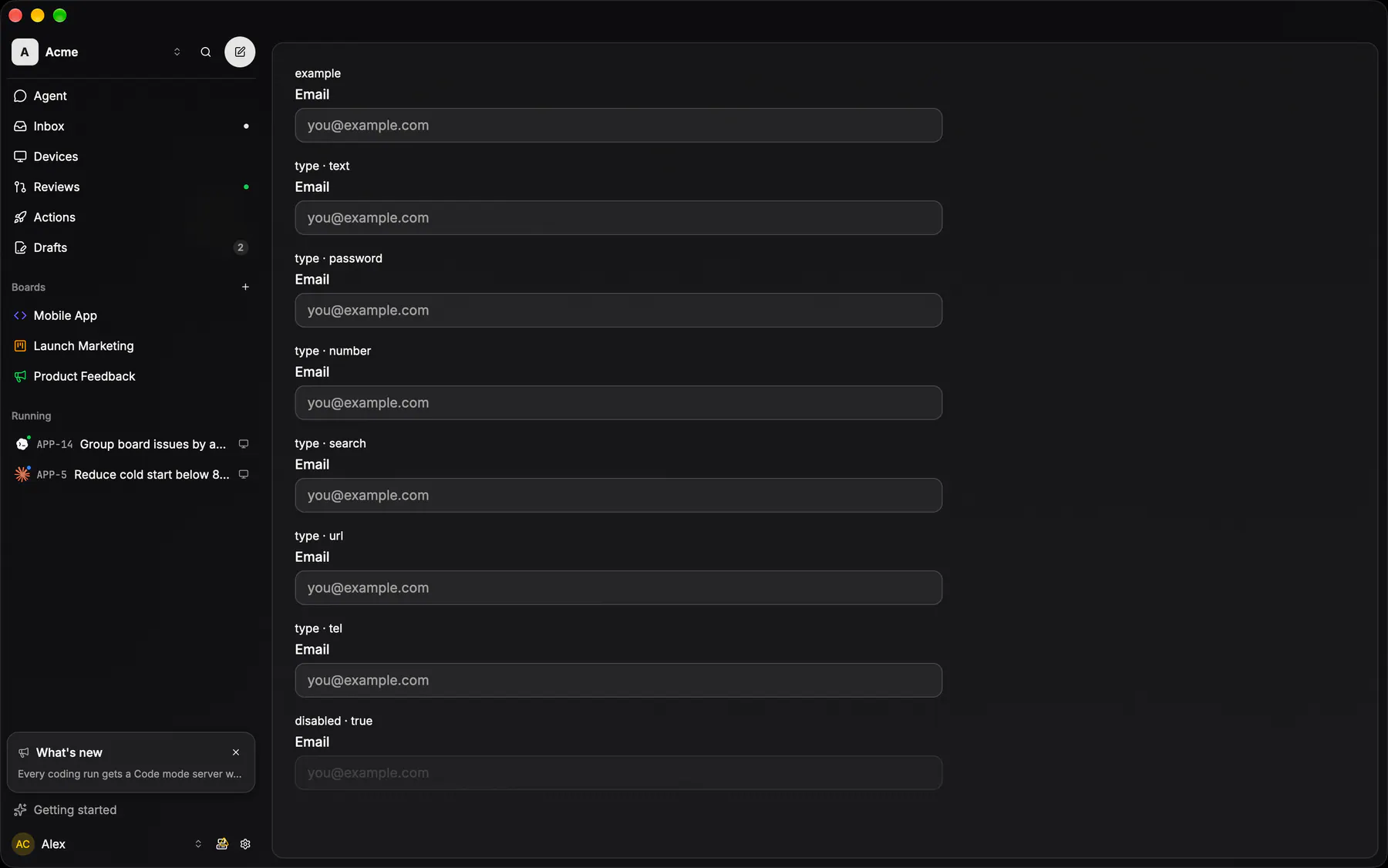
View exponential-ui-input, painted by each native renderer.
disabled| Prop | Type | Default | Description |
|---|---|---|---|
labelrequired | string | – | The field label. |
namerequired | string | – | The field's key in the submitted data. |
type | text | email | password | number | search | url | tel | "text" | The keyboard and masking kind. |
placeholder | string | – | Hint text while empty. |
valuebind | string | – | The text; bind it to a data path. |
disabled | boolean | false | Shows it inert. |
checks | [check] | – | Validation rules (required, email, length, regex, numeric). |
validateOn | change | blur | submit | "blur" | When the checks run. |
| Name | Kind |
|---|---|
on.change | event: runs an action |
on.submit | event: runs an action |
on.focus | event: runs an action |
on.blur | event: runs an action |
- Role
textbox- Semantics
- textbox
| Keys | Action |
|---|---|
| Enter | submit (fires submit, submits the Form) |
- Recipe parts
Input/rootInput/labelInput/fieldInput/placeholderInput/descriptionInput/error- Keyed by
typedisabled:hover:pressed:focus:disabled:checked:open:selected:invalid:dragover
Input row
A bare right-aligned field at 70% foreground inside the shell — no box, no border.
More
The row is the field's chrome.
Form text rows use the system field inside GlassSection
GlassTextField(bordered = false)apps/android/app/src/main/java/com/exponential/app/ui/components/GlassTextField.ktcontrols::rows::glass_input_rowapps/desktop/crates/exponential-ui-gpui/src/controls/rows.rsText field
36 tall, padding 0/12, radius 12, card fill under a card stroke; focus swaps the stroke to active — no ring.
More
Placeholder at 50%.
GlassTextFieldapps/android/app/src/main/java/com/exponential/app/ui/components/GlassTextField.ktcontrols::inputs::glass_inputapps/desktop/crates/exponential-ui-gpui/src/controls/inputs.rsfocus swaps the stroke to strokeActive, no ring (EXP-720); the corner is radius.lg (EXP-963)
Field label
The 14px medium line that names a field, tied to it by htmlFor so the label is part of the hit box, and dimmed with the field when it is disabled.
More
It exists on the WEB only: every native lays a field out as a ROW that already carries its name on the left, so a label above the control there would say the same thing twice.
same — the name is the row title inside GlassTextField / GlassPickerRow
same — TextFieldRow / PickerRow carry the label themselves
a field's name is the glass row's own leading text — see input row
Search field
The ONE "filter this list" field: the text field with the search glyph INSIDE it and a ghost clear that appears only once there is something to clear — and puts the caret back in the field, so typing continues.
More
Eight of them existed at five heights, most a bare Input re-dressed by hand and none with either affordance, while both natives had drawn exactly this for years. Two rungs: md is the stock 36 field, sm the 28 one dense columns use — the Changes file tree's filter, a sidebar filter. It is an Input, not a new box: every chrome decision still comes from there.
GlassSheetSearchFieldapps/android/app/src/main/java/com/exponential/app/ui/components/GlassSheet.ktcontrols::inputs::search_fieldapps/desktop/crates/exponential-ui-gpui/src/controls/inputs.rsEXP-963: SearchFieldSize::Md 36 / Sm 28; the diff pane filter, every picker query and the search dialog draw it