Card macrolite
A bordered content card with an optional title and description; use it for grouped content, not page headers.
createSurface + updateComponents, A2UI v0.9.
[
  {
    "version": "v0.9",
    "createSurface": {
      "surfaceId": "preview",
      "catalogId": "https://ui.exponential.at/catalogs/core/v1"
    }
  },
  {
    "version": "v0.9",
    "updateComponents": {
      "surfaceId": "preview",
      "components": [
        {
          "id": "root",
          "component": "Stack",
          "direction": "vertical",
          "align": "stretch",
          "children": [
            "example"
          ]
        },
        {
          "id": "example",
          "component": "Card",
          "title": "Overview",
          "description": "Your account summary",
          "children": [
            "c0-t",
            "c0-b"
          ]
        },
        {
          "id": "c0-t",
          "component": "Text",
          "text": "3 open issues · 2 in review",
          "variant": "body"
        },
        {
          "id": "c0-b",
          "component": "Button",
          "label": "Open board",
          "variant": "outline"
        }
      ]
    }
  }
]
This surface through a MemoryTransport. Install and transports: React guide.
This surface through a MemoryTransport. Install and transports: SwiftUI guide.
This surface through a MemoryTransport. Install and transports: Compose guide.
This surface through a MemoryTransport. Install and transports: gpui guide.
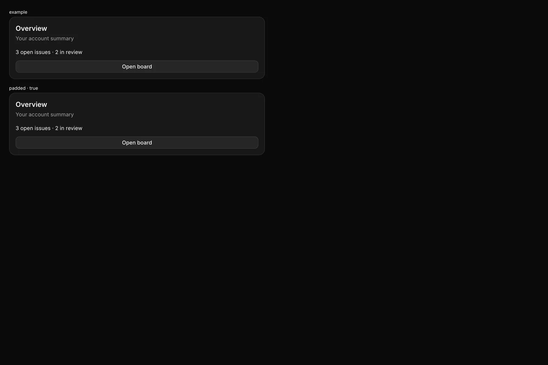
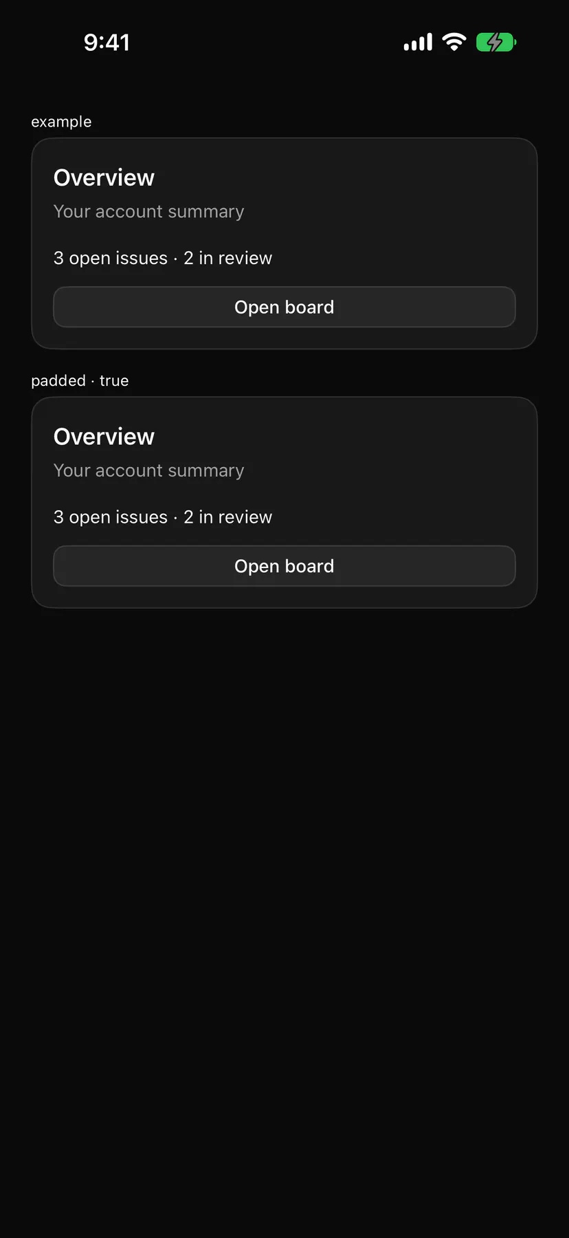
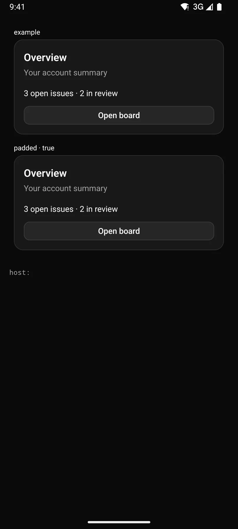
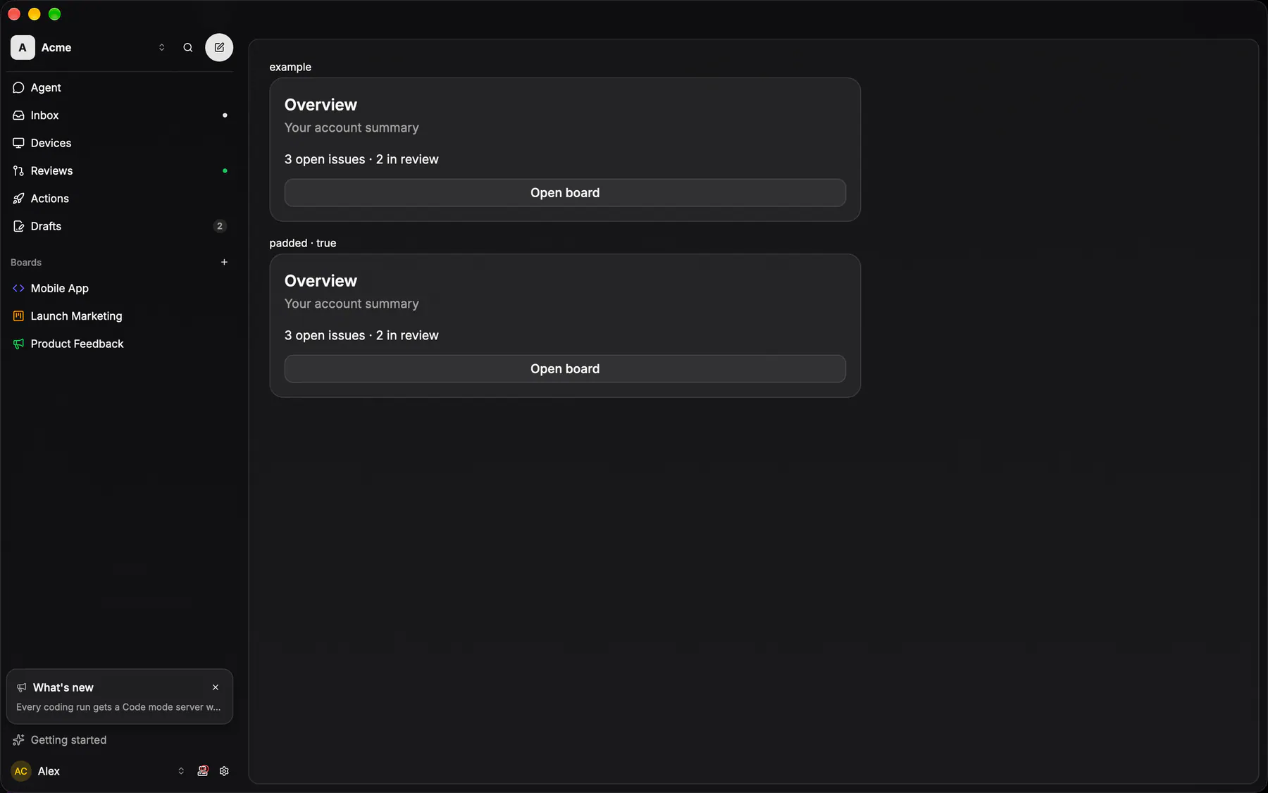
View exponential-ui-card, painted by each native renderer.
| Prop | Type | Default | Description |
|---|---|---|---|
title | string | – | The card heading. |
description | string | – | A muted line under the heading. |
padded | boolean | true | Pads the body; off for edge-to-edge rows. |
style | style | – | Extra Box styles merged over the card's own. |
No events, no slots. Children: many.
- Role
group- Semantics
- group labelled by its title
Not focusable; no keys.
- Recipe parts
Card/rootCard/headerCard/titleCard/descriptionCard/body- Keyed by
:hover:pressed:focus:disabled:checked:open:selected:invalid:dragover
Glass card
The ONE translucent card, and only its box: radius XL, the card hairline, the glass card fill.
More
Everything a card owns on its own stays at the call site, because those genuinely differ — its padding, a blur, a shadow, and the divide-y + overflow hidden that turns the same box into a GROUP of rows. EXP-903: five surfaces painted it by copy-paste (the comment row, the agent AskCard, the usage card, the mobile issue properties sheet and the repo picker, which had drifted to the MD corner and the bare hairline). The shadcn Card derives its recipe from the same constant, so the two cannot disagree; a group of list ROWS is the group container instead, on the row fill with no outer stroke.
GlassCard / GLASS_CARD_CLASSpackages/ui/src/glass-card.tsxCard (./card.tsx) derives its own recipe from the same constant.