Avatar nativelite
A round user picture that falls back to initials on a stable hue.
createSurface + updateComponents, A2UI v0.9.
[
  {
    "version": "v0.9",
    "createSurface": {
      "surfaceId": "preview",
      "catalogId": "https://ui.exponential.at/catalogs/core/v1"
    }
  },
  {
    "version": "v0.9",
    "updateComponents": {
      "surfaceId": "preview",
      "components": [
        {
          "id": "root",
          "component": "Stack",
          "direction": "vertical",
          "align": "start",
          "children": [
            "example"
          ]
        },
        {
          "id": "example",
          "component": "Avatar",
          "name": "Jane Doe",
          "size": "default"
        }
      ]
    }
  }
]
This surface through a MemoryTransport. Install and transports: React guide.
This surface through a MemoryTransport. Install and transports: SwiftUI guide.
This surface through a MemoryTransport. Install and transports: Compose guide.
This surface through a MemoryTransport. Install and transports: gpui guide.


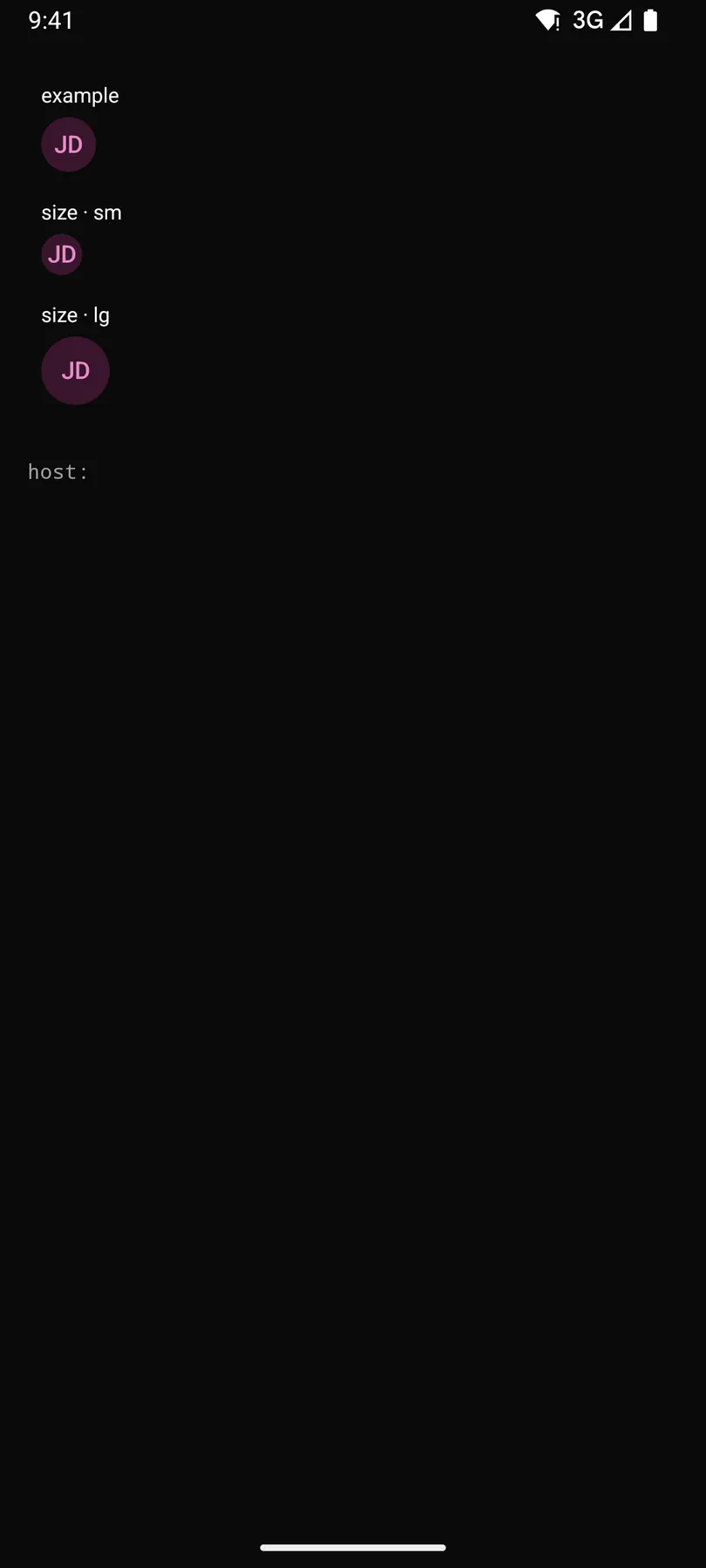
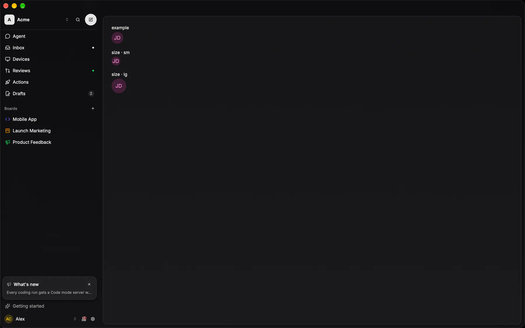
View exponential-ui-avatar, painted by each native renderer.
size · smsize · defaultsize · lg| Prop | Type | Default | Description |
|---|---|---|---|
namerequiredbind | string | – | The person's name; initials come from it. |
srcbind | url | – | The picture URL. |
size | sm | default | lg | "default" | Diameter class. |
seed | string | – | Hashes the fallback hue; defaults to the name. |
No events, no slots. Children: none.
- Role
img- Semantics
- img (name)
Not focusable; no keys.
- Recipe parts
Avatar/rootAvatar/imageAvatar/fallback- Keyed by
size:hover:pressed:focus:disabled:checked:open:selected:invalid:dragover
Avatar
Picture first: a circle filled edge to edge by the person's image.
More
Without one the initials sit on THEIR hue — one of eight token colours picked by fnv1a32(utf8(userId)) % 8 — as a 20% fill under the glyph at full strength, no stroke. The hash is byte-identical on all four clients, so one person is one colour everywhere; a subject with no id at all (a bot, an unresolved reporter) keeps the muted fallback.
UserAvatarpackages/ui/src/user-avatar.tsxAvatarFallback (./avatar.tsx) paints the hue; UserAvatar is the composition every site renders.