Button nativelite
A press target with a label and optional icon (or one custom child).
createSurface + updateComponents, A2UI v0.9.
[
  {
    "version": "v0.9",
    "createSurface": {
      "surfaceId": "preview",
      "catalogId": "https://ui.exponential.at/catalogs/core/v1"
    }
  },
  {
    "version": "v0.9",
    "updateComponents": {
      "surfaceId": "preview",
      "components": [
        {
          "id": "root",
          "component": "Stack",
          "direction": "vertical",
          "align": "start",
          "children": [
            "example"
          ]
        },
        {
          "id": "example",
          "component": "Button",
          "label": "Submit",
          "variant": "default"
        }
      ]
    }
  }
]
This surface through a MemoryTransport. Install and transports: React guide.
This surface through a MemoryTransport. Install and transports: SwiftUI guide.
This surface through a MemoryTransport. Install and transports: Compose guide.
This surface through a MemoryTransport. Install and transports: gpui guide.
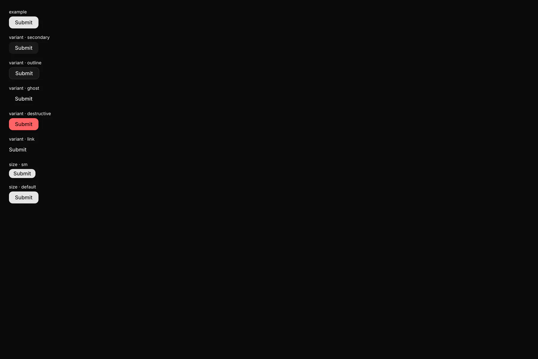
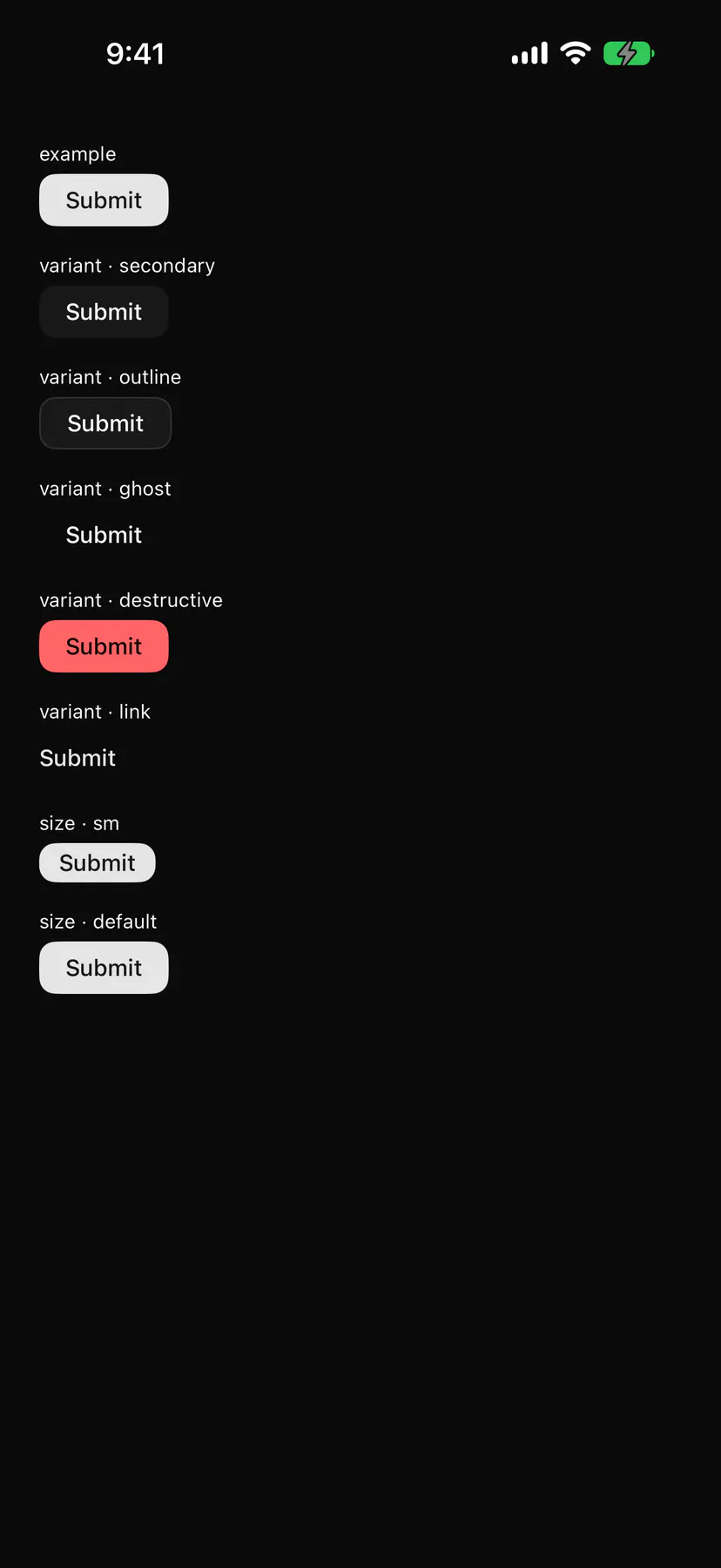
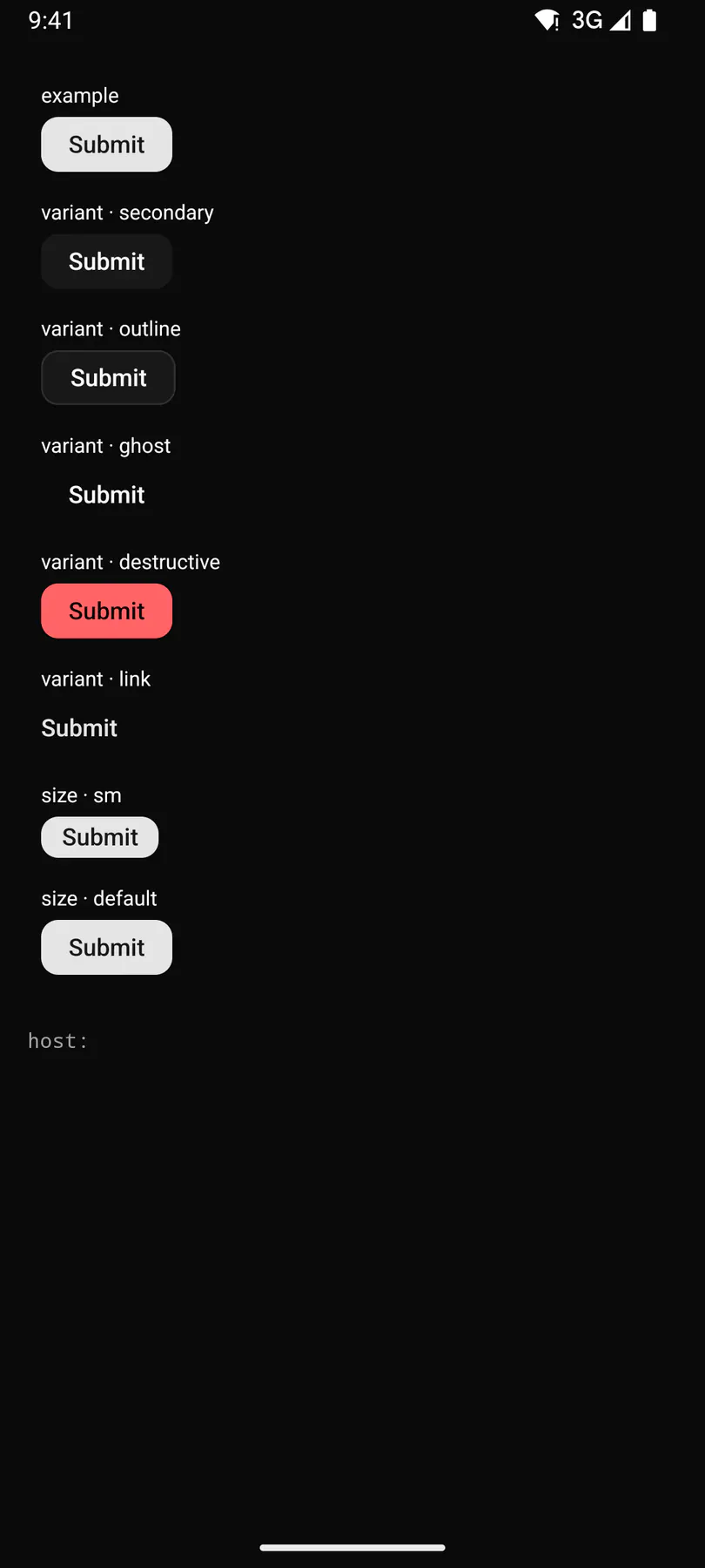
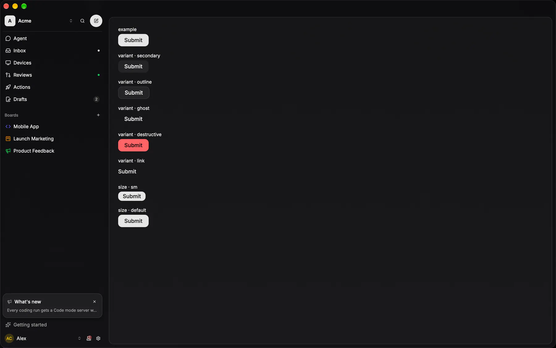
View exponential-ui-button, painted by each native renderer.
variant · defaultvariant · secondaryvariant · outlinevariant · ghostvariant · destructivevariant · linksize · smsize · defaultsize · lgsize · icondisabled| Prop | Type | Default | Description |
|---|---|---|---|
labelbind | string | – | The button text (omit for an icon-only button). |
icon | icon | – | An icon before the label, or alone with size icon. |
variant | default | secondary | outline | ghost | destructive | link | "default" | default = the primary action, destructive = dangerous, ghost/link = quiet. |
size | sm | default | lg | icon | "default" | Control height class; icon is a square icon-only button. |
disabledbind | boolean | false | Shows it inert. |
loading | boolean | false | Shows a spinner and refuses presses. |
submit | boolean | false | Submits the enclosing Form on press. |
| Name | Kind |
|---|---|
on.press | event: runs an action |
- Role
button- Semantics
- button
| Keys | Action |
|---|---|
| EnterSpace | press |
| – | A submit button submits the enclosing Form |
- Recipe parts
Button/rootButton/iconButton/labelButton/spinner- Keyed by
variantsizedisabledloading:hover:pressed:focus:disabled:checked:open:selected:invalid:dragover
Primary icon button
A 32px circle of card fill under a card stroke, glyph 16px at 70% foreground; hover fills to active and the glyph goes full strength.
More
The SHAPE is the meaning (EXP-771, narrowed by EXP-862): a circle marks the PRIMARY action and nothing else wears one. That is play / start, send, the rail's New issue and Search, a mobile FAB, and the "+" that adds. Every other icon-only control is the ghost icon button. The remaining exception is a picker TRIGGER, which is a rounded square: see icon picker.
CircleIconButtonapps/android/app/src/main/java/com/exponential/app/ui/components/CircleIconButton.ktGhost icon button
The SECONDARY icon button (EXP-862): the same 32px box and the same 16px glyph at 70% foreground, with no circle, no fill and no border at rest.
More
Hover is the only paint it carries, the row wash under the MD corner, and the glyph goes full strength; a toggle that is ON says so with aria-pressed and keeps that wash (the editor rail's marks, EXP-960). Everything that is not the primary action wears this one: the "…" overflow, close, the folder and file-list toggles, the chevrons (back, fold, reorder), trash and remove, refresh. Put a circle here and the surface ends up with three things asking to be pressed and no way to tell which one it wants.
CircleIconButton(borderless = true)apps/android/app/src/main/java/com/exponential/app/ui/components/CircleIconButton.ktone composable, two shapes: borderless drops the circle and the stroke and keeps the hover fill
controls::buttons::ghost_icon_buttonapps/desktop/crates/exponential-ui-gpui/src/controls/buttons.rsPrimary submit
Full width, padding 14/16, radius 10, solid primary.
More
Disabled drops to card fill with a card stroke and 50% foreground. EXP-1176: ONE shape on every client — the specimen is the web's own Button, a radius-10 rectangle like the mobile sheet submit and desktop web_md. A text button is never a capsule; the capsule is the pill.
Button (variant default)packages/ui/src/button.tsxthe same radius-10 rectangle on every client since EXP-1176; the mobile sheet submit is the full-width form of it
GlassSubmitButtonapps/android/app/src/main/java/com/exponential/app/ui/components/GlassSubmitButton.ktcontrols::pills::glass_pill_button_primaryapps/desktop/crates/exponential-ui-gpui/src/controls/pills.rsText button
EXP-962: a control made of WORDS — `size="inline"`, 12px, no box, no height of its own, sitting in the run of muted text around it.
More
Two variants, and the difference is what happens when it is pressed: `text` is muted, brightens under the pointer and never underlines, because it toggles something IN PLACE (a fold's Show more / Show less, "Back to the current step"); `link` takes the primary colour and underlines on hover, because it GOES somewhere (a session band's "Continues in a newer run", a stack band's `↓ #APP-14`). Anything that wants a box is the pill or the primary submit — four call sites hand-drew one of these two shapes before.
Button("Show more").buttonStyle(.plain)apps/ios/Exponential/UI/Session/AgentSessionView.swiftinlined twice with its own caption2 font and tertiary opacity; no shared text button exists
ShowMoreToggleapps/android/app/src/main/java/com/exponential/app/ui/session/AgentSessionScreen.kta private clickable Text on the session screen; nothing else may reach it
controls::text_button (TextButtonVariant::Text)apps/desktop/crates/ui/src/controls.rsEXP-963: the output card's and the body's Show more, the edited-files footer ride it