Checkbox nativelite
A labelled checkbox; bind checked.
createSurface + updateComponents, A2UI v0.9.
[
  {
    "version": "v0.9",
    "createSurface": {
      "surfaceId": "preview",
      "catalogId": "https://ui.exponential.at/catalogs/core/v1"
    }
  },
  {
    "version": "v0.9",
    "updateComponents": {
      "surfaceId": "preview",
      "components": [
        {
          "id": "root",
          "component": "Stack",
          "direction": "vertical",
          "align": "start",
          "children": [
            "example"
          ]
        },
        {
          "id": "example",
          "component": "Checkbox",
          "label": "I agree",
          "name": "agree",
          "checked": false
        }
      ]
    }
  }
]
This surface through a MemoryTransport. Install and transports: React guide.
This surface through a MemoryTransport. Install and transports: SwiftUI guide.
This surface through a MemoryTransport. Install and transports: Compose guide.
This surface through a MemoryTransport. Install and transports: gpui guide.

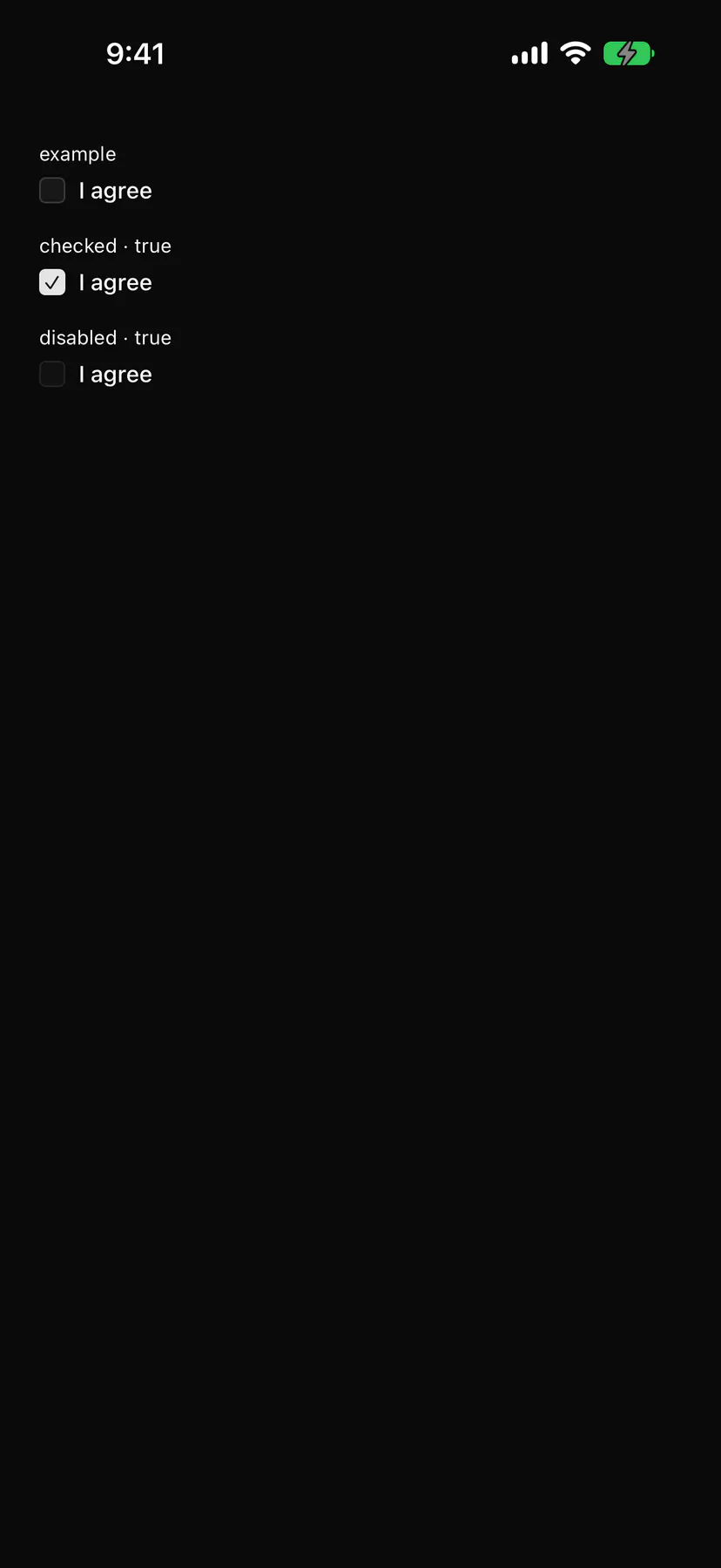
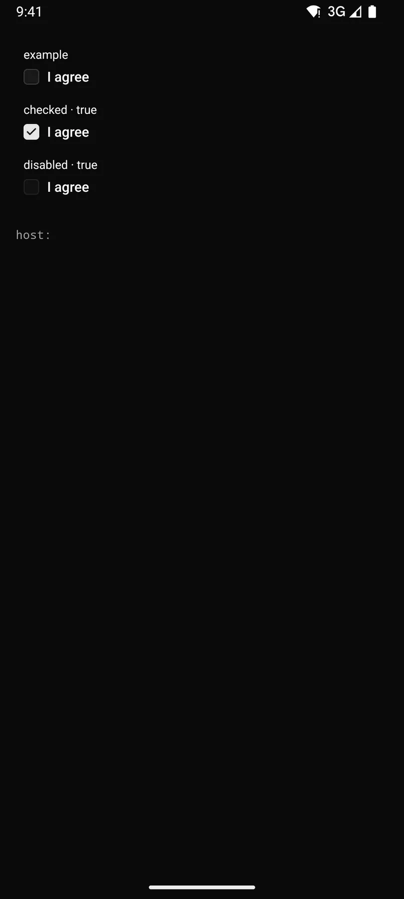
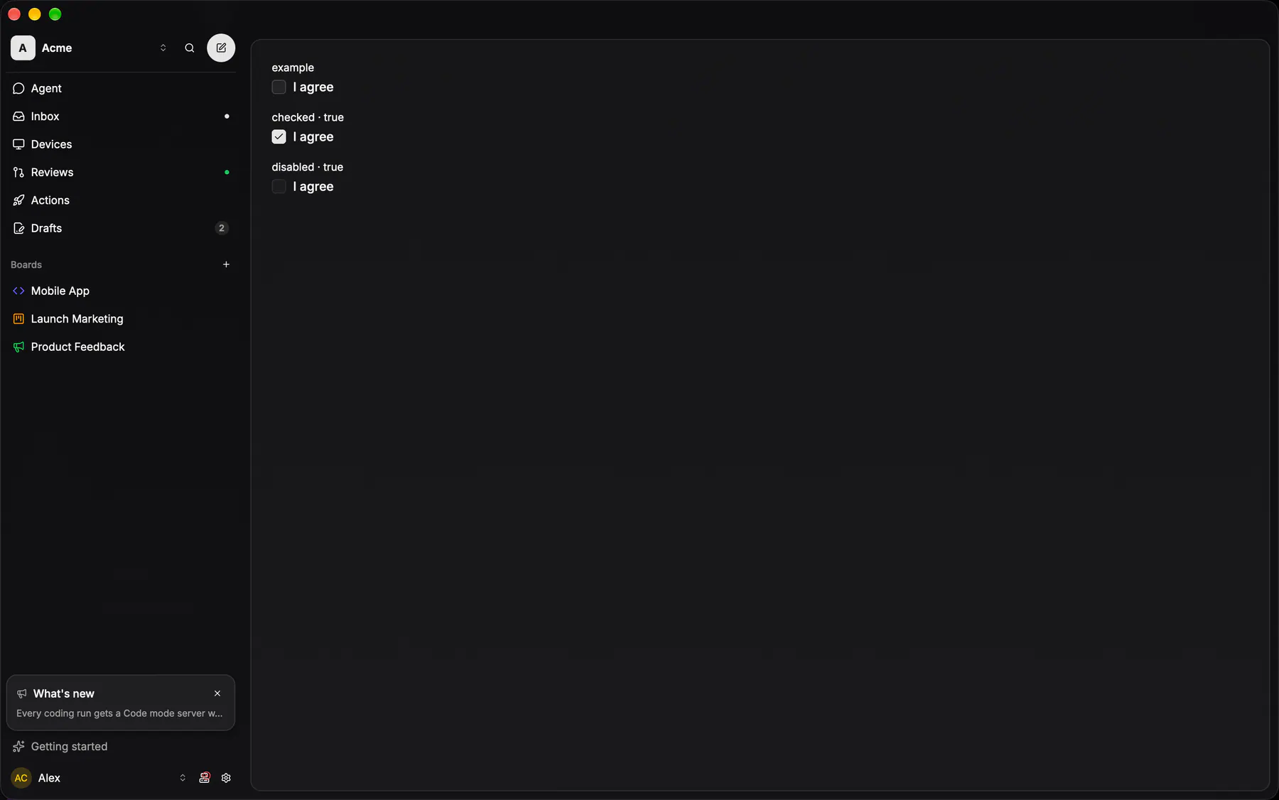
View exponential-ui-checkbox, painted by each native renderer.
checkeddisabled| Prop | Type | Default | Description |
|---|---|---|---|
labelrequiredbind | string | – | The text beside the box. |
namerequired | string | – | The field's key in the submitted data. |
checkedbind | boolean | false | The state; bind it. |
disabled | boolean | false | Shows it inert. |
checks | [check] | – | Validation rules. |
| Name | Kind |
|---|---|
on.change | event: runs an action |
- Role
checkbox- Semantics
- checkbox
| Keys | Action |
|---|---|
| Space | toggle |
- Recipe parts
Checkbox/rootCheckbox/boxCheckbox/checkCheckbox/labelCheckbox/description- Keyed by
checkeddisabled:hover:pressed:focus:disabled:checked:open:selected:invalid:dragover
Checkbox
A 16px rounded square that holds a TABLE's selection — the bulk-select column of an issue list and nothing else.
More
It is deliberately NOT the multi-select affordance in a picker: every option row on all four clients marks itself with the leading circle pair (ui-selected / ui-unselected), so a checkbox inside a picker would make web the only client drawing selection twice. Checked takes the primary fill under the primary foreground; indeterminate is the same box with a minus.
no checkbox exists: a multi-select row draws the ui-selected / ui-unselected circle pair
same as iOS — the sheet's option rows carry the circle glyph pair, never a box
controls::inputs::checkboxapps/desktop/crates/exponential-ui-gpui/src/controls/inputs.rsglass box (row fill, strong stroke, radius SM), primary when checked, ui-check / ui-minus; bulk-select + checklist rows