Tabs nativelite
Tab navigation; the child at index i is the panel of tab i.
Preview
Loading the renderer…
createSurface + updateComponents, A2UI v0.9.
json
[
  {
    "version": "v0.9",
    "createSurface": {
      "surfaceId": "preview",
      "catalogId": "https://ui.exponential.at/catalogs/core/v1"
    }
  },
  {
    "version": "v0.9",
    "updateComponents": {
      "surfaceId": "preview",
      "components": [
        {
          "id": "root",
          "component": "Stack",
          "direction": "vertical",
          "align": "stretch",
          "children": [
            "example"
          ]
        },
        {
          "id": "example",
          "component": "Tabs",
          "tabs": [
            {
              "label": "Issue",
              "value": "issue"
            },
            {
              "label": "Run",
              "value": "run"
            }
          ],
          "value": "issue",
          "children": [
            "c0-p1",
            "c0-p2"
          ]
        },
        {
          "id": "c0-p1",
          "component": "Text",
          "text": "The issue panel.",
          "variant": "body"
        },
        {
          "id": "c0-p2",
          "component": "Text",
          "text": "The run panel.",
          "variant": "body"
        }
      ]
    }
  }
]
This surface through a MemoryTransport. Install and transports: React guide.
This surface through a MemoryTransport. Install and transports: SwiftUI guide.
This surface through a MemoryTransport. Install and transports: Compose guide.
This surface through a MemoryTransport. Install and transports: gpui guide.
Platforms

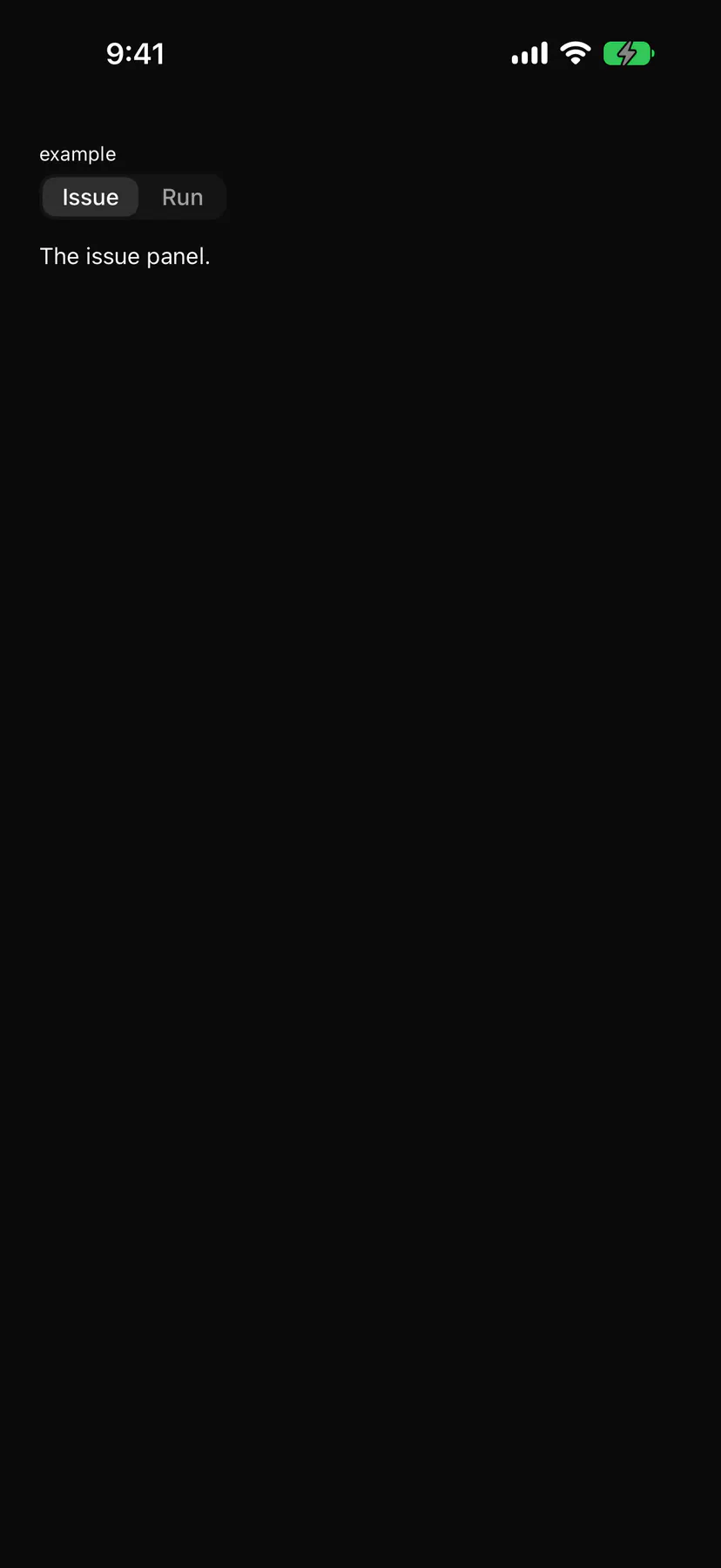
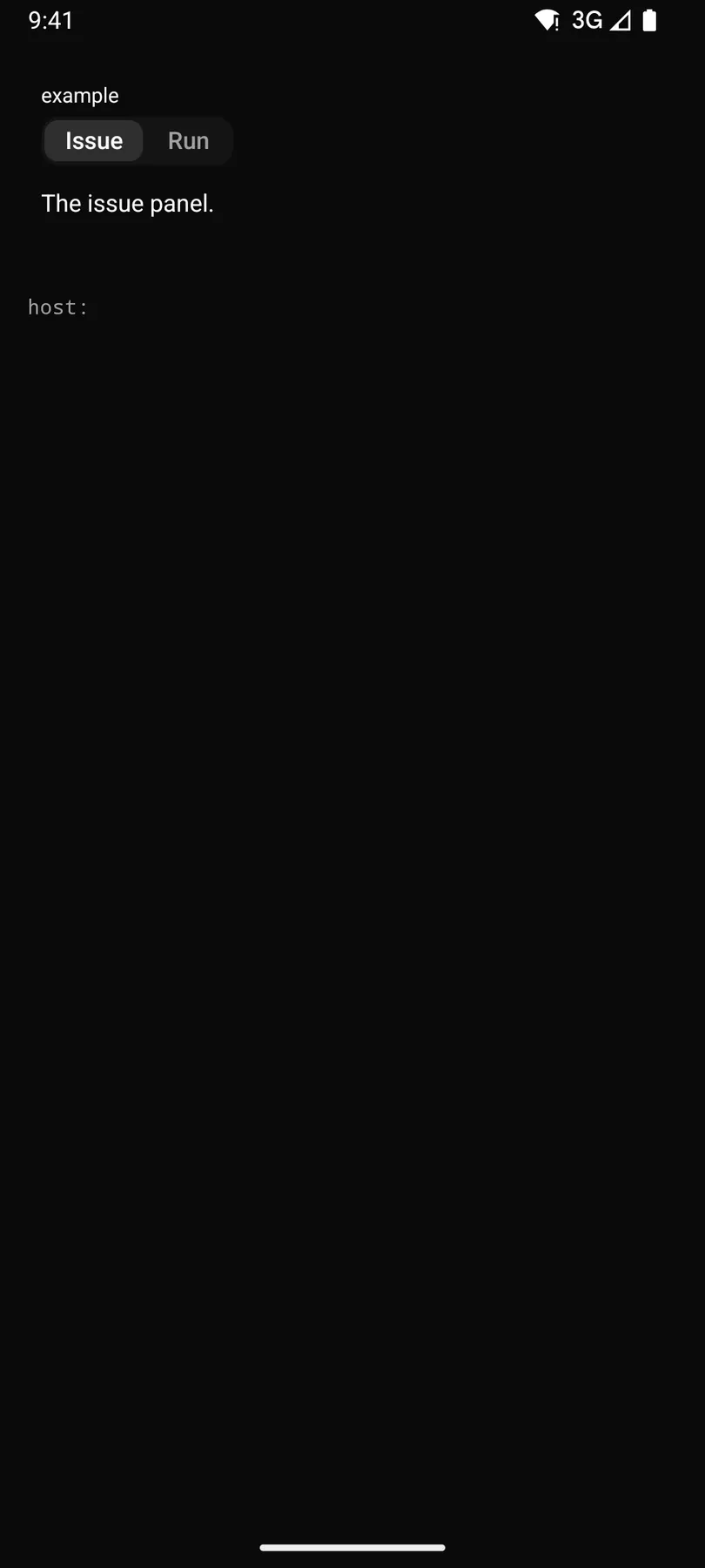
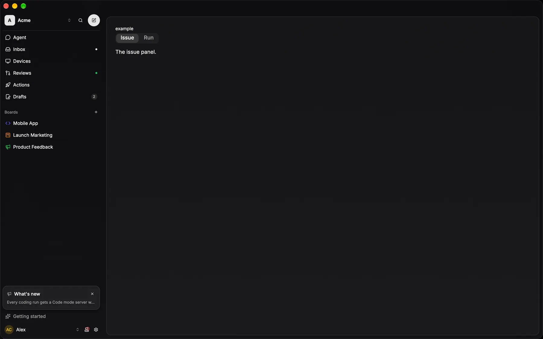
View exponential-ui-tabs, painted by each native renderer.
Variants
fillProps
| Prop | Type | Default | Description |
|---|---|---|---|
tabsrequired | [tab] | – | The tab headers in order. |
valuebind | string | – | The active tab's value; bind it for two-way state. |
fill | boolean | false | Stretches the headers across the width. |
Events and slots
| Name | Kind |
|---|---|
on.change | event: runs an action |
Accessibility
- Role
tablist- Semantics
- tablist / tab / tabpanel
| Keys | Action |
|---|---|
| – | Roving tab stop on the tabs |
| ArrowLeftArrowRight | previous/next tab, activating it (wraps) |
| HomeEnd | first/last tab |
| Tab | into the active panel |
Theming
- Recipe parts
Tabs/rootTabs/listTabs/tabTabs/indicatorTabs/content- Keyed by
fill:hover:pressed:focus:disabled:checked:open:selected:invalid:dragover