Drawer native
A panel sliding in from an edge (a bottom sheet on phones).
createSurface + updateComponents, A2UI v0.9.
[
  {
    "version": "v0.9",
    "createSurface": {
      "surfaceId": "preview",
      "catalogId": "https://ui.exponential.at/catalogs/core/v1"
    }
  },
  {
    "version": "v0.9",
    "updateComponents": {
      "surfaceId": "preview",
      "components": [
        {
          "id": "root",
          "component": "Stack",
          "direction": "vertical",
          "align": "stretch",
          "children": [
            "example"
          ]
        },
        {
          "id": "example",
          "component": "Drawer",
          "title": "Filters",
          "side": "bottom",
          "open": false,
          "children": [
            "c0-p"
          ],
          "slots": {
            "trigger": "c0-trigger",
            "footer": "c0-apply"
          }
        },
        {
          "id": "c0-p",
          "component": "Text",
          "text": "Status, assignee and labels.",
          "variant": "body"
        },
        {
          "id": "c0-trigger",
          "component": "Button",
          "label": "Filters",
          "variant": "outline"
        },
        {
          "id": "c0-apply",
          "component": "Button",
          "label": "Apply",
          "variant": "default"
        }
      ]
    }
  }
]
This surface through a MemoryTransport. Install and transports: React guide.
This surface through a MemoryTransport. Install and transports: SwiftUI guide.
This surface through a MemoryTransport. Install and transports: Compose guide.
This surface through a MemoryTransport. Install and transports: gpui guide.

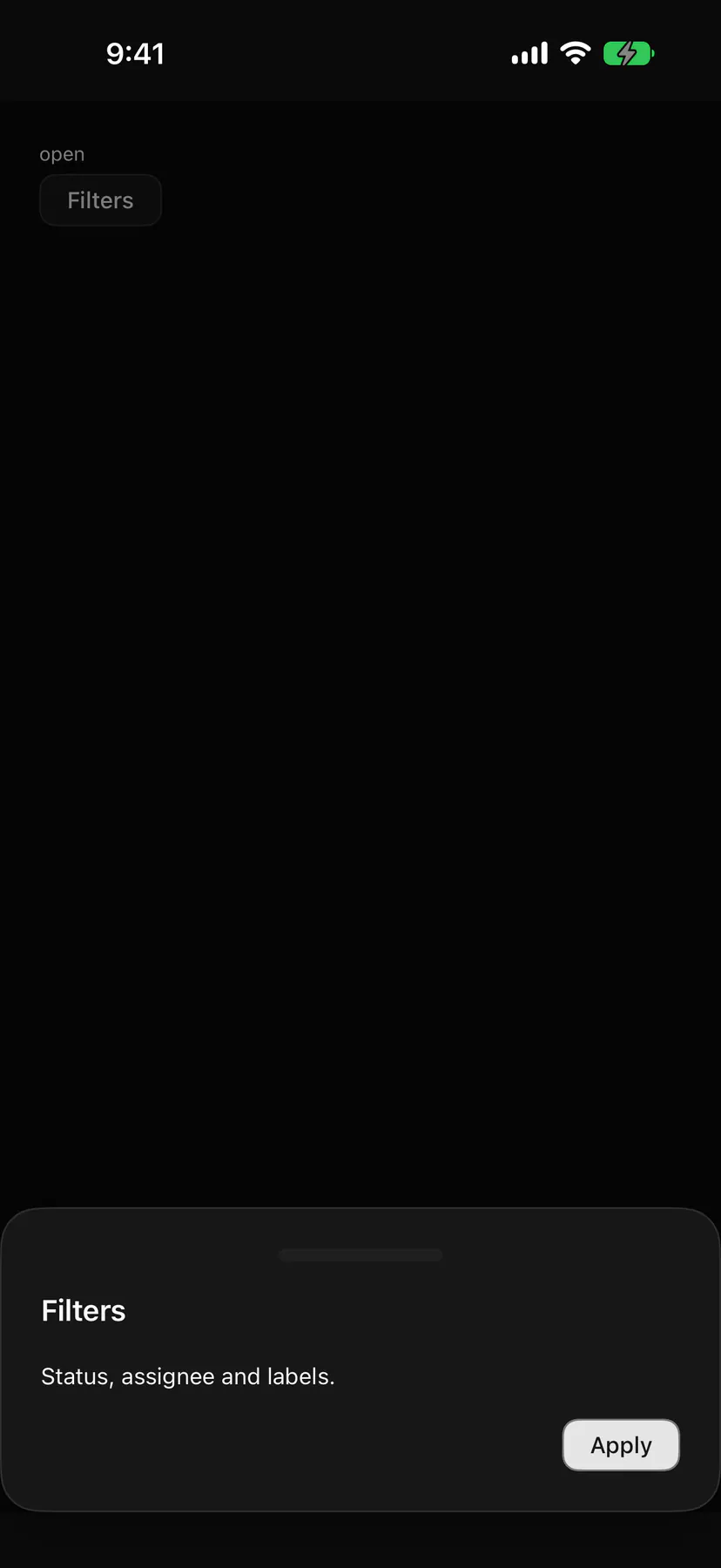
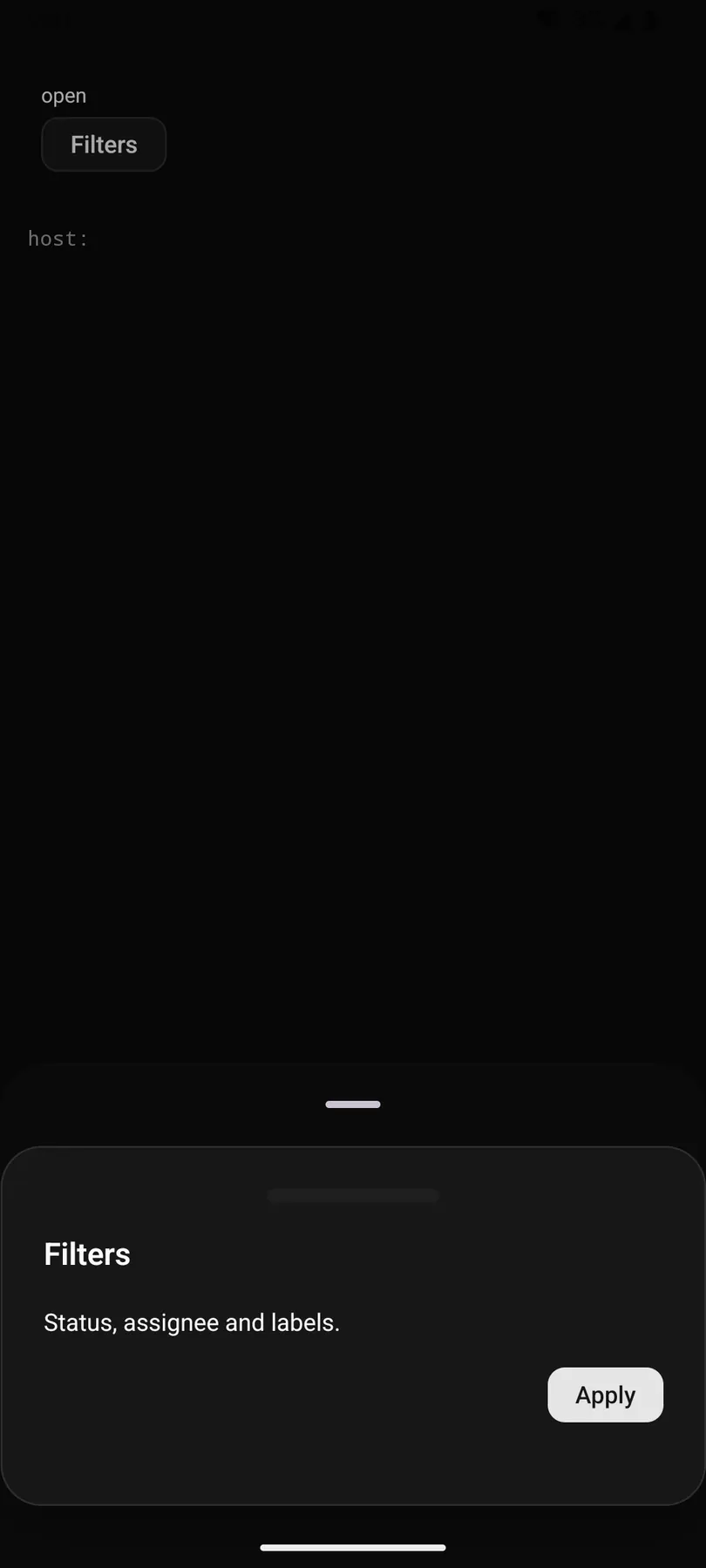
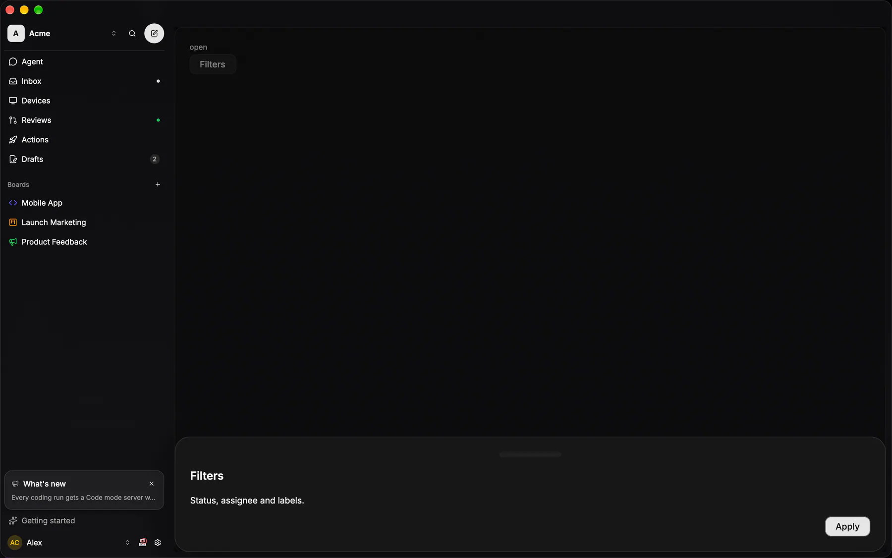
View exponential-ui-drawer, painted by each native renderer.
| Prop | Type | Default | Description |
|---|---|---|---|
title | string | – | The drawer heading. |
description | string | – | A muted line under the heading. |
openbind | boolean | false | Whether it shows; bind it to a boolean path. |
sideresp | top | right | bottom | left | "bottom" | The edge it slides from; {base: "bottom", md: "right"} turns the phone sheet into a side panel on wide surfaces. |
dismissible | boolean | true | Closes on the backdrop or Escape. |
dragToDismiss | boolean | true | Lets a swipe toward its edge close it. |
| Name | Kind |
|---|---|
on.change | event: runs an action |
trigger | slot: one component by id |
footer | slot: one component by id |
- Role
dialog- Semantics
- dialog (modal)
| Keys | Action |
|---|---|
| – | As Dialog; a swipe toward the edge closes when dragToDismiss |
- Recipe parts
Drawer/overlayDrawer/contentDrawer/handleDrawer/titleDrawer/descriptionDrawer/footer- Keyed by
sidedismissible:hover:pressed:focus:disabled:checked:open:selected:invalid:dragover
Sheet shell
Top radius 24 over the page's bottom gradient, a card hairline, a 36×4 grabber.
More
Header gutter 20, content gutter 16. Dismissal is the grabber drag or the backdrop — the header's trailing slot holds an optional ACTION, never a Cancel — and the bottom carries exactly one primary.
GlassSheet + GlassSheetDefaultsapps/android/app/src/main/java/com/exponential/app/ui/components/GlassSheet.ktdialogs are OS windows