Segmented nativelite
ONE row of segments selecting one or many values: the pill-track segmented control, bare toggles, joined outline buttons or a bottom bar of destinations.
createSurface + updateComponents, A2UI v0.9.
[
  {
    "version": "v0.9",
    "createSurface": {
      "surfaceId": "preview",
      "catalogId": "https://ui.exponential.at/catalogs/core/v1"
    }
  },
  {
    "version": "v0.9",
    "updateComponents": {
      "surfaceId": "preview",
      "components": [
        {
          "id": "root",
          "component": "Stack",
          "direction": "vertical",
          "align": "start",
          "children": [
            "example"
          ]
        },
        {
          "id": "example",
          "component": "Segmented",
          "items": [
            {
              "label": "List",
              "value": "list"
            },
            {
              "label": "Board",
              "value": "board"
            }
          ],
          "value": "list"
        }
      ]
    }
  }
]
This surface through a MemoryTransport. Install and transports: React guide.
This surface through a MemoryTransport. Install and transports: SwiftUI guide.
This surface through a MemoryTransport. Install and transports: Compose guide.
This surface through a MemoryTransport. Install and transports: gpui guide.
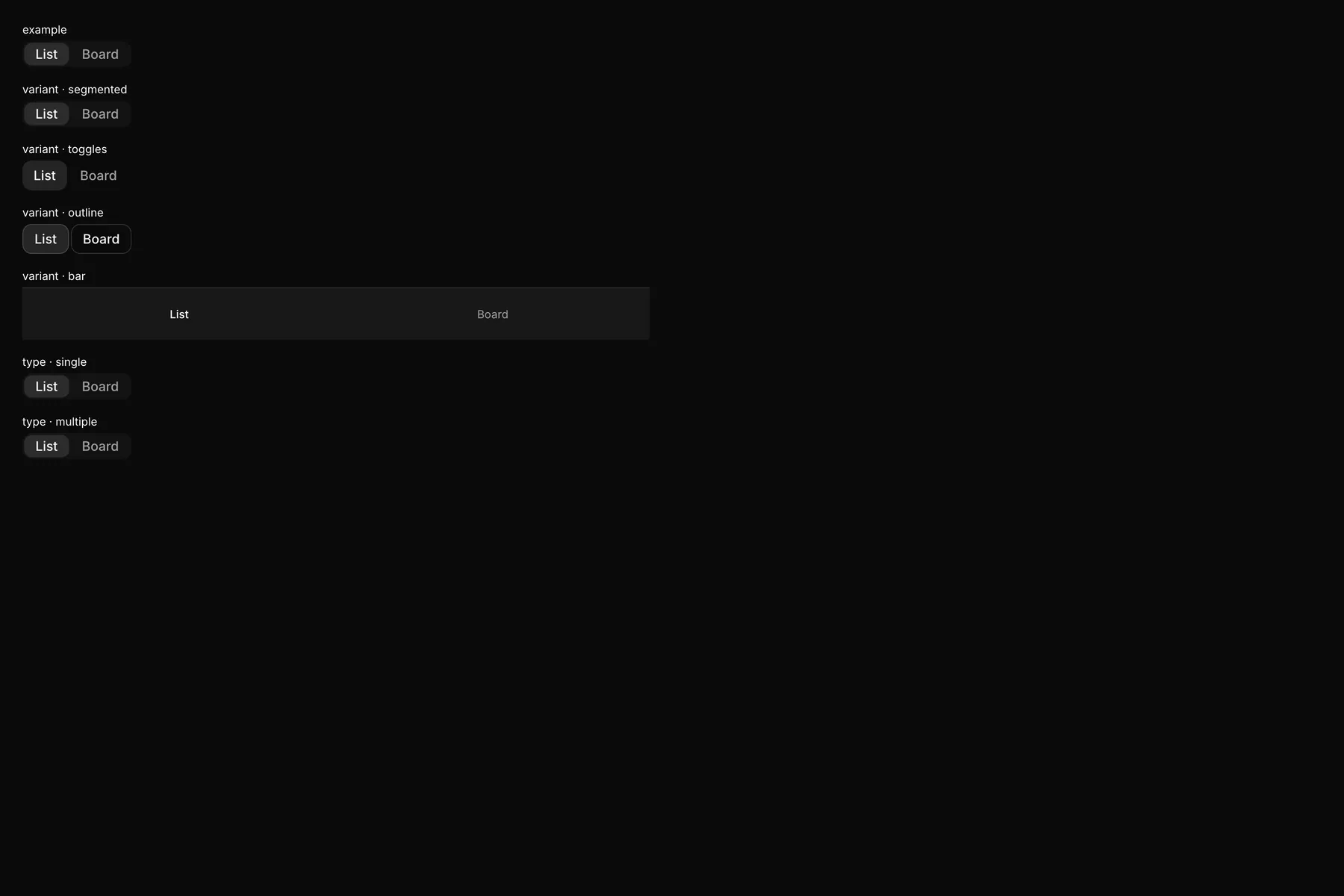
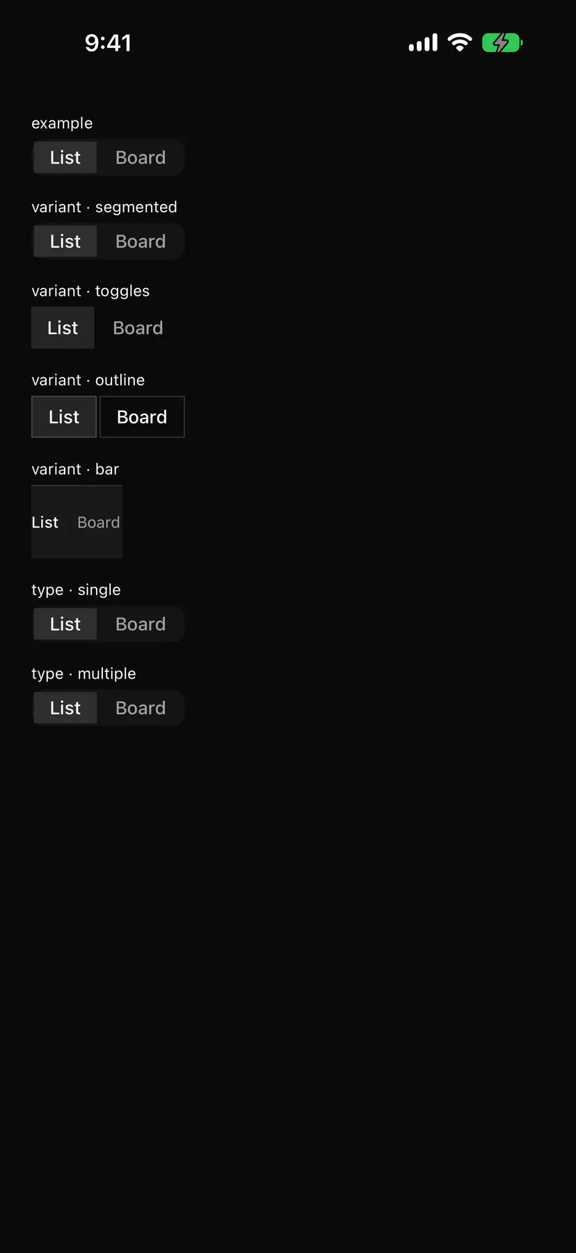
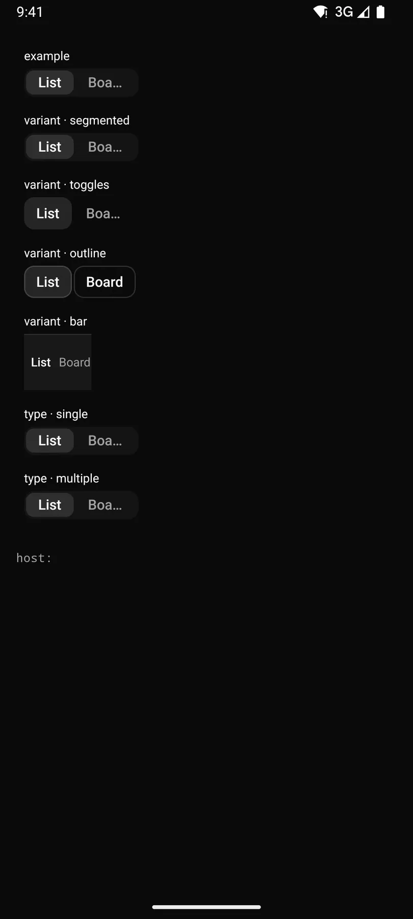
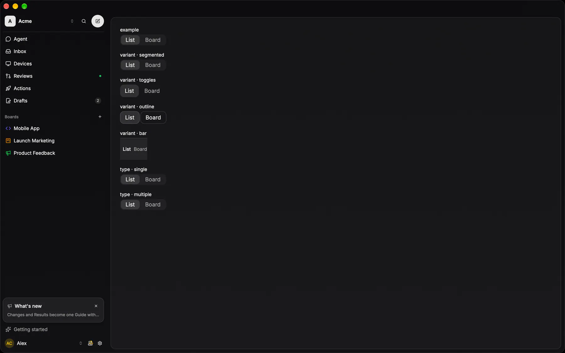
View exponential-ui-segmented, painted by each native renderer.
type · singletype · multiplevariant · segmentedvariant · togglesvariant · outlinevariant · barsize · smsize · defaultsize · lgfill| Prop | Type | Default | Description |
|---|---|---|---|
itemsrequired | [option] | – | The segments in order. |
type | single | multiple | "single" | One active value or several. |
valuebind | string | – | The selected value (comma-joined when multiple); bind it. |
variant | segmented | toggles | outline | bar | "segmented" | The segmented track, bare toggles, joined outline buttons, or a full-width bar with icons over labels. |
size | sm | default | lg | "default" | Control height class. |
fill | boolean | false | Stretches the segments across the width (a bar always does). |
| Name | Kind |
|---|---|
on.change | event: runs an action |
- Role
radiogroup- Semantics
- radiogroup (single) or toolbar of toggle buttons (multiple);
bar= navigation of buttons, the selected one aria-current=page
| Keys | Action |
|---|---|
| – | Roving tab stop |
| ArrowLeftArrowRight (ArrowUpArrowDown) | move focus (wraps) |
| HomeEnd | first/last |
| SpaceEnter | toggle the focused item |
- Recipe parts
Segmented/rootSegmented/itemSegmented/iconSegmented/label- Keyed by
typevariantsizefill:hover:pressed:focus:disabled:checked:open:selected:invalid:dragover
Embedded tabs row
The segmented control as the FIRST row of a group: padding 8, full width, no fill and no stroke of its own.
GlassSegmentedControl(embedded = true)apps/android/app/src/main/java/com/exponential/app/ui/components/GlassSegmentedControl.ktSegmented control
The standalone capsule: 36 tall, padding 3, the section fill under a section stroke.
More
Segments share the embedded row's geometry — EXP-941 made that second form a prop rather than a second component, so the settings strips and the free-floating ones are one control. Eight strips wired their own Tabs + TabsList + N triggers by hand before, and drifted in padding and in whether a segment carried a glyph; the class recipe still lives in tabs.tsx, which other surfaces read directly.
SegmentedControlpackages/ui/src/segmented-control.tsxthe SEGMENTED_* class constants stay in tabs.tsx byte-identical; this renders the strip from an option array
GlassSegmentedControlapps/android/app/src/main/java/com/exponential/app/ui/components/GlassSegmentedControl.kt