List nativelite
A windowed scrolling list; required for anything longer than a screen, children may come from a data template.
Preview
Loading the renderer…
createSurface + updateComponents, A2UI v0.9.
json
[
  {
    "version": "v0.9",
    "createSurface": {
      "surfaceId": "preview",
      "catalogId": "https://ui.exponential.at/catalogs/core/v1"
    }
  },
  {
    "version": "v0.9",
    "updateComponents": {
      "surfaceId": "preview",
      "components": [
        {
          "id": "root",
          "component": "Stack",
          "direction": "vertical",
          "align": "stretch",
          "children": [
            "example"
          ]
        },
        {
          "id": "example",
          "component": "List",
          "direction": "vertical",
          "divided": true,
          "children": [
            "c0-l1",
            "c0-l2",
            "c0-l3"
          ]
        },
        {
          "id": "c0-l1",
          "component": "Text",
          "text": "Inbox",
          "variant": "body"
        },
        {
          "id": "c0-l2",
          "component": "Text",
          "text": "Drafts",
          "variant": "body"
        },
        {
          "id": "c0-l3",
          "component": "Text",
          "text": "Archive",
          "variant": "body"
        }
      ]
    }
  }
]
This surface through a MemoryTransport. Install and transports: React guide.
This surface through a MemoryTransport. Install and transports: SwiftUI guide.
This surface through a MemoryTransport. Install and transports: Compose guide.
This surface through a MemoryTransport. Install and transports: gpui guide.
Platforms


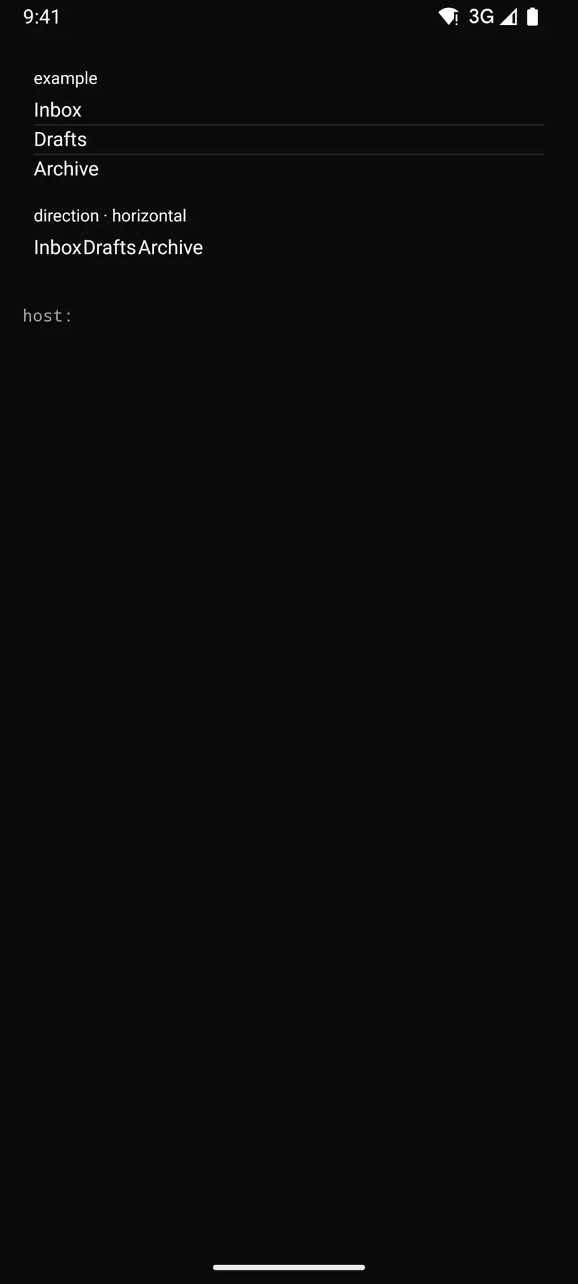
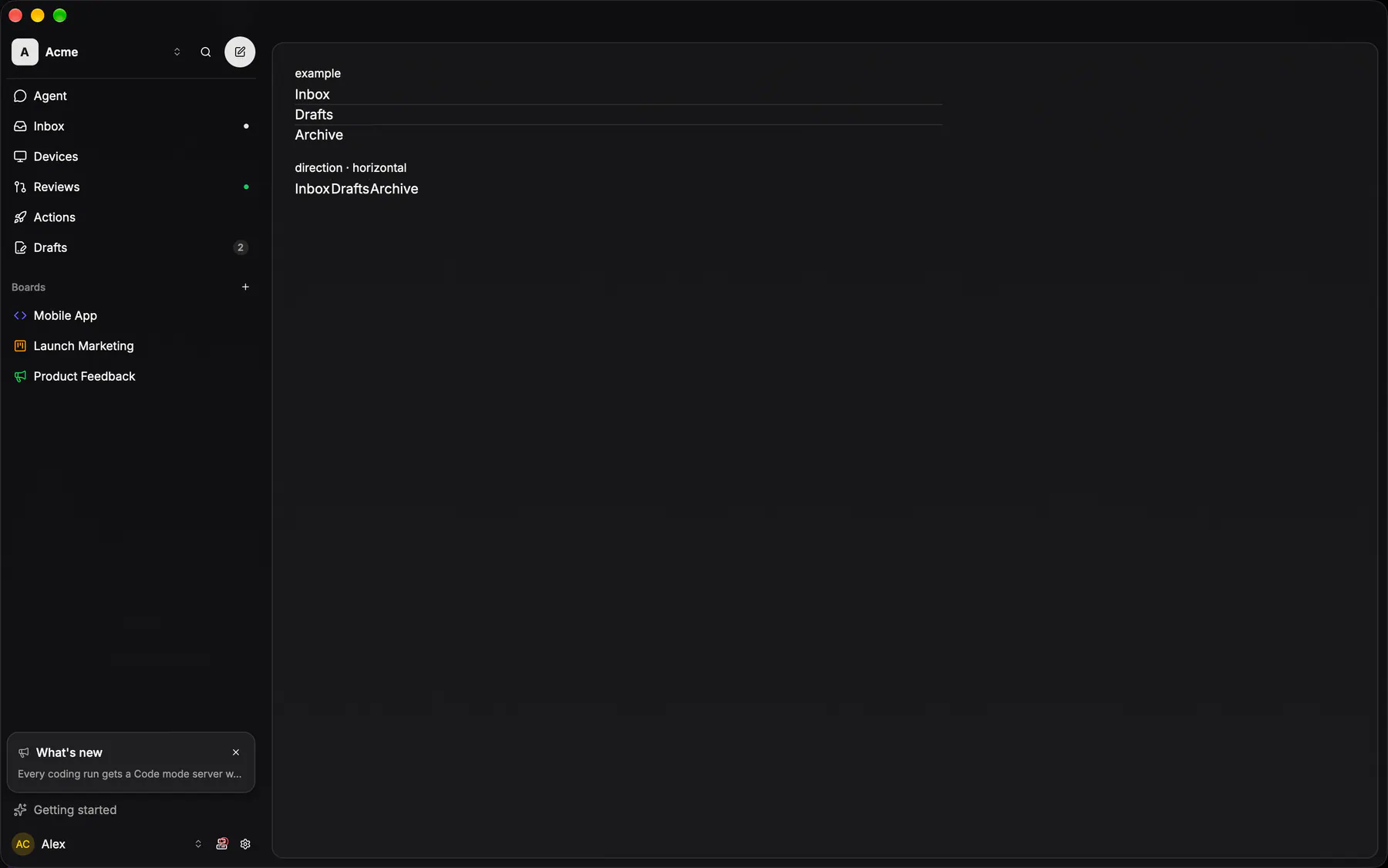
View exponential-ui-list, painted by each native renderer.
Variants
direction · verticaldirection · horizontalProps
| Prop | Type | Default | Description |
|---|---|---|---|
direction | vertical | horizontal | "vertical" | Scroll axis. |
gap | none | xs | sm | md | lg | xl | "none" | The space between items. |
divided | boolean | false | Draws a hairline between items. |
sectionBy | string | – | Groups consecutive template items by this field; slot section = each header (scope {value, count}). |
stickyHeaders | boolean | false | Pins the current section header. |
style | style | – | Extra Box styles for the list frame. |
Events and slots
| Name | Kind |
|---|---|
section | slot: one component by id |
Accessibility
- Role
list- Semantics
- list; each item a listitem with its position in the WHOLE list (aria-setsize/posinset, also when windowed); a section header is a heading (level 3) and stays first in reading order while pinned
| Keys | Action |
|---|---|
| – | Tab moves through the rows' controls; the list itself is one scroll region |
Theming
- Recipe parts
List/rootList/dividerList/section- Keyed by
directiondividedstickyHeaders:hover:pressed:focus:disabled:checked:open:selected:invalid:dragover