Text nativelite
A run of text in one of the type styles; prefer dedicated components over inline markdown.
Preview
Loading the renderer…
createSurface + updateComponents, A2UI v0.9.
json
[
  {
    "version": "v0.9",
    "createSurface": {
      "surfaceId": "preview",
      "catalogId": "https://ui.exponential.at/catalogs/core/v1"
    }
  },
  {
    "version": "v0.9",
    "updateComponents": {
      "surfaceId": "preview",
      "components": [
        {
          "id": "root",
          "component": "Stack",
          "direction": "vertical",
          "align": "stretch",
          "children": [
            "example"
          ]
        },
        {
          "id": "example",
          "component": "Text",
          "text": "Hello, world!",
          "variant": "body"
        }
      ]
    }
  }
]
This surface through a MemoryTransport. Install and transports: React guide.
This surface through a MemoryTransport. Install and transports: SwiftUI guide.
This surface through a MemoryTransport. Install and transports: Compose guide.
This surface through a MemoryTransport. Install and transports: gpui guide.
Platforms
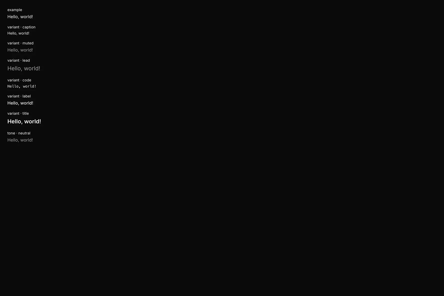
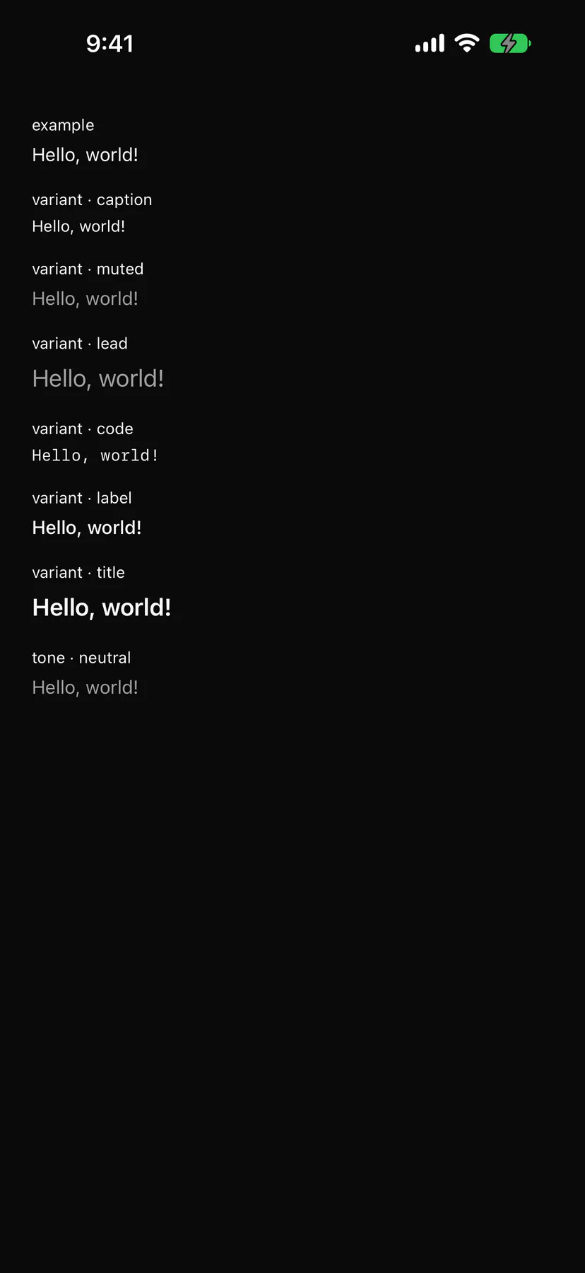
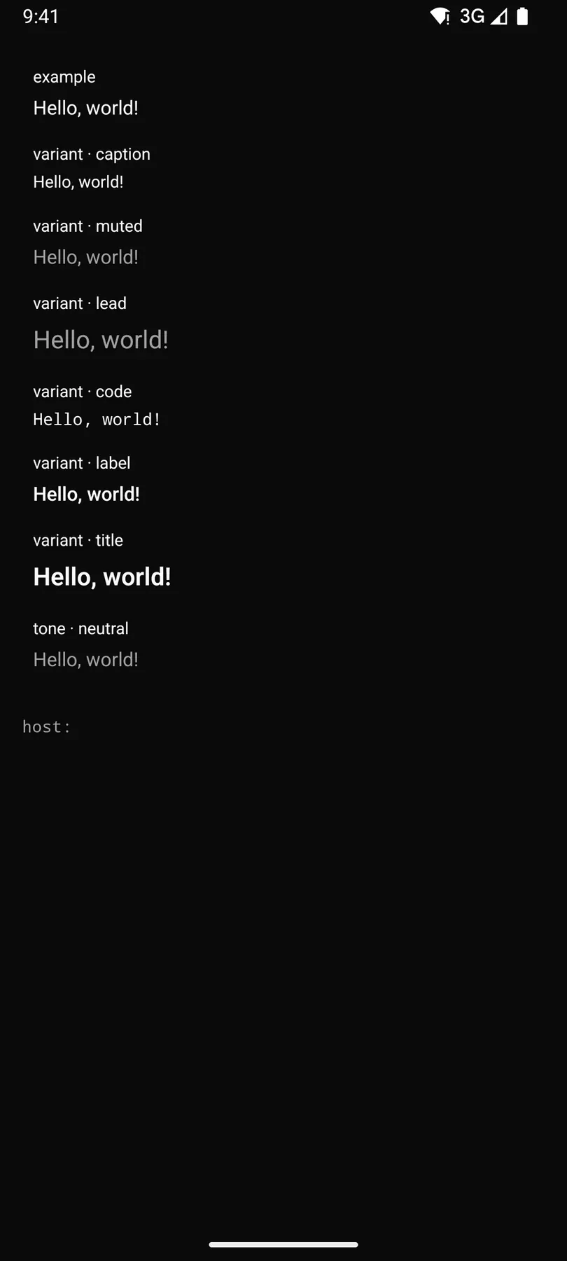
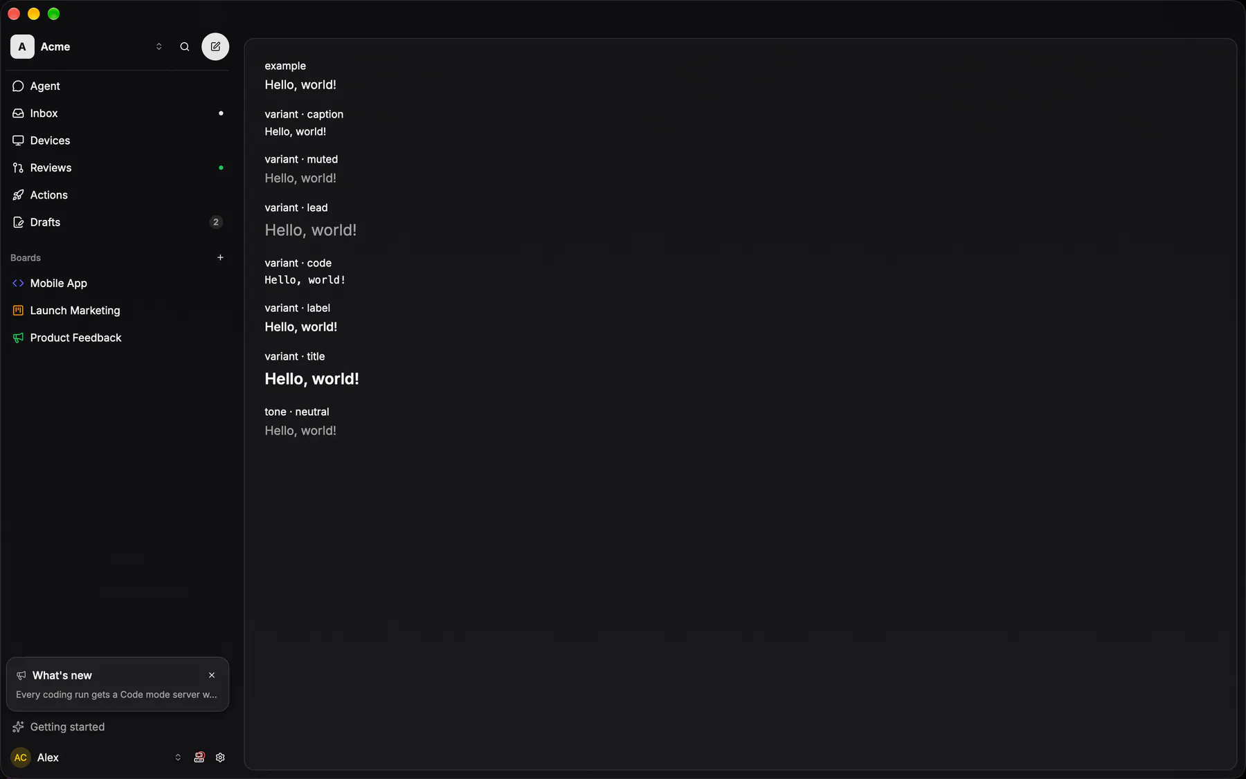
View exponential-ui-text, painted by each native renderer.
Variants
variant · bodyvariant · captionvariant · mutedvariant · leadvariant · codevariant · labelvariant · titletone · neutraltone · primarytone · successtone · warningtone · dangertone · infoProps
| Prop | Type | Default | Description |
|---|---|---|---|
textrequiredbind | string | – | The text to show. |
variant | body | caption | muted | lead | code | label | title | "body" | The type style. |
align | start | center | end | – | Horizontal alignment inside its box. |
lines | number | – | Truncates to this many lines with an ellipsis. |
tone | neutral | primary | success | warning | danger | info | – | A colour tone instead of the default foreground. |
live | off | polite | assertive | "off" | Announces text changes to screen readers (assertive interrupts). |
style | style | – | Extra Box styles for the text box. |
Events and slots
No events, no slots. Children: none.
Accessibility
- Role
text- Semantics
- text (a live region when
liveis not off)
Not focusable; no keys.
Theming
- Recipe parts
Text/root- Keyed by
varianttone:hover:pressed:focus:disabled:checked:open:selected:invalid:dragover