Ring nativelite
A circular progress ring for a fraction, sized like an icon.
createSurface + updateComponents, A2UI v0.9.
[
  {
    "version": "v0.9",
    "createSurface": {
      "surfaceId": "preview",
      "catalogId": "https://ui.exponential.at/catalogs/core/v1"
    }
  },
  {
    "version": "v0.9",
    "updateComponents": {
      "surfaceId": "preview",
      "components": [
        {
          "id": "root",
          "component": "Stack",
          "direction": "vertical",
          "align": "start",
          "children": [
            "example"
          ]
        },
        {
          "id": "example",
          "component": "Ring",
          "value": 0.62,
          "tone": "primary"
        }
      ]
    }
  }
]
This surface through a MemoryTransport. Install and transports: React guide.
This surface through a MemoryTransport. Install and transports: SwiftUI guide.
This surface through a MemoryTransport. Install and transports: Compose guide.
This surface through a MemoryTransport. Install and transports: gpui guide.
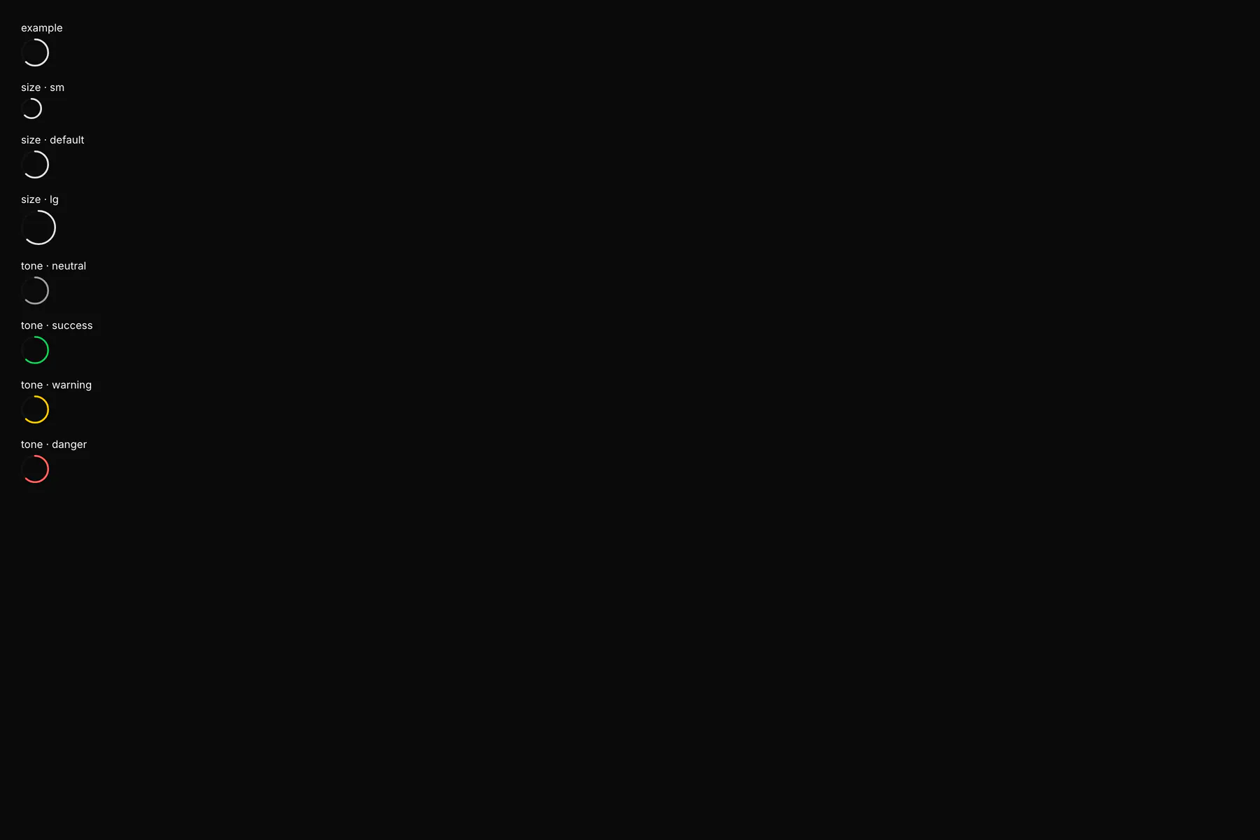
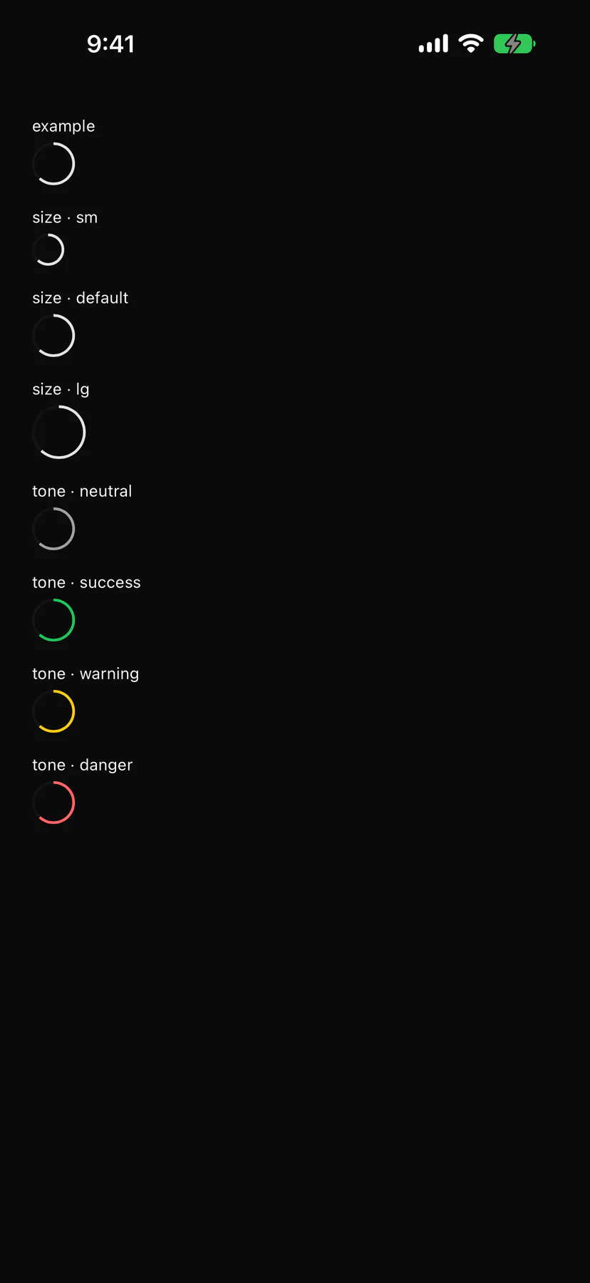
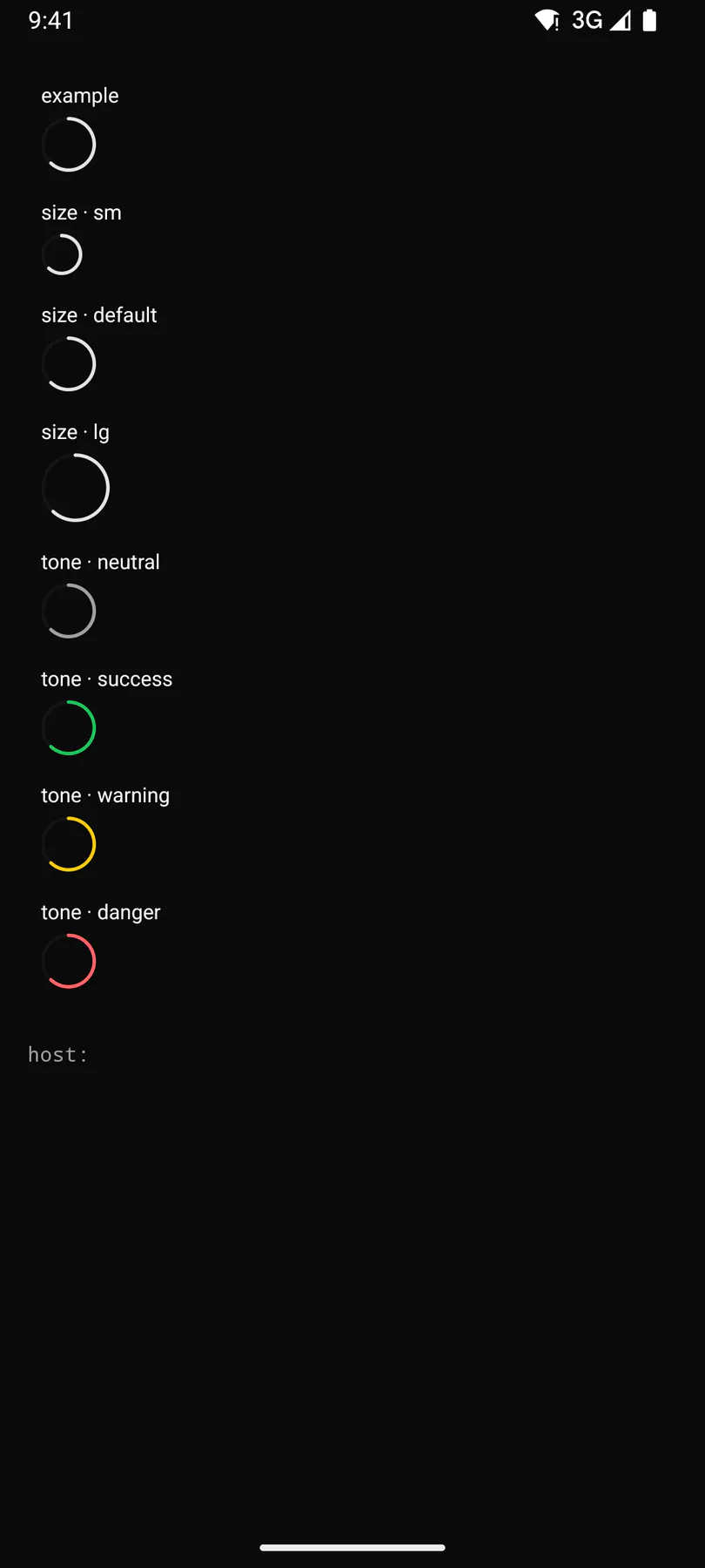
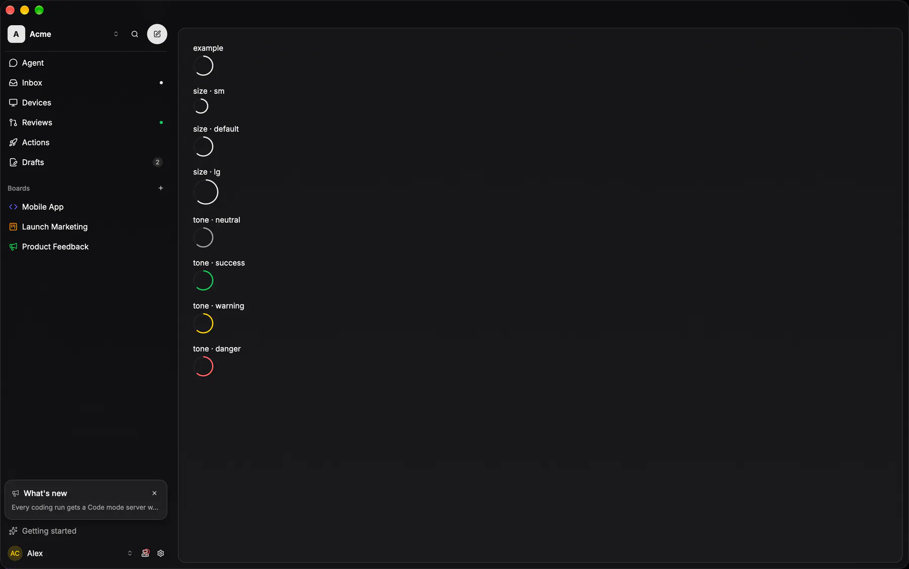
View exponential-ui-ring, painted by each native renderer.
size · smsize · defaultsize · lgtone · neutraltone · primarytone · successtone · warningtone · dangertone · info| Prop | Type | Default | Description |
|---|---|---|---|
valuerequiredbind | number | – | The fraction 0 to 1. |
size | sm | default | lg | "default" | Diameter class. |
tone | neutral | primary | success | warning | danger | info | "primary" | The arc colour tone. |
label | string | – | An accessibility label. |
No events, no slots. Children: none.
- Role
progressbar- Semantics
- progressbar (value 0..1 as percent)
Not focusable; no keys.
- Recipe parts
Ring/rootRing/trackRing/fillRing/label- Keyed by
sizetone:hover:pressed:focus:disabled:checked:open:selected:invalid:dragover
Context ring
EXP-877: how full the agent's context window is, as a 16px radial where the context pill used to be — and the trigger of the usage overlay the session already had.
More
The arc is a stroked circle rotated a quarter turn, the track the same circle at 20% opacity, and the tone is the session's, not the ring's: the app maps its own thresholds onto normal / warning / danger and passes one in. A run nothing has measured renders NOTHING unless `showEmpty` says the run has other usage worth opening.
ContextRingpackages/ui/src/context-ring.tsxringGeometry + RING_TONE_CLASS ship with it; the app's lib/context-ring.ts derives percent and tone
usage_sheet::context_ringapps/desktop/crates/ui/src/usage_sheet.rsmounted by steer_viewer::render_context_ring; the percentage comes from usage_bar::context_percent
Sub-issue progress ring
EXP-1097: the completion ring that leads the issue detail's Sub-issues band — done of total as an arc over a 20% track, the SAME 16-unit box, 2-unit stroke and track as the context ring (`ringGeometry`), drawn at 14px and painted in the team's COMPLETED status colour.
More
The band reads ring · "Sub-issues" · `done/total` · `+` over flat rows (`lib/issue-relations-view.ts`, fixture-locked ×4).
ProgressRingpackages/ui/src/progress-ring.tsxthe Sub-issues band in components/issue-relations-card.tsx mounts it
ProgressRingapps/ios/ExpUI/Sources/ProgressRing.swiftEXP-1097: IssueSubIssuesSection (IssueRelationRows.swift) leads its band with it
SubIssueProgressRingapps/android/app/src/main/java/com/exponential/app/ui/issue/RelationsSection.ktEXP-1097: SubIssuesSection leads its band with it
issue_relations::render_sub_issuesapps/desktop/crates/ui/src/issue_relations.rsEXP-1097: a ProgressCircle on the context ring's geometry, the COMPLETED status colour