Collapsible macrolite
One disclosure section with a title row that shows or hides its children.
createSurface + updateComponents, A2UI v0.9.
[
  {
    "version": "v0.9",
    "createSurface": {
      "surfaceId": "preview",
      "catalogId": "https://ui.exponential.at/catalogs/core/v1"
    }
  },
  {
    "version": "v0.9",
    "updateComponents": {
      "surfaceId": "preview",
      "components": [
        {
          "id": "root",
          "component": "Stack",
          "direction": "vertical",
          "align": "stretch",
          "children": [
            "example"
          ]
        },
        {
          "id": "example",
          "component": "Collapsible",
          "title": "Advanced",
          "open": true,
          "children": [
            "c0-p"
          ]
        },
        {
          "id": "c0-p",
          "component": "Text",
          "text": "Retries, timeouts and the proxy live here.",
          "variant": "muted"
        }
      ]
    }
  }
]
This surface through a MemoryTransport. Install and transports: React guide.
This surface through a MemoryTransport. Install and transports: SwiftUI guide.
This surface through a MemoryTransport. Install and transports: Compose guide.
This surface through a MemoryTransport. Install and transports: gpui guide.


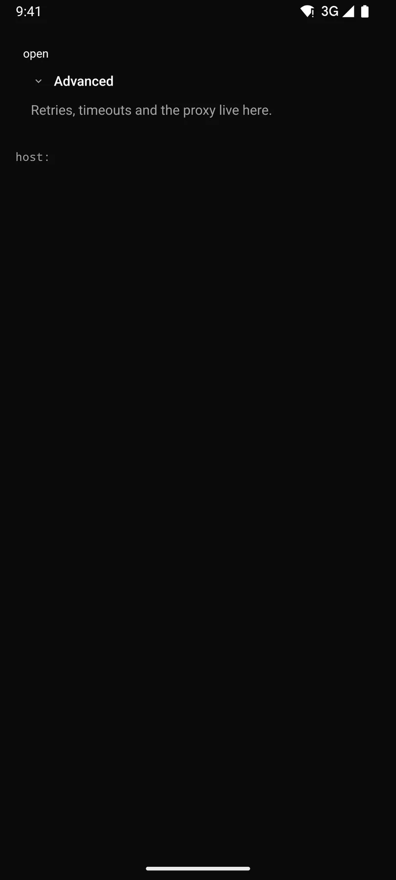
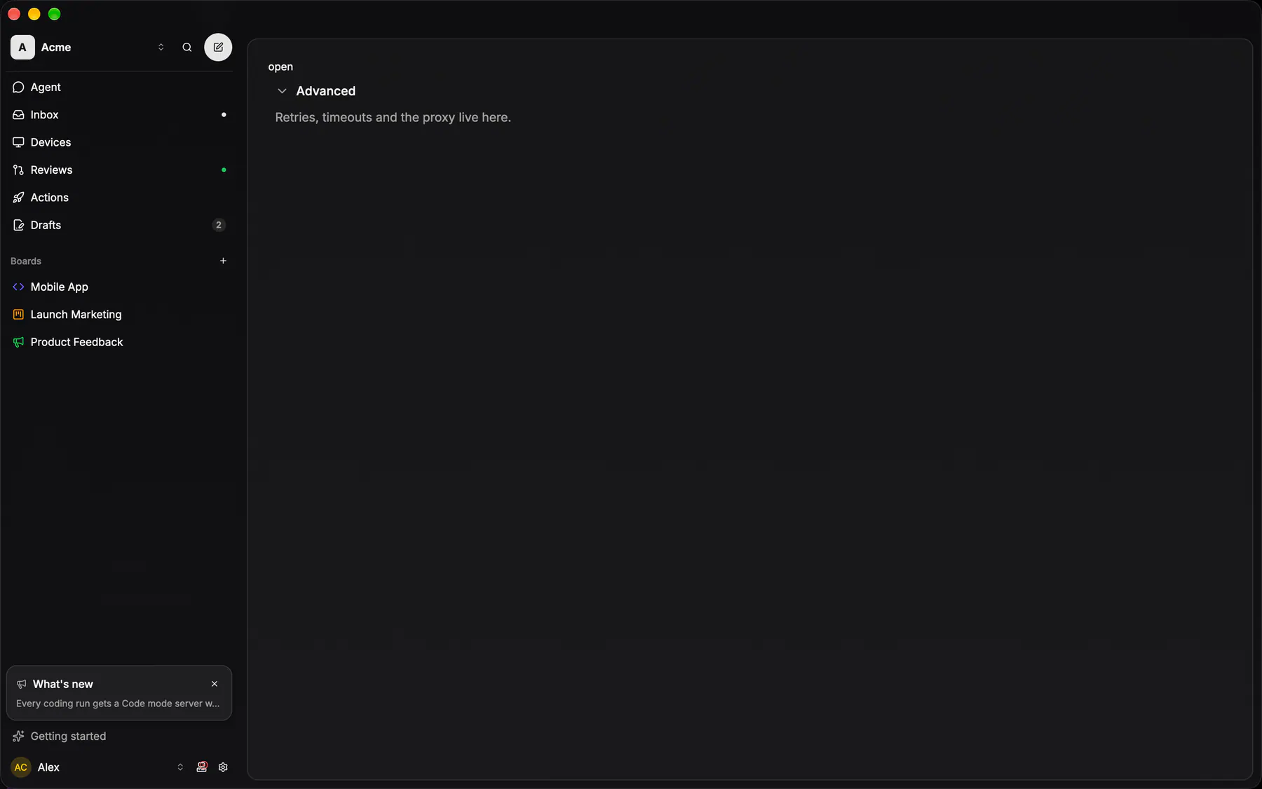
View exponential-ui-collapsible, painted by each native renderer.
| Prop | Type | Default | Description |
|---|---|---|---|
titlerequired | string | – | The header text. |
openbind | boolean | false | Whether the body shows; bind it. |
count | number | – | A count shown in the header. |
| Name | Kind |
|---|---|
on.change | event: runs an action |
- Role
group- Semantics
- trigger = button with aria-expanded. The trigger is a button with aria-expanded = open ($a11y).
| Keys | Action |
|---|---|
| EnterSpace | toggle |
- Recipe parts
Collapsible/rootCollapsible/triggerCollapsible/chevronCollapsible/titleCollapsible/countCollapsible/body- Keyed by
open:hover:pressed:focus:disabled:checked:open:selected:invalid:dragover
Disclosure header
EXP-962: the fold toggle INSIDE a row, and the whole of it is one line of bare text — a 12px chevron pointing right folded and down open, the label muted and brightening under the pointer, `aria-expanded` stating the fold, the entire line the target.
More
The steer feed's tool groups, its Exponential calls, its subagent lanes and its long bodies, the workflow card's agents and the issue group's own header each drew this by hand before it was one component. `chevron="trailing"` parks the glyph at the far edge instead, for a row whose siblings carry none and must not indent out of line with them. It is NOT the group band above: that is a filled strip heading a LIST. And it may not contain another button — a fold's own action renders beside it, because a button inside a button is invalid markup.
ToolGroupRow / ExpToolGroupRow / SubagentGroupRowapps/ios/Exponential/UI/Session/AgentSessionView.swiftthree private structs repeat the 11pt chevron row, each with its own @State expanded
ToolGroupRow / ExpToolGroupRow / SubagentGroupRowapps/android/app/src/main/java/com/exponential/app/ui/session/AgentSessionScreen.ktthe same three private composables, each rebuilding the chevron row
controls::rows::disclosure_headerapps/desktop/crates/exponential-ui-gpui/src/controls/rows.rsEXP-963: the steer feed's tool groups, Exponential runs, subagent lanes and workflow agents fold on it
Collapsible
The fold BEHIND a disclosure header: Radix Collapsible owns the open state and the content's mount, the header owns the words and the chevron.
More
It never draws chrome of its own, so a fold reads as the surface it sits in (a settings group, a transcript's Show work, a properties section). The natives fold with their own animation primitives under the same disclosure header. In the catalog: `Collapsible`, or a `Section collapsible` when the fold heads a list.
a fold = DisclosureHeader + a conditional view
a fold = DisclosureHeader + AnimatedVisibility
a fold = disclosure_header + the caller's own child toggle