Textarea nativelite
A multi-line text field.
Preview
Loading the renderer…
createSurface + updateComponents, A2UI v0.9.
json
[
  {
    "version": "v0.9",
    "createSurface": {
      "surfaceId": "preview",
      "catalogId": "https://ui.exponential.at/catalogs/core/v1"
    }
  },
  {
    "version": "v0.9",
    "updateComponents": {
      "surfaceId": "preview",
      "components": [
        {
          "id": "root",
          "component": "Stack",
          "direction": "vertical",
          "align": "stretch",
          "children": [
            "example"
          ]
        },
        {
          "id": "example",
          "component": "Textarea",
          "label": "Notes",
          "name": "notes",
          "rows": 4
        }
      ]
    }
  }
]
This surface through a MemoryTransport. Install and transports: React guide.
This surface through a MemoryTransport. Install and transports: SwiftUI guide.
This surface through a MemoryTransport. Install and transports: Compose guide.
This surface through a MemoryTransport. Install and transports: gpui guide.
Platforms

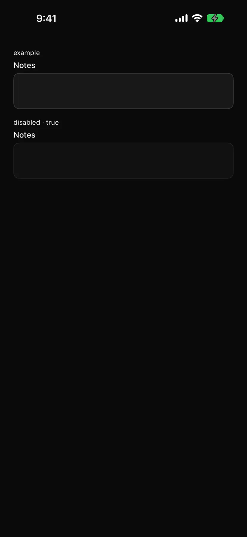
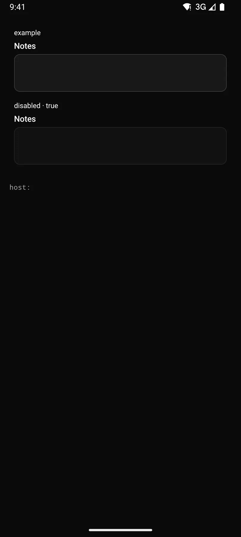
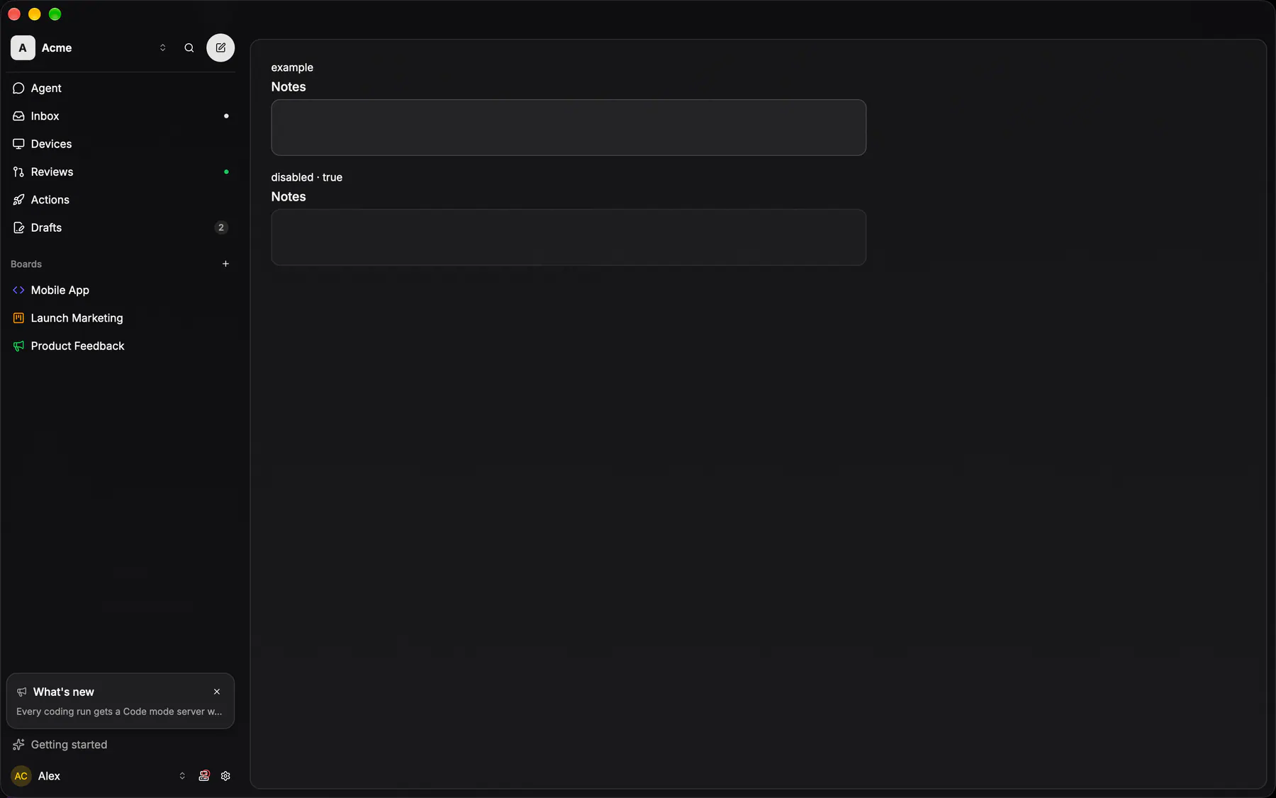
View exponential-ui-textarea, painted by each native renderer.
Variants
disabledProps
| Prop | Type | Default | Description |
|---|---|---|---|
labelrequired | string | – | The field label. |
namerequired | string | – | The field's key in the submitted data. |
placeholder | string | – | Hint text while empty. |
rows | number | 3 | Visible lines (the minimum when autosizing). |
autosize | boolean | false | Grows with the text from rows up to maxRows. |
maxRows | number | – | Autosize stops growing here and scrolls. |
valuebind | string | – | The text; bind it to a data path. |
disabled | boolean | false | Shows it inert. |
checks | [check] | – | Validation rules. |
validateOn | change | blur | submit | "blur" | When the checks run. |
Events and slots
| Name | Kind |
|---|---|
on.change | event: runs an action |
on.focus | event: runs an action |
on.blur | event: runs an action |
Accessibility
- Role
textbox- Semantics
- textbox (multiline)
| Keys | Action |
|---|---|
| Enter | newline |
Theming
- Recipe parts
Textarea/rootTextarea/labelTextarea/fieldTextarea/placeholderTextarea/descriptionTextarea/error- Keyed by
disabled:hover:pressed:focus:disabled:checked:open:selected:invalid:dragover
In the Exponential app
Text area
The field's own recipe, grown: radius 12, card fill under a card stroke, focus swaps the stroke to active — no ring.
More
Padding 8/12, three rows tall, and it GROWS with content; the drag handle is off everywhere. Inside a group it goes borderless, because the row is already the chrome.
Androidok
GlassTextField(minLines/maxLines)apps/android/app/src/main/java/com/exponential/app/ui/components/GlassTextField.ktDesktopok
controls::inputs::web_textareaapps/desktop/crates/exponential-ui-gpui/src/controls/inputs.rs