Switch nativelite
A labelled on/off switch; bind checked.
createSurface + updateComponents, A2UI v0.9.
[
  {
    "version": "v0.9",
    "createSurface": {
      "surfaceId": "preview",
      "catalogId": "https://ui.exponential.at/catalogs/core/v1"
    }
  },
  {
    "version": "v0.9",
    "updateComponents": {
      "surfaceId": "preview",
      "components": [
        {
          "id": "root",
          "component": "Stack",
          "direction": "vertical",
          "align": "start",
          "children": [
            "example"
          ]
        },
        {
          "id": "example",
          "component": "Switch",
          "label": "Auto-scan",
          "name": "autoScan",
          "checked": true
        }
      ]
    }
  }
]
This surface through a MemoryTransport. Install and transports: React guide.
This surface through a MemoryTransport. Install and transports: SwiftUI guide.
This surface through a MemoryTransport. Install and transports: Compose guide.
This surface through a MemoryTransport. Install and transports: gpui guide.

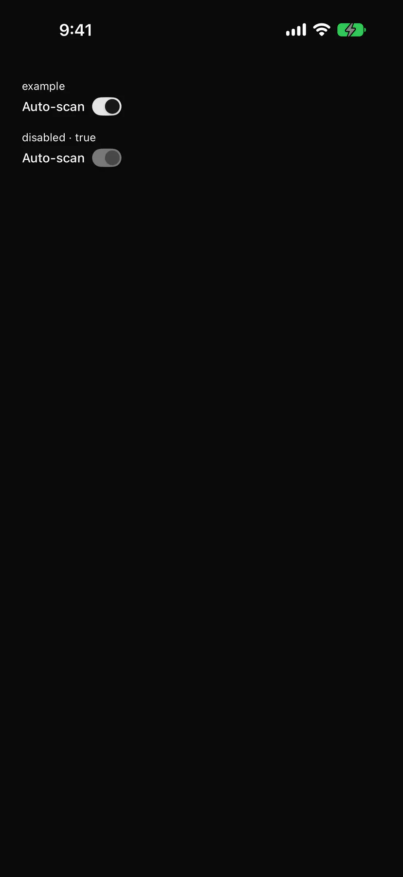
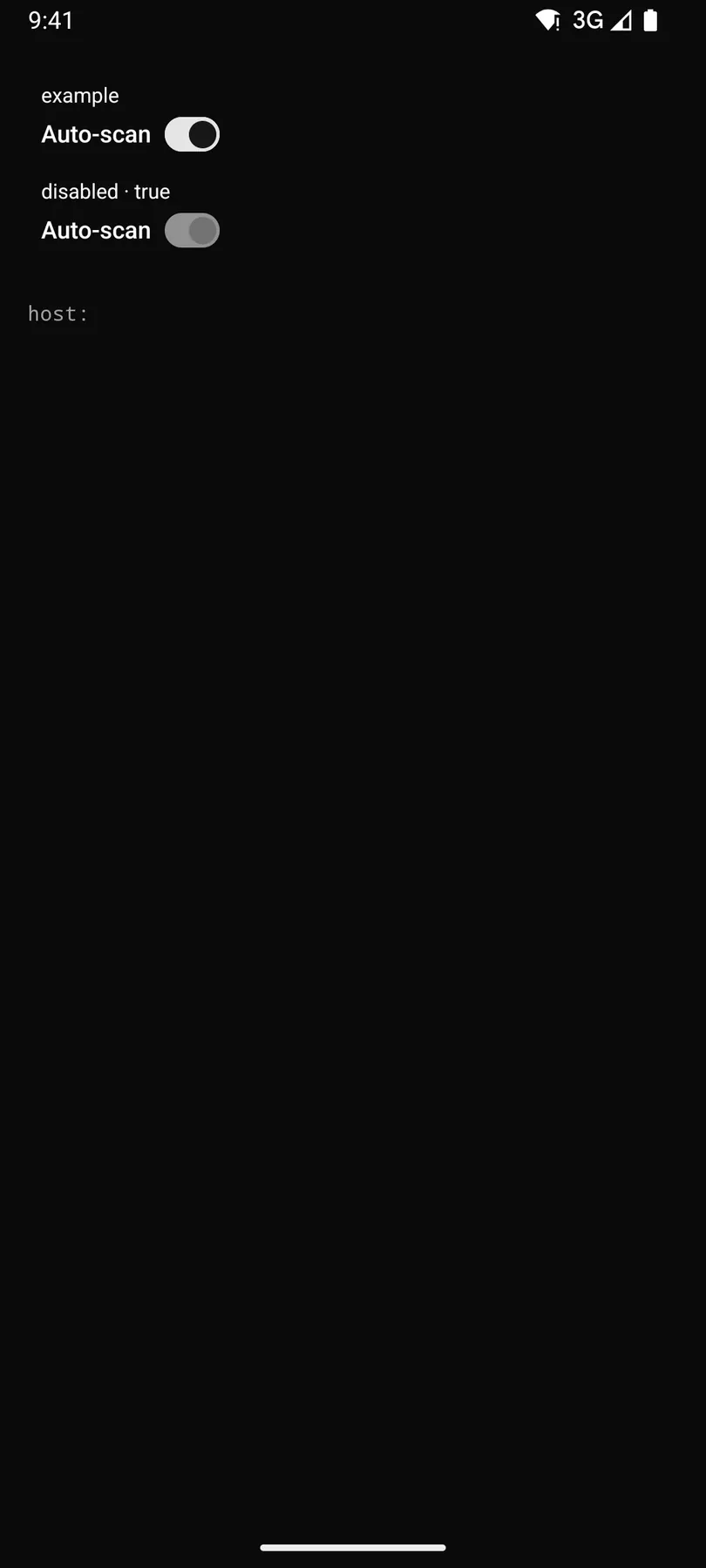
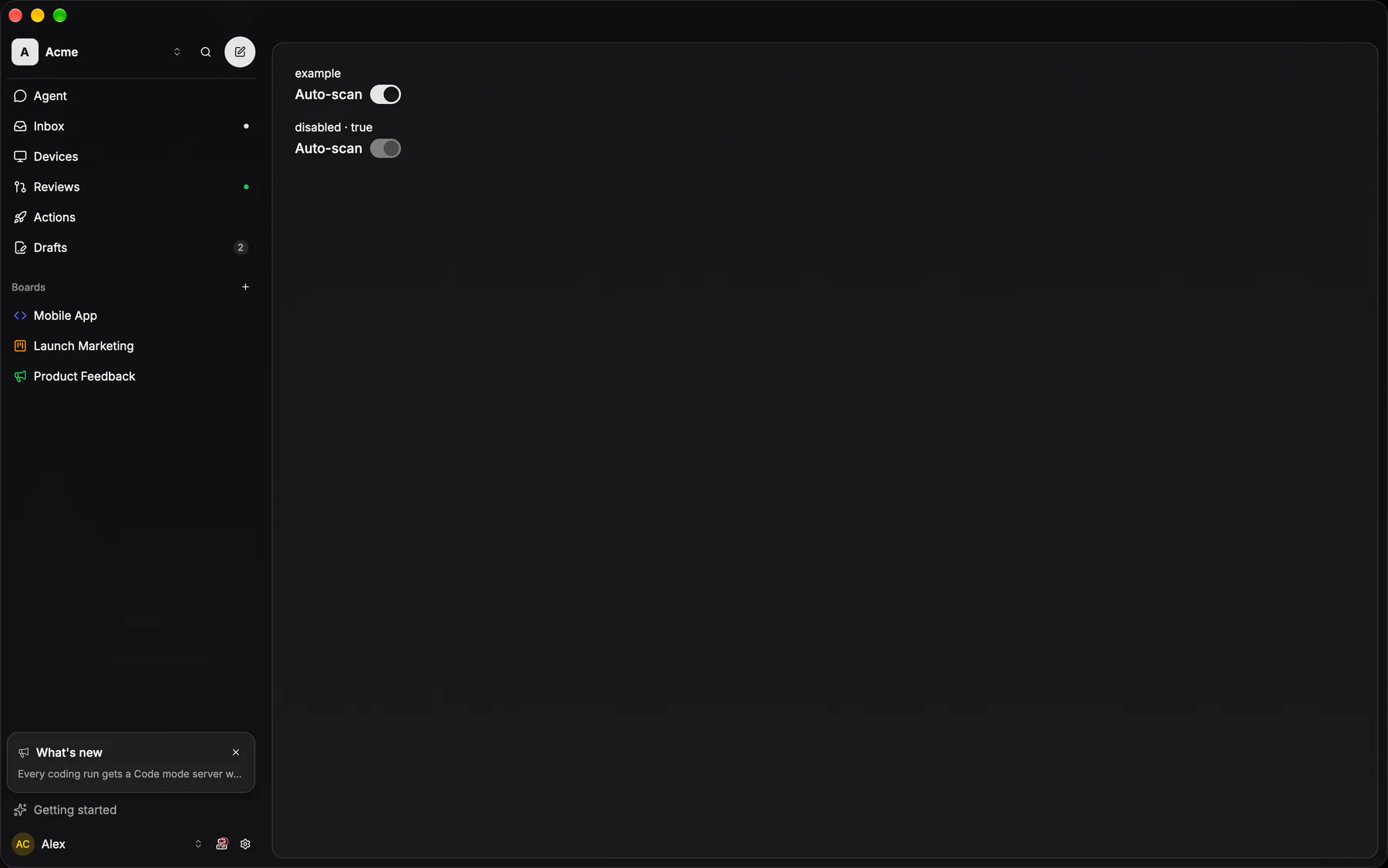
View exponential-ui-switch, painted by each native renderer.
disabled| Prop | Type | Default | Description |
|---|---|---|---|
labelrequiredbind | string | – | The text beside the switch. |
namerequired | string | – | The field's key in the submitted data. |
checkedbind | boolean | false | The state; bind it. |
description | string | – | A muted line under the label. |
disabled | boolean | false | Shows it inert. |
| Name | Kind |
|---|---|
on.change | event: runs an action |
- Role
switch- Semantics
- switch; the label (and description) first, the switch at the end; the whole row toggles
| Keys | Action |
|---|---|
| SpaceEnter | toggle |
- Recipe parts
Switch/rootSwitch/trackSwitch/thumbSwitch/labelSwitch/descriptionSwitch/body- Keyed by
checkeddisabled:hover:pressed:focus:disabled:checked:open:selected:invalid:dragover
Toggle row
Label, an optional 12px description at 50%, and a 36×20 switch: on is the primary track with a primary-foreground thumb, off the active fill.
Switch
The 36×20 capsule that flips a setting the moment it is pressed — there is no Save beside one.
More
Off is the active fill under the foreground knob, on the primary fill under the primary-foreground knob, and the travel is one fast duration. It almost always rides a toggle ROW, which owns the label and the description; this is the bare control.
GlassToggleStyleapps/ios/ExpUI/Sources/GlassControls.swiftapplied app-wide as .toggleStyle(.glass), so call sites keep the stock Toggle
glassSwitchColors()apps/android/app/src/main/java/com/exponential/app/ui/components/SheetOptionRows.ktthe tokens for the stock M3 Switch; there is no GlassSwitch composable
controls::buttons::web_switchapps/desktop/crates/exponential-ui-gpui/src/controls/buttons.rsa lint (only_controls_constructs_switches) refuses Switch::new anywhere else