Table native
A data table of typed columns over rows: sorting, row selection, widths, alignment, windowed; a slot column renders a component per cell.
Preview
Loading the renderer…
createSurface + updateComponents, A2UI v0.9.
json
[
  {
    "version": "v0.9",
    "createSurface": {
      "surfaceId": "preview",
      "catalogId": "https://ui.exponential.at/catalogs/core/v1"
    }
  },
  {
    "version": "v0.9",
    "updateComponents": {
      "surfaceId": "preview",
      "components": [
        {
          "id": "root",
          "component": "Stack",
          "direction": "vertical",
          "align": "stretch",
          "children": [
            "example"
          ]
        },
        {
          "id": "example",
          "component": "Table",
          "columns": [
            {
              "key": "name",
              "label": "Name"
            },
            {
              "key": "role",
              "label": "Role"
            },
            {
              "key": "runs",
              "label": "Runs",
              "type": "number",
              "sortable": true,
              "align": "end"
            }
          ],
          "rows": [
            {
              "id": "a",
              "name": "Alice",
              "role": "Owner",
              "runs": 12
            },
            {
              "id": "b",
              "name": "Bob",
              "role": "Member",
              "runs": 3
            }
          ]
        }
      ]
    }
  }
]
This surface through a MemoryTransport. Install and transports: React guide.
This surface through a MemoryTransport. Install and transports: SwiftUI guide.
This surface through a MemoryTransport. Install and transports: Compose guide.
This surface through a MemoryTransport. Install and transports: gpui guide.
Platforms
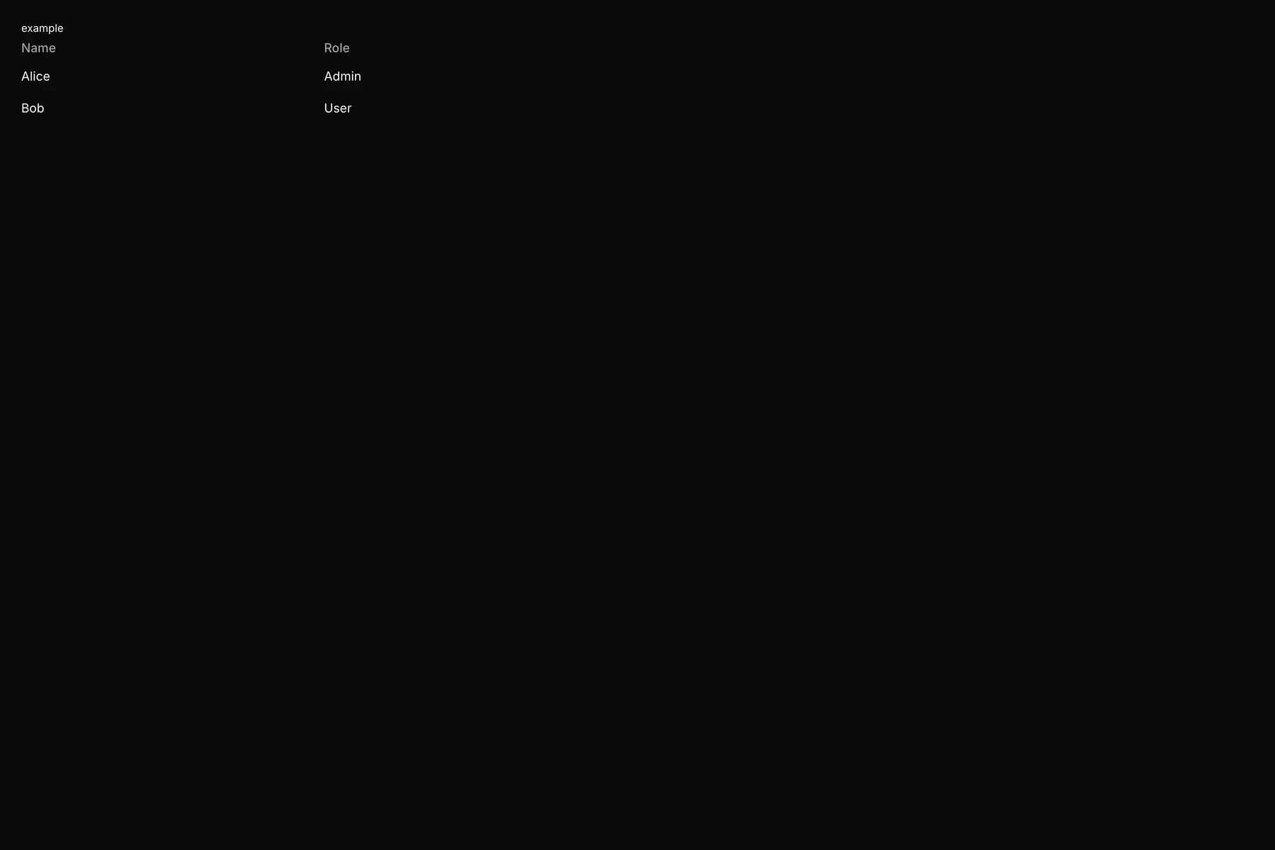
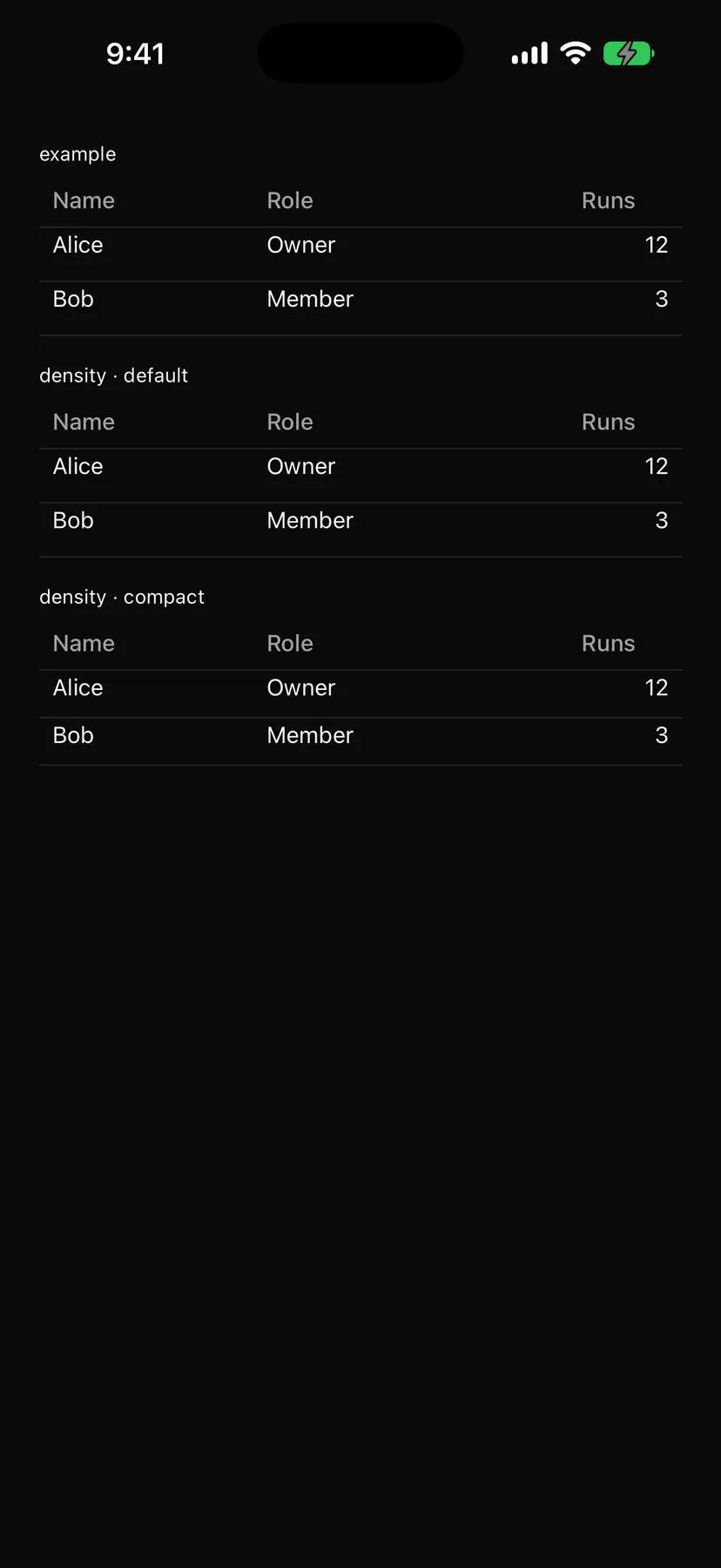
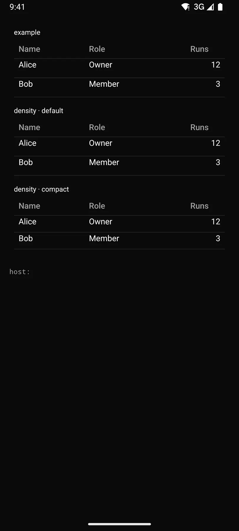
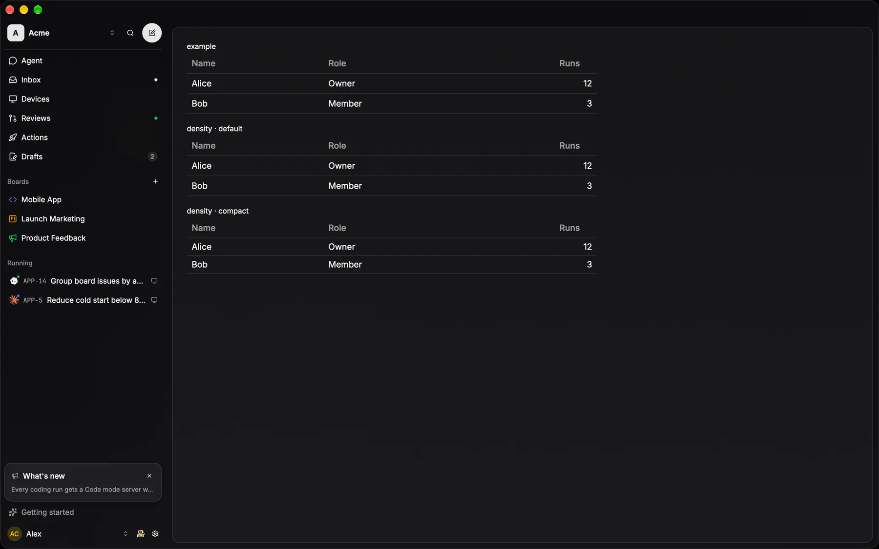
View exponential-ui-table, painted by each native renderer.
Variants
stripeddensity · defaultdensity · compactProps
| Prop | Type | Default | Description |
|---|---|---|---|
columnsrequired | [column] | – | The columns in order. |
rowsrequiredbind | [object] | – | One object per row keyed by column key; bind it for live data. |
rowKey | string | "id" | The row field that identifies a row. |
sortbind | sort | – | The active sort; bound = you order rows, unbound = sorted locally. |
selectable | none | single | multiple | "none" | Row selection (many = a checkbox column). |
selectedbind | [string] | – | The selected row keys; bind them. |
caption | string | – | A caption under the table. |
emptyText | string | "$string.noResults" | Shown when there are no rows. |
striped | boolean | false | Alternates row fills. |
density | default | compact | "default" | Row height class. |
stickyHeader | boolean | false | Keeps the header visible while the rows scroll. |
Events and slots
| Name | Kind |
|---|---|
on.sort | event: runs an action |
on.select | event: runs an action |
on.rowPress | event: runs an action |
* | slot: one component by id |
Accessibility
- Role
table- Semantics
- table (grid when selectable): columnheader with aria-sort, row with aria-selected
| Keys | Action |
|---|---|
| EnterSpace on a sortable header | cycle the sort (asc, desc) |
| Space on a row checkbox | toggle the row; on the header checkbox: select all |
| Enter on a focused row | rowPress |
| – | Tab moves through headers, checkboxes and cell controls |
Theming
- Recipe parts
Table/rootTable/captionTable/headerTable/headerCellTable/sortIconTable/rowTable/cellTable/checkboxTable/emptyTable/body- Keyed by
selectablestripeddensitystickyHeaderalign:hover:pressed:focus:disabled:checked:open:selected:invalid:dragover