Dialog native
A centred modal over the surface, opened by its trigger slot or by binding open.
createSurface + updateComponents, A2UI v0.9.
[
  {
    "version": "v0.9",
    "createSurface": {
      "surfaceId": "preview",
      "catalogId": "https://ui.exponential.at/catalogs/core/v1"
    }
  },
  {
    "version": "v0.9",
    "updateComponents": {
      "surfaceId": "preview",
      "components": [
        {
          "id": "root",
          "component": "Stack",
          "direction": "vertical",
          "align": "stretch",
          "children": [
            "example"
          ]
        },
        {
          "id": "example",
          "component": "Dialog",
          "title": "Delete board?",
          "description": "This cannot be undone.",
          "open": false,
          "children": [
            "c0-p"
          ],
          "slots": {
            "trigger": "c0-trigger",
            "footer": "c0-footer"
          }
        },
        {
          "id": "c0-p",
          "component": "Text",
          "text": "The board and its 42 issues move to the trash for 48 hours.",
          "variant": "body"
        },
        {
          "id": "c0-trigger",
          "component": "Button",
          "label": "Delete board",
          "variant": "destructive"
        },
        {
          "id": "c0-footer",
          "component": "Stack",
          "direction": "horizontal",
          "gap": "sm",
          "justify": "end",
          "children": [
            "c0-cancel",
            "c0-ok"
          ]
        },
        {
          "id": "c0-cancel",
          "component": "Button",
          "label": "Cancel",
          "variant": "outline"
        },
        {
          "id": "c0-ok",
          "component": "Button",
          "label": "Delete",
          "variant": "destructive"
        }
      ]
    }
  }
]
This surface through a MemoryTransport. Install and transports: React guide.
This surface through a MemoryTransport. Install and transports: SwiftUI guide.
This surface through a MemoryTransport. Install and transports: Compose guide.
This surface through a MemoryTransport. Install and transports: gpui guide.
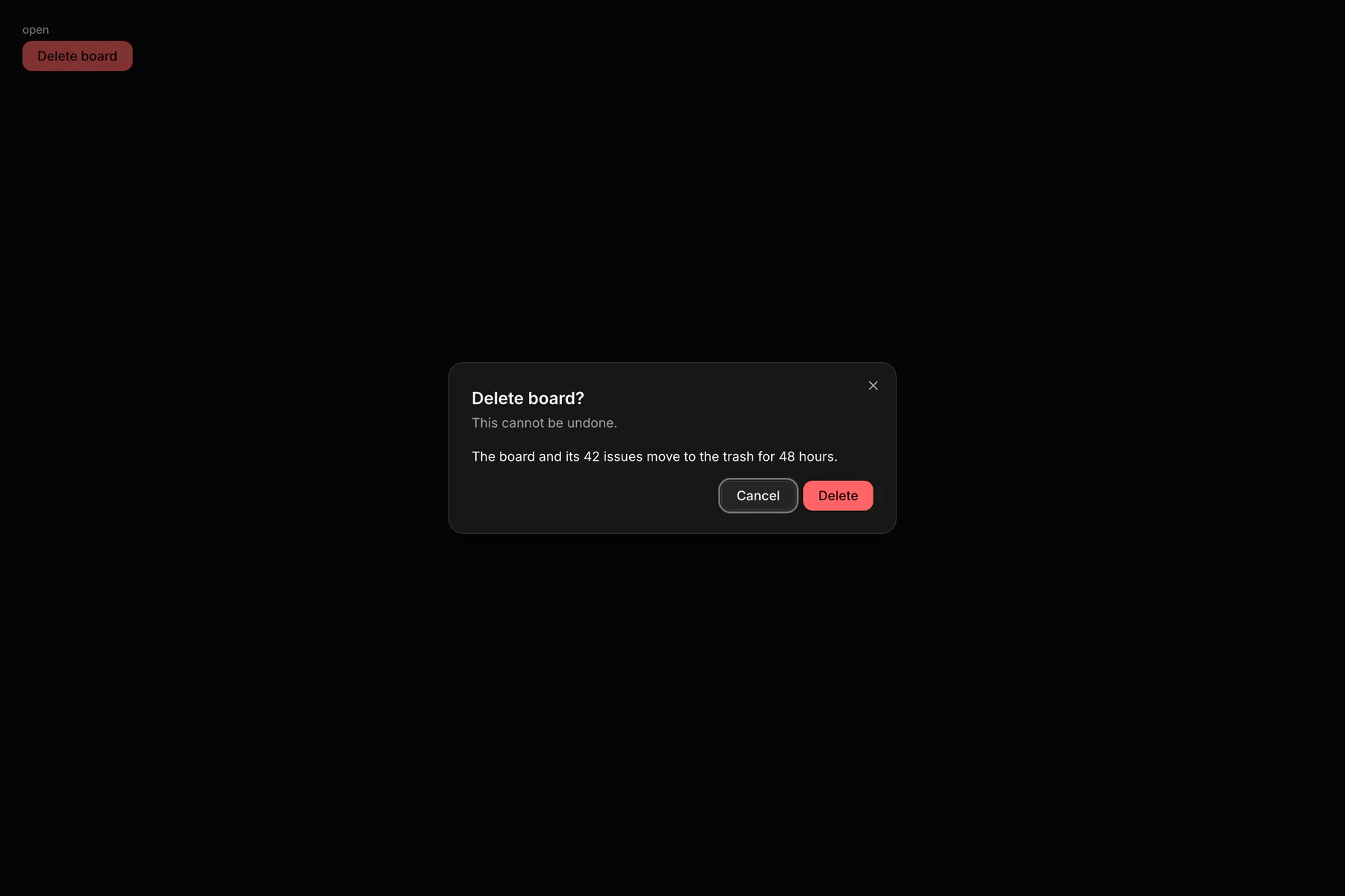
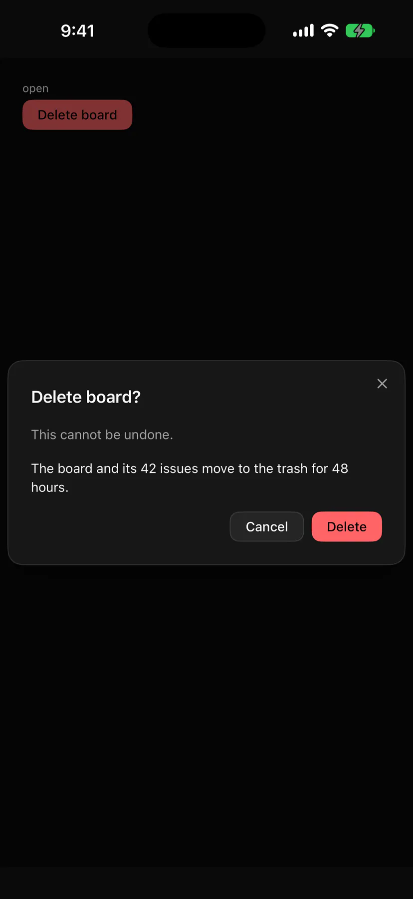
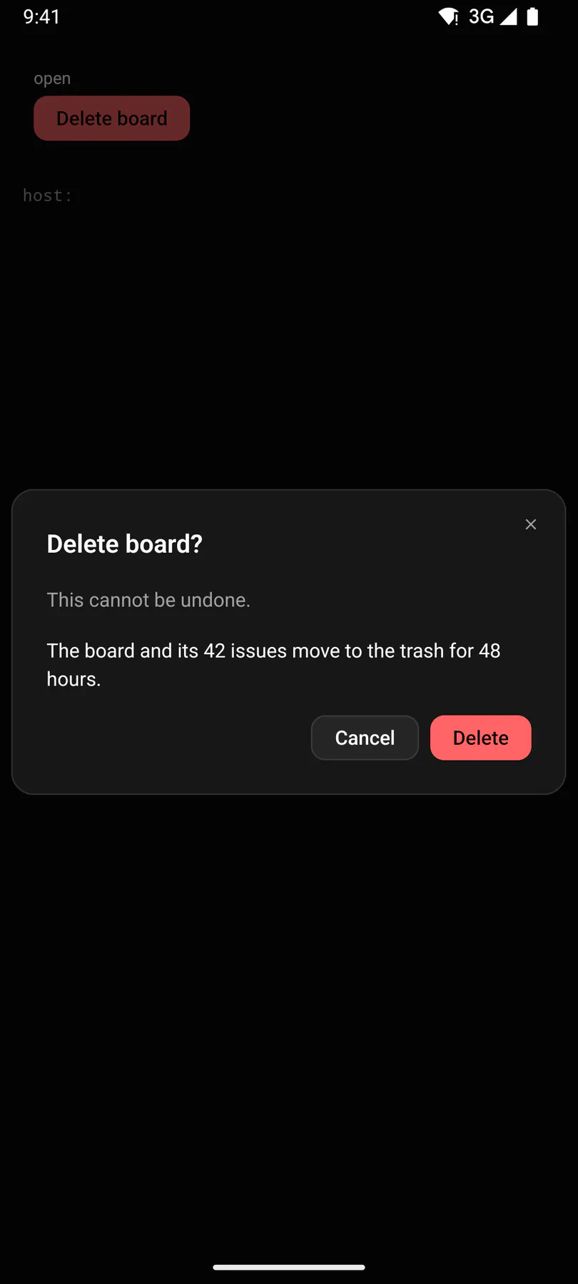
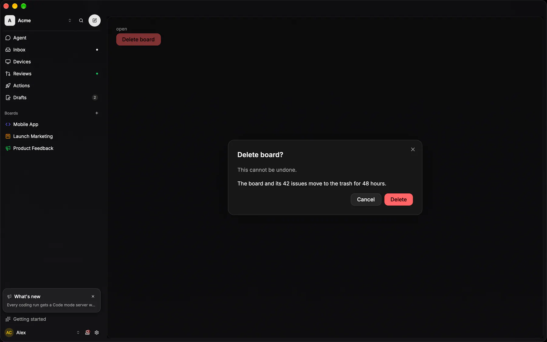
View exponential-ui-dialog, painted by each native renderer.
| Prop | Type | Default | Description |
|---|---|---|---|
title | string | – | The dialog heading. |
description | string | – | A muted line under the heading. |
openbind | boolean | false | Whether it shows; bind it to a boolean path. |
dismissible | boolean | true | Closes on the backdrop or Escape. |
| Name | Kind |
|---|---|
on.change | event: runs an action |
trigger | slot: one component by id |
footer | slot: one component by id |
- Role
dialog- Semantics
- dialog (modal)
| Keys | Action |
|---|---|
| – | Opening moves focus to the first focusable child (else the dialog) |
| – | Tab cycles inside the dialog (focus trap) |
| Escape | close when dismissible |
| – | Closing returns focus to the trigger |
- Recipe parts
Dialog/overlayDialog/contentDialog/titleDialog/descriptionDialog/footerDialog/close- Keyed by
dismissible:hover:pressed:focus:disabled:checked:open:selected:invalid:dragover
Dialog
The centred modal: a radius-16 card on the OPAQUE card fill under a card hairline, a semibold title, one line of body, and a footer whose LAST button is the primary.
More
Cancel is borderless — two boxed buttons side by side ask the reader to choose between two equals. On a phone the same component drops to the bottom sheet arm. A confirm or a choice is never this shell: it is the Prompt (EXP-1215). Hand-written here because a closed Radix portal renders nothing at all statically (PORTAL_ONLY_IDS).
Dialog / DialogContentpackages/ui/src/dialog.tsxa confirm or a choice is the Prompt entry (EXP-1215), never this shell
no shared shell: a confirm is GlassAlert (the Prompt entry), a content dialog is the sheet
same: a confirm is GlassAlert (the Prompt entry), a content dialog is GlassSheet
native_dialog::DialogShellapps/desktop/crates/ui/src/native_dialog.rsEXP-284: every IDE dialog is a real OS window, not an in-window overlay
Prompt
THE confirm and choice prompt (EXP-1215): every "Delete X?", merge confirm and multi-answer choice on the web is this one card, the same on every width, its wording read from the contract fixture `prompts.json` (web mirror `apps/web/src/lib/prompts.ts`, the same strings on iOS and Android).
More
A centred card over the dimmed scrim, no ✕ (scrim tap and Esc are its cancel path); ONE question as the title; a body line only for a fact the title cannot carry (what is deleted, a name, a count, a consequence for other people), never a restatement of the buttons; an optional content slot between the text and the row (the blocked-start graph, an input); ONE row of the 32px `md` Pill capsules; only when that row cannot fit do the pills stack, one per line at their own width, trailing-aligned, in reverse display order: the default on top, Cancel below it, a quiet destructive answer last (iOS `GlassAlertLayout.stacked`); never a two-row hybrid. Roles: `cancel` = the plain pill that only dismisses; `primary` = the safe/expected answer, the accent pill at the trailing edge; `default` = a plain pill that does something; `destructive` = the answer of a plain "Delete X?" confirm, the plain pill with a destructive label and tinted border next to Cancel (no primary, Cancel takes focus); `quietDestructive` = destructive TEXT set apart on the leading edge when a safe primary exists too. No solid red blocks, no full-width buttons; initial focus and Enter never land on a destructive answer; a busy answer keeps its label and shows the pill's spinner while the row and the dismiss paths lock. The natives draw the same card (GlassAlert); the IDE asks in native alert windows with the same words, roles and focus (EXP-1230, `AlertSpec::from_prompt`).
native_dialog::AlertSpec::from_promptapps/desktop/crates/ui/src/native_dialog.rsEXP-1230: the fixture's words, roles and focus (domain prompts.rs) in a native alert window