Select nativelite
A dropdown picker of one or many options; searchable makes it a filtering combobox, source a host list.
createSurface + updateComponents, A2UI v0.9.
[
  {
    "version": "v0.9",
    "createSurface": {
      "surfaceId": "preview",
      "catalogId": "https://ui.exponential.at/catalogs/core/v1"
    }
  },
  {
    "version": "v0.9",
    "updateComponents": {
      "surfaceId": "preview",
      "components": [
        {
          "id": "root",
          "component": "Stack",
          "direction": "vertical",
          "align": "stretch",
          "children": [
            "example"
          ]
        },
        {
          "id": "example",
          "component": "Select",
          "label": "Board",
          "name": "board",
          "options": [
            {
              "label": "Backlog",
              "value": "backlog"
            },
            {
              "label": "Sprint",
              "value": "sprint"
            }
          ],
          "value": "sprint"
        }
      ]
    }
  }
]
This surface through a MemoryTransport. Install and transports: React guide.
This surface through a MemoryTransport. Install and transports: SwiftUI guide.
This surface through a MemoryTransport. Install and transports: Compose guide.
This surface through a MemoryTransport. Install and transports: gpui guide.
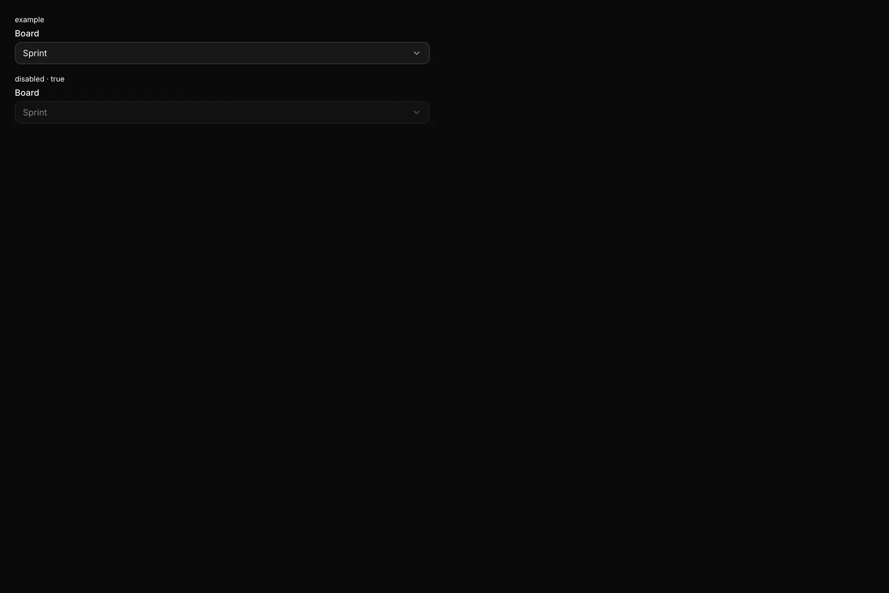
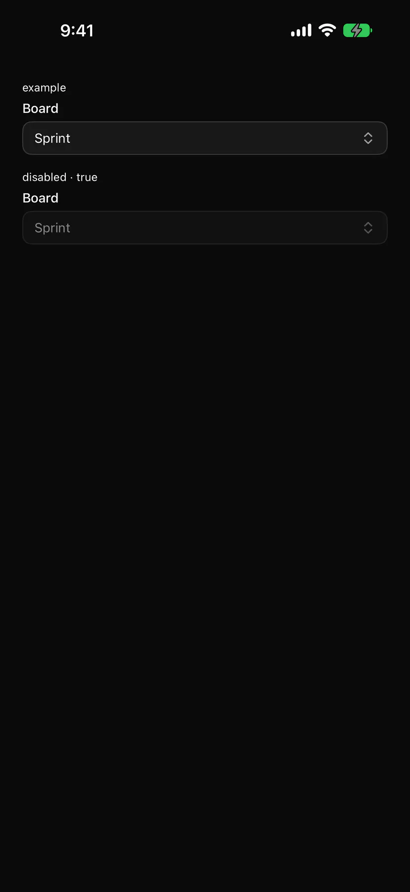
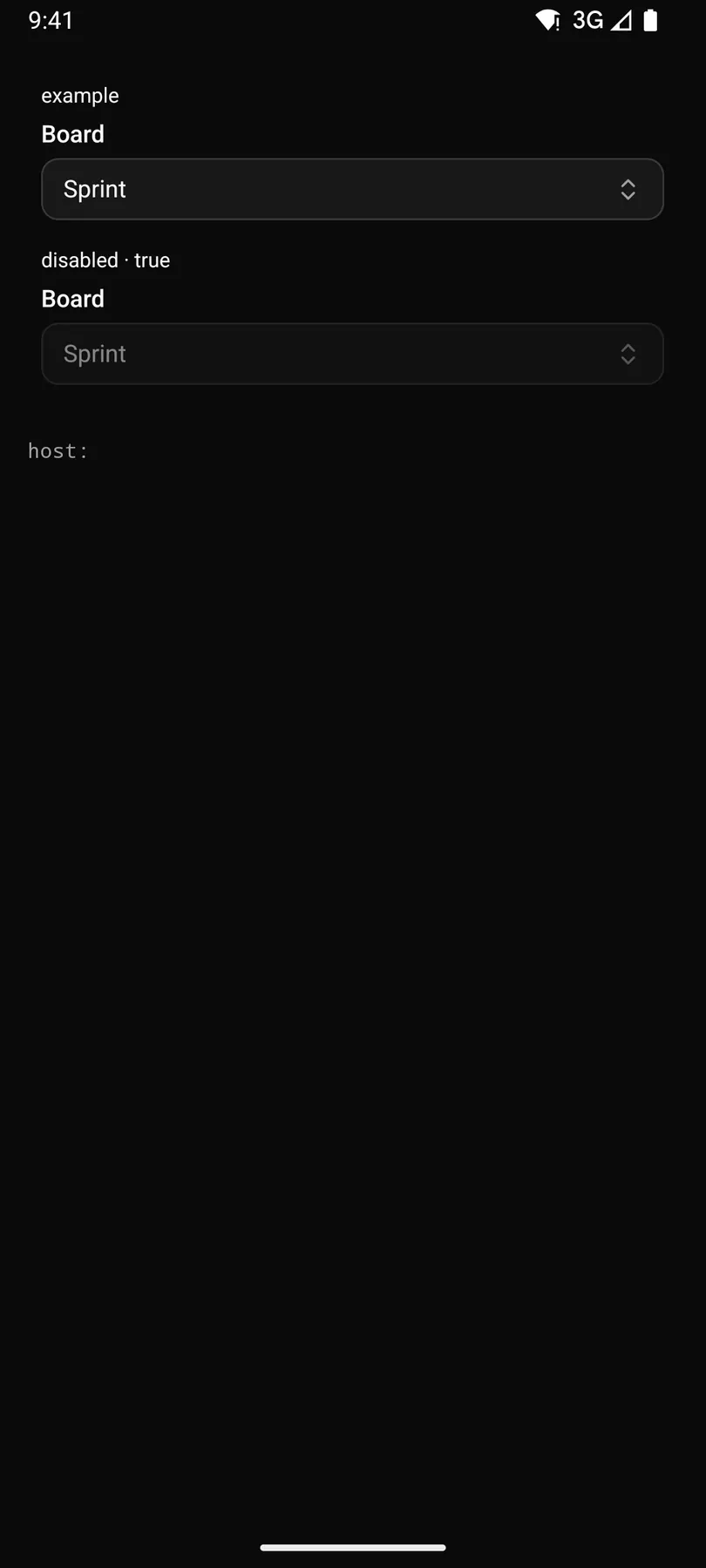
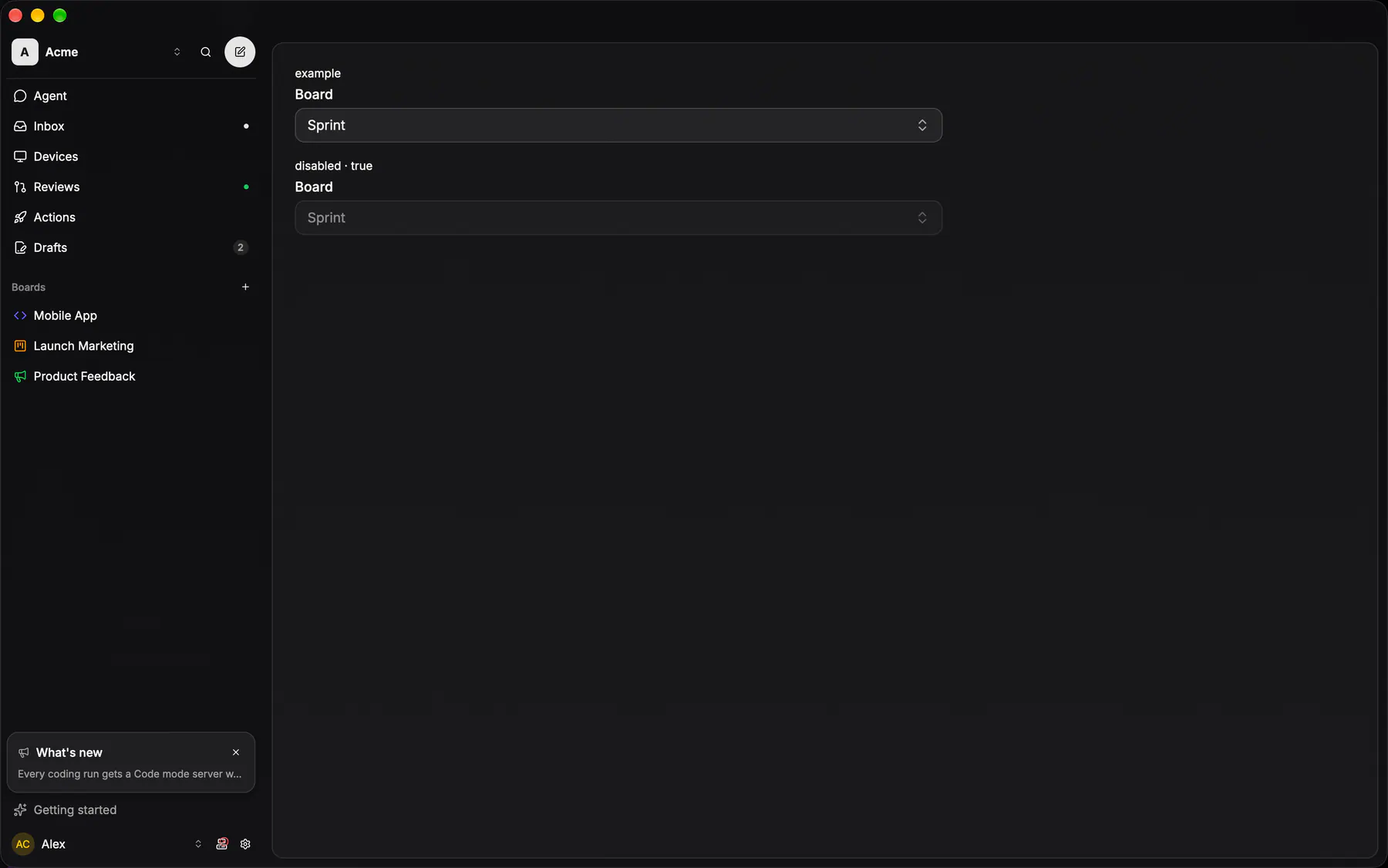
View exponential-ui-select, painted by each native renderer.
disabled| Prop | Type | Default | Description |
|---|---|---|---|
label | string | – | The field label. |
namerequired | string | – | The field's key in the submitted data. |
optionsbind | [option] | – | Inline choices, or a path the host refills on search; omit with source. |
source | string | – | A host list id (e.g. |
placeholder | string | – | Shown while nothing is chosen. |
valuebind | string | – | The chosen value (comma-joined when multiple); bind it. |
multiple | boolean | false | Allows several values. |
searchable | boolean | false | Adds a filter field; typing fires search. |
emptyText | string | "$string.noResults" | Shown when the search matches nothing. |
disabled | boolean | false | Shows it inert. |
checks | [check] | – | Validation rules. |
validateOn | change | blur | submit | "change" | When the checks run. |
| Name | Kind |
|---|---|
on.change | event: runs an action |
on.search | event: runs an action |
- Role
combobox- Semantics
- combobox + listbox / option
| Keys | Action |
|---|---|
| EnterSpaceArrowDown | open on the selected option |
| ArrowDownArrowUp | move the active option; Home/End: first/last |
| Enter | choose (multiple: toggle and stay open) |
| Escape | close without change |
| Typing | jump to the next matching option; with searchable, typing filters, focus stays in the search field and arrows move the active option (aria-activedescendant) |
- Recipe parts
Select/rootSelect/labelSelect/triggerSelect/placeholderSelect/contentSelect/searchSelect/itemSelect/checkSelect/empty- Keyed by
multiplesearchabledisabled:hover:pressed:focus:disabled:checked:open:selected:invalid:dragover
Select
The closed single-select: a field-height trigger of card fill under a card hairline, the value left and a chevron right, focus swapping the stroke to active.
More
Only the PLACEHOLDER arm can be photographed — SelectValue resolves against items that live inside the portalled list, so a valued trigger renders empty until the browser opens it (see @exp/ui's island limits). On the natives there is no free-standing select at all: the closed trigger is always a picker ROW opening a sheet.
no free-standing select: the closed single-select is a GlassPickerRow opening a sheet (see picker row)
same as iOS — PickerRow (SheetOptionRows.kt) is the closed arm, and the sheet is the list
controls::rows::glass_picker_selectapps/desktop/crates/exponential-ui-gpui/src/controls/rows.rsPicker surface
The searchable SURFACE every Picker opens (Picker = the only public picker; its Combobox engine is internal since EXP-1249): a popover on a pointer, the bottom sheet on a phone.
More
Selection speaks ONE language: SINGLE marks the picked row with a trailing ui-check, MULTI by the row's own highlight wash (data-picked), and a bulk edit over rows that disagree marks the row mixed; never a checkbox, never a circle pair. `value` is the identity and `keywords` the search text, so two boards may share a name; `noneLabel` renders a row that reports null. Single closes on pick, multi stays open. PickerItem is the row shape; the trigger comes in four `triggerVariant`s, pill | field | row | inline (row = the form ladder's picker row, the catalog `Row chevron: selector`). PickerMenuRows draws the same rows inside a Menu.
Picker / PickerListpackages/ui/src/picker/picker.tsxPickerItem is the row shape; PickerList the body without the popover; PickerMenuRows the rows inside a menu
GlassPickerapps/ios/ExpUI/Sources/Picker/Picker.swiftEXP-1249 retired GlassPickerSheet: every pick outside the typed subjects goes through GlassPicker
GlassSheetRowapps/android/app/src/main/java/com/exponential/app/ui/components/GlassSheet.ktEXP-1021 built the generic picker (Picker, its own entry); this row is what the sheets outside the ten assemble
picker::Pickerapps/desktop/crates/ui/src/picker/mod.rsEXP-1021 retired searchable_picker; the primitive owns its query + cursor, so a host holds no picker entities
Picker
THE picker primitive: one surface per platform (a popover at the trigger on a pointer, a bottom sheet of plain rows on a phone), single or multi, optional search.
More
Presentation belongs to the primitive, never to the caller — a row is a glyph or a dot, a label and a muted second line, and it is never a card. The selection language is the whole point of EXP-1021: a single pick wears a trailing check, a MULTI pick reads as the row's own highlight, never a leading circle, so the picker that links a relation and the picker that batches issues finally look like one thing. The trigger is the caller's (four shapes: pill, field, row, inline); the surface, the search field and the keys are the primitive's.
GlassPickerapps/ios/ExpUI/Sources/Picker/Picker.swiftSwiftUI owns the bare name Picker, so the primitive is GlassPicker; the ten typed ones keep theirs.
Menu · Picker · Typeahead
EXP-1074/1249: ONE data-driven Menu for every action menu, a list of MenuEntry rows (item, submenu with more rows or a picker body, toggle, separator, header) under one renderer in three modes: TRIGGER (a dropdown at a button), POINTER (a context menu at the pointer; one gesture host per layout, a row opts in with menuProps(kind, id)) and SHEET (the same rows as a bottom sheet below md, submenus as pushed pages).
More
Every row is the one --menu-* recipe (pointer 36 · 8 · 8 · 16, touch 48 · 12 · 12 · 16), a destructive row red with no divider above it (EXP-687). A submenu's picker body is PickerMenuRows, and Menu, Picker and the typeahead speak ONE highlight language: single = a trailing check, multi = the row's wash, mixed = a softer wash. In the catalog: `Menu` (`openOn: press | contextmenu`, submenu `items` bindable to a host source) and `Select`.
Menu / MenuGestureHost / MenuPanelpackages/ui/src/menu.tsxrows wear MENU_ITEM_CLASS (packages/exponential-ui-react/src/primitives/menu-surface.ts)
GlassDropdownMenuapps/android/app/src/main/java/com/exponential/app/ui/components/GlassMenu.ktthe touch set: M3's 48dp rows, 12dp padding
PopupMenu + controls::PointerMenu / pointer_label_itemapps/desktop/crates/ui/src/controls.rsissue, tab, file and run menus point; settings, actions and team menus still plain crate rows
- apps/desktop/crates/ui/src/controls.rs: gpui-component's PopupMenu draws 26px rows / 8px pad from the crate; the tokens record 36 / 8 (a leftover by decision)