Group macrolite
A form-field container: a rounded group of rows with an optional title and footnote.
createSurface + updateComponents, A2UI v0.9.
[
  {
    "version": "v0.9",
    "createSurface": {
      "surfaceId": "preview",
      "catalogId": "https://ui.exponential.at/catalogs/core/v1"
    }
  },
  {
    "version": "v0.9",
    "updateComponents": {
      "surfaceId": "preview",
      "components": [
        {
          "id": "root",
          "component": "Stack",
          "direction": "vertical",
          "align": "stretch",
          "children": [
            "example"
          ]
        },
        {
          "id": "example",
          "component": "Group",
          "title": "Notifications",
          "children": [
            "c0-r1",
            "c0-r2"
          ]
        },
        {
          "id": "c0-r1",
          "component": "Row",
          "title": "Mentions",
          "meta": "Push + email",
          "pressable": true
        },
        {
          "id": "c0-r2",
          "component": "Row",
          "title": "Assigned to me",
          "meta": "Push",
          "pressable": true
        }
      ]
    }
  }
]
This surface through a MemoryTransport. Install and transports: React guide.
This surface through a MemoryTransport. Install and transports: SwiftUI guide.
This surface through a MemoryTransport. Install and transports: Compose guide.
This surface through a MemoryTransport. Install and transports: gpui guide.
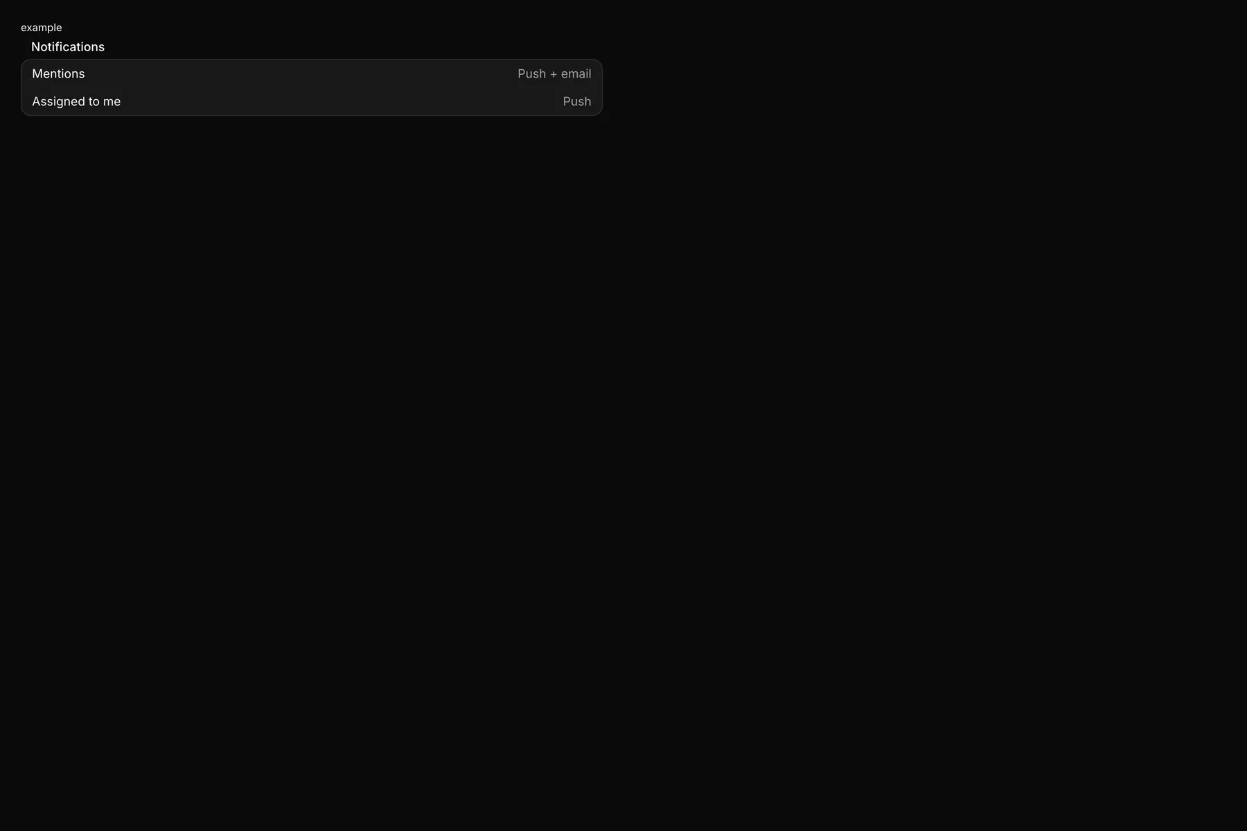
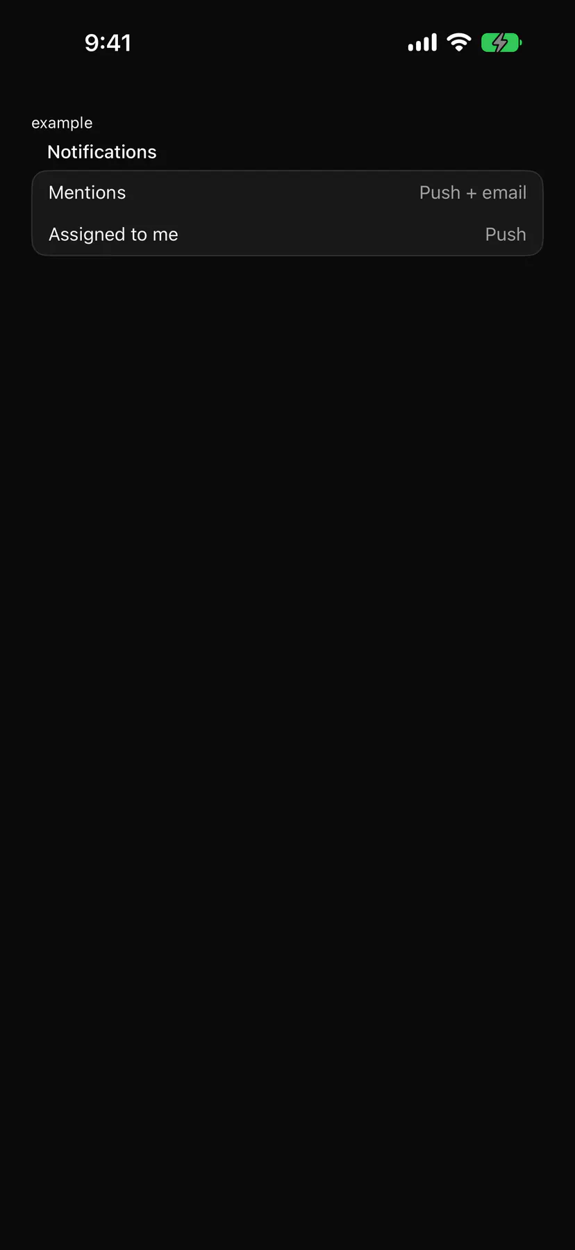
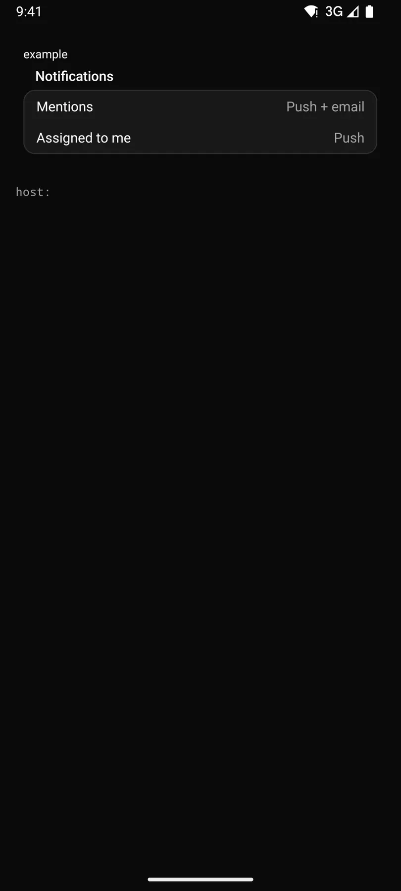
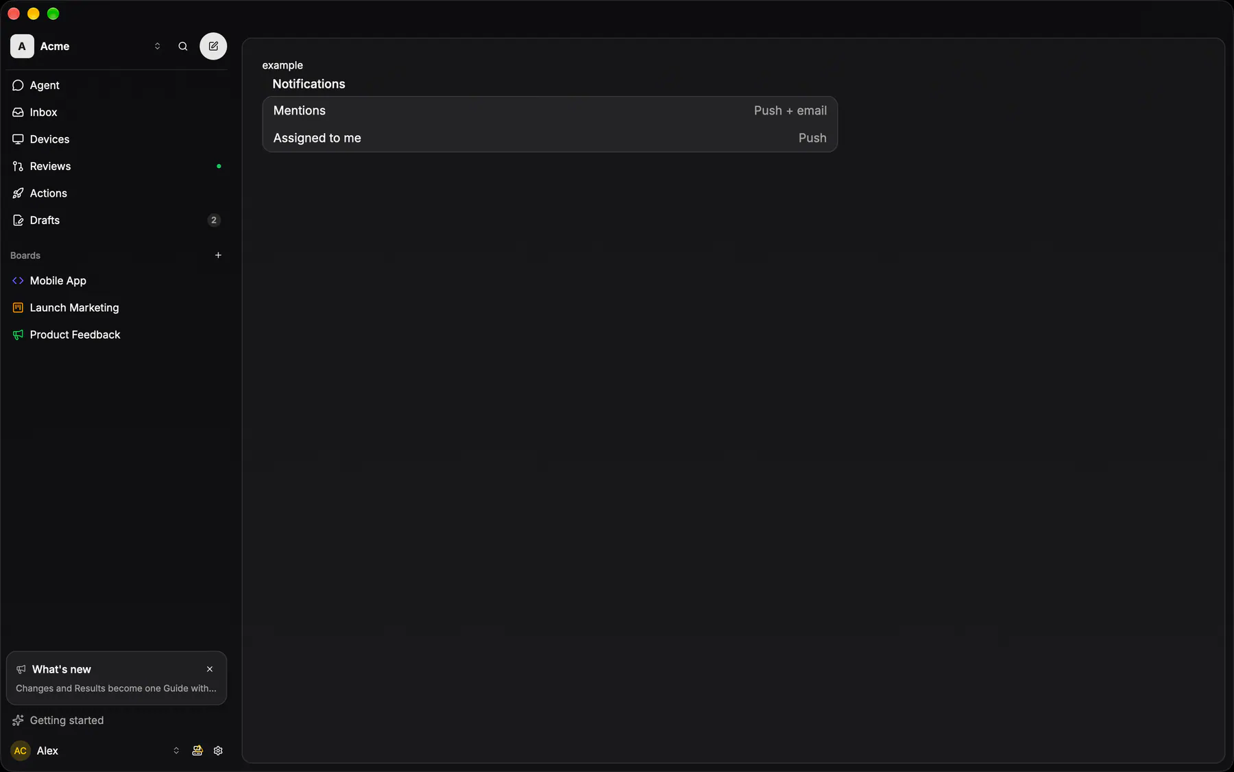
View exponential-ui-group, painted by each native renderer.
| Prop | Type | Default | Description |
|---|---|---|---|
title | string | – | A caption above the group. |
footer | string | – | A muted note under the group. |
No events, no slots. Children: many.
- Role
group- Semantics
- group labelled by its title, described by its footer
Not focusable; no keys.
- Recipe parts
Group/rootGroup/titleGroup/bodyGroup/footer- Keyed by
:hover:pressed:focus:disabled:checked:open:selected:invalid:dragover
Group container
EXP-994: THE settings shell, one per platform — borderless: radius 12, the row fill, a hairline BETWEEN every pair of children, overflow hidden.
More
The fill is the edge, never an outer stroke, and never a card inside a card: inside an overlay that already is a surface (the composer's ⋯ popover, a bottom sheet) the group goes BARE — dividers only, no fill, no radius — so the host's edge is the only edge. Every grouped settings list on every platform draws this; the second specimen is the bare form. Its picker rows are `Picker triggerVariant="row"`, never a Combobox (the Combobox engine is internal to Picker since EXP-1249).
Modifier.glassGroup()apps/android/app/src/main/java/com/exponential/app/ui/theme/Glass.ktOptionGroup in ui/components/SheetOptionRows.kt is the list wrapper around it.
Row shell
The rhythm every grouped row inherits: padding 12/16, gap 12, 14px text.
More
The shell never draws a stroke — the group's hairlines do.
PickerRowapps/android/app/src/main/java/com/exponential/app/ui/components/SheetOptionRows.ktcontrols::rows::glass_row_shellapps/desktop/crates/exponential-ui-gpui/src/controls/rows.rsInput row
A bare right-aligned field at 70% foreground inside the shell — no box, no border.
More
The row is the field's chrome.
Form text rows use the system field inside GlassSection
GlassTextField(bordered = false)apps/android/app/src/main/java/com/exponential/app/ui/components/GlassTextField.ktcontrols::rows::glass_input_rowapps/desktop/crates/exponential-ui-gpui/src/controls/rows.rsToggle row
Label, an optional 12px description at 50%, and a 36×20 switch: on is the primary track with a primary-foreground thumb, off the active fill.
Embedded tabs row
The segmented control as the FIRST row of a group: padding 8, full width, no fill and no stroke of its own.
GlassSegmentedControl(embedded = true)apps/android/app/src/main/java/com/exponential/app/ui/components/GlassSegmentedControl.kt