Resizable nativelite
Panels split by draggable handles; each child is one panel.
Preview
Loading the renderer…
createSurface + updateComponents, A2UI v0.9.
json
[
  {
    "version": "v0.9",
    "createSurface": {
      "surfaceId": "preview",
      "catalogId": "https://ui.exponential.at/catalogs/core/v1"
    }
  },
  {
    "version": "v0.9",
    "updateComponents": {
      "surfaceId": "preview",
      "components": [
        {
          "id": "root",
          "component": "Stack",
          "direction": "vertical",
          "align": "stretch",
          "children": [
            "example"
          ]
        },
        {
          "id": "example",
          "component": "Resizable",
          "direction": "horizontal",
          "sizes": [
            30,
            70
          ],
          "handle": true,
          "children": [
            "c0-p1",
            "c0-p2"
          ],
          "style": {
            "height": 160
          }
        },
        {
          "id": "c0-p1",
          "component": "Text",
          "text": "Boards",
          "variant": "label"
        },
        {
          "id": "c0-p2",
          "component": "Text",
          "text": "Drag the handle or use the arrow keys.",
          "variant": "muted"
        }
      ]
    }
  }
]
This surface through a MemoryTransport. Install and transports: React guide.
This surface through a MemoryTransport. Install and transports: SwiftUI guide.
This surface through a MemoryTransport. Install and transports: Compose guide.
This surface through a MemoryTransport. Install and transports: gpui guide.
Platforms
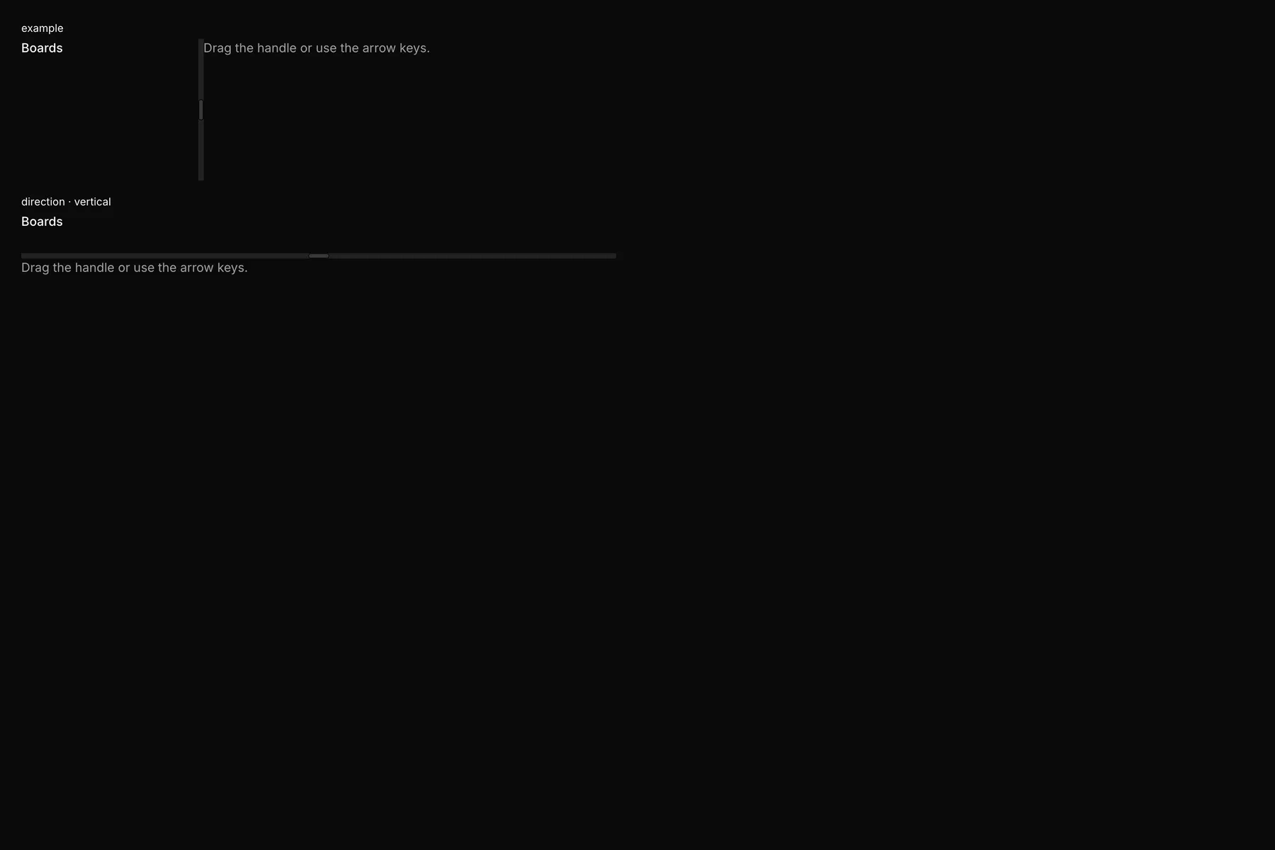
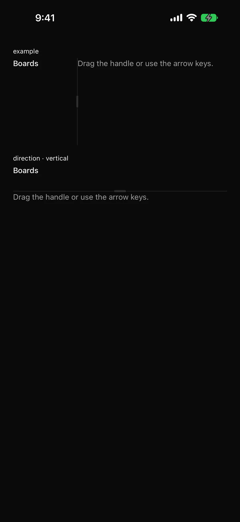
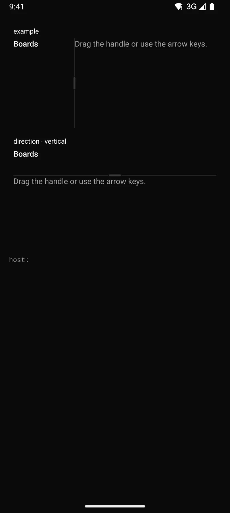
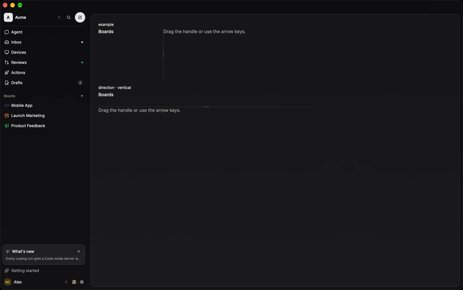
View exponential-ui-resizable, painted by each native renderer.
Variants
direction · horizontaldirection · verticalProps
| Prop | Type | Default | Description |
|---|---|---|---|
directionresp | horizontal | vertical | "horizontal" | Side by side or stacked. |
sizesbind | [number] | – | Percent per panel; bind it. |
panels | [panel] | – | Per-panel limits, by index. |
handle | boolean | false | Draws a grip on each handle. |
style | style | – | Extra Box styles for the group box (give it a height). |
Events and slots
| Name | Kind |
|---|---|
on.change | event: runs an action |
Accessibility
- Role
group- Semantics
- group; each handle a focusable separator (aria-orientation = the line's, valuenow = the size of the panel before it, valuemin/max = its limits, controls = that panel), named
$string.resize
| Keys | Action |
|---|---|
| Arrow keys on a handle | move it on screen by 10 points (Left/Right horizontal, Up/Down vertical; rtl: ArrowRight shrinks the first panel) |
| HomeEnd | the panel before the handle to its min / max |
| Enter | collapse or reopen a collapsible panel |
Theming
- Recipe parts
Resizable/rootResizable/panelResizable/handleResizable/grip- Keyed by
directionhandle:hover:pressed:focus:disabled:checked:open:selected:invalid:dragover