Toast native
A transient notice in the toast layer; render one per notice with open bound.
Preview
createSurface + updateComponents, A2UI v0.9.
json
[
  {
    "version": "v0.9",
    "createSurface": {
      "surfaceId": "preview",
      "catalogId": "https://ui.exponential.at/catalogs/core/v1"
    }
  },
  {
    "version": "v0.9",
    "updateComponents": {
      "surfaceId": "preview",
      "components": [
        {
          "id": "root",
          "component": "Stack",
          "direction": "vertical",
          "align": "stretch",
          "children": [
            "example"
          ]
        },
        {
          "id": "example",
          "component": "Toast",
          "title": "Saved",
          "description": "Your changes are live.",
          "type": "success",
          "open": false
        }
      ]
    }
  }
]
This surface through a MemoryTransport. Install and transports: React guide.
This surface through a MemoryTransport. Install and transports: SwiftUI guide.
This surface through a MemoryTransport. Install and transports: Compose guide.
This surface through a MemoryTransport. Install and transports: gpui guide.
Platforms
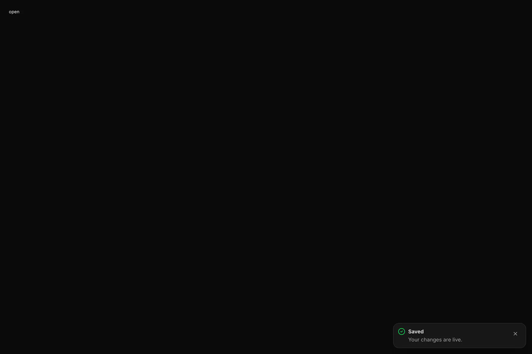
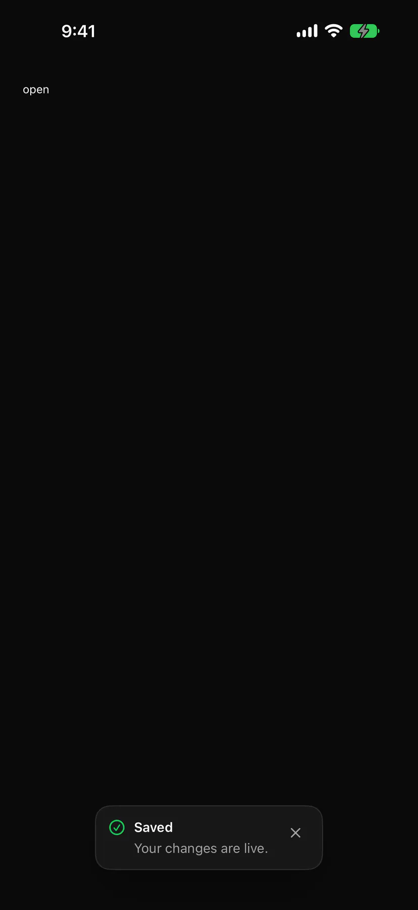
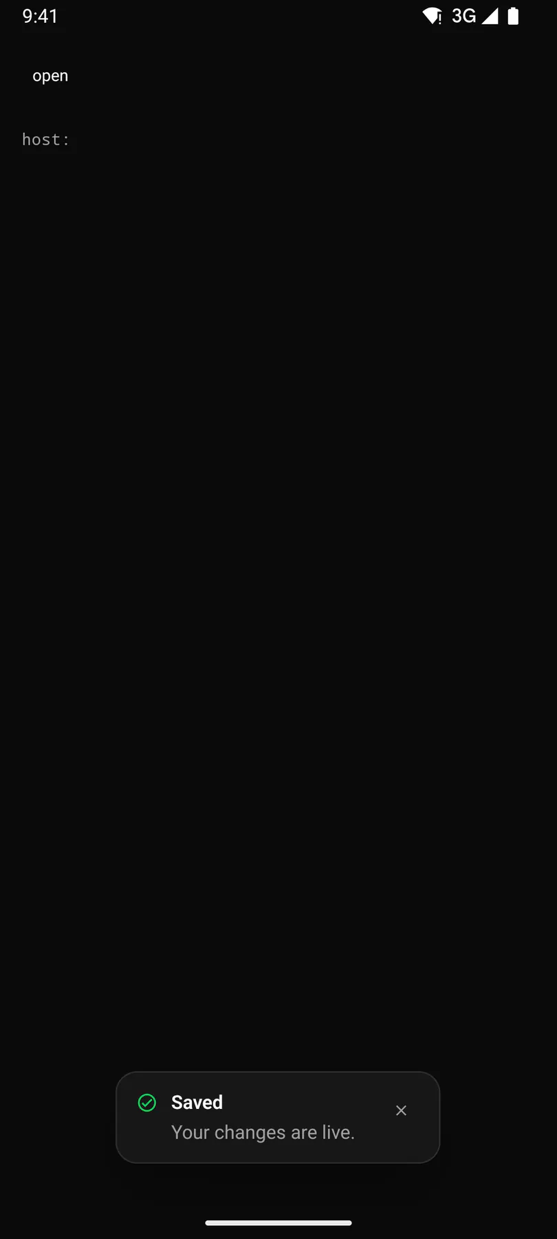
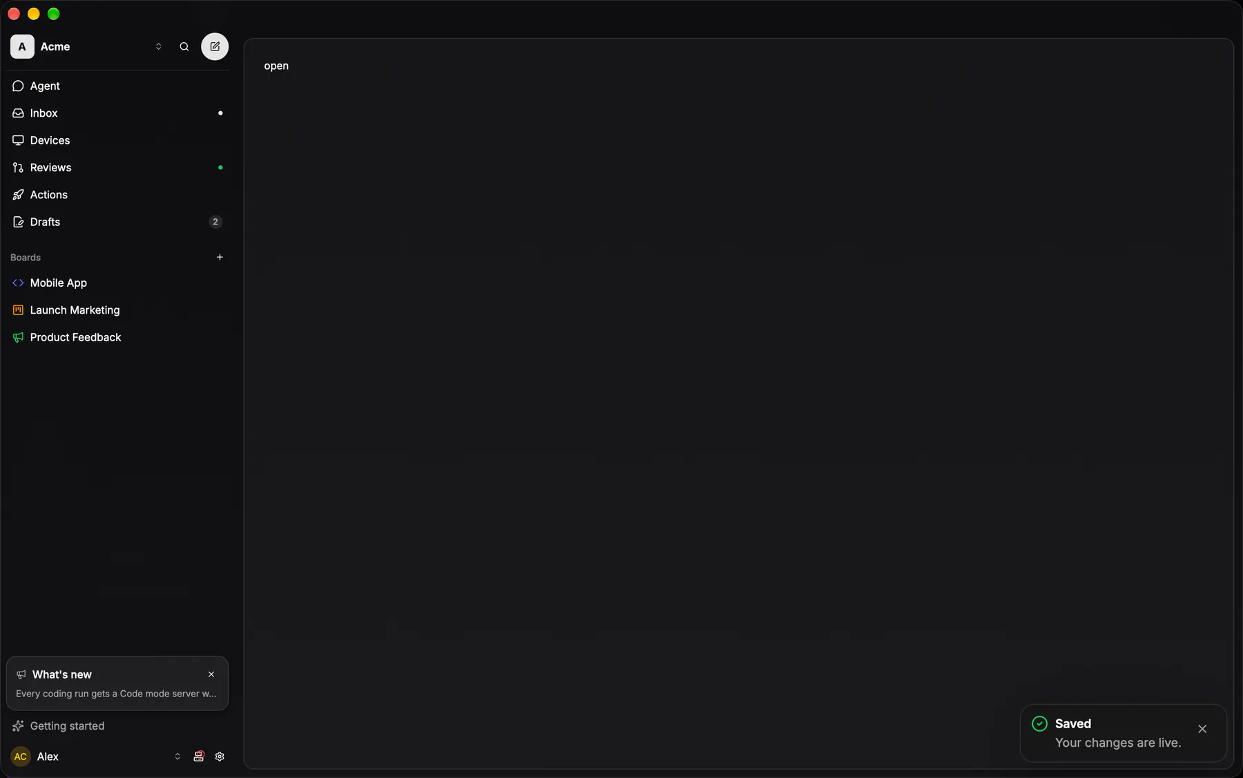
View exponential-ui-toast, painted by each native renderer.
Props
| Prop | Type | Default | Description |
|---|---|---|---|
titlerequiredbind | string | – | The notice. |
descriptionbind | string | – | Detail under the notice. |
type | info | success | warning | error | "info" | The severity, picking icon and tone (error interrupts screen readers). |
openbind | boolean | true | Whether it shows; bind it so the host learns of a dismissal. |
duration | number | 5000 | Ms until it dismisses itself; 0 = never. |
actionLabel | string | – | A button label; pressing it fires action. |
dismissible | boolean | true | Shows the close control. |
Events and slots
| Name | Kind |
|---|---|
on.dismiss | event: runs an action |
on.action | event: runs an action |
on.change | event: runs an action |
Accessibility
- Role
status- Semantics
- status (polite); alert (assertive) for type error
| Keys | Action |
|---|---|
| – | Never takes focus on appear; Tab reaches its action and close |
| Escape on a focused toast | dismiss |
| – | Hover or focus pauses the duration timer |
Theming
- Recipe parts
Toast/rootToast/iconToast/titleToast/descriptionToast/actionToast/close- Keyed by
type:hover:pressed:focus:disabled:checked:open:selected:invalid:dragover