Spinner native
An indeterminate activity indicator.
Preview
Loading the renderer…
createSurface + updateComponents, A2UI v0.9.
json
[
  {
    "version": "v0.9",
    "createSurface": {
      "surfaceId": "preview",
      "catalogId": "https://ui.exponential.at/catalogs/core/v1"
    }
  },
  {
    "version": "v0.9",
    "updateComponents": {
      "surfaceId": "preview",
      "components": [
        {
          "id": "root",
          "component": "Stack",
          "direction": "vertical",
          "align": "start",
          "children": [
            "example"
          ]
        },
        {
          "id": "example",
          "component": "Spinner",
          "size": "default"
        }
      ]
    }
  }
]
This surface through a MemoryTransport. Install and transports: React guide.
This surface through a MemoryTransport. Install and transports: SwiftUI guide.
This surface through a MemoryTransport. Install and transports: Compose guide.
This surface through a MemoryTransport. Install and transports: gpui guide.
Platforms
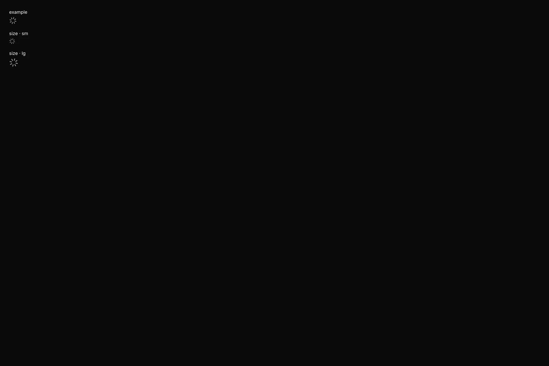
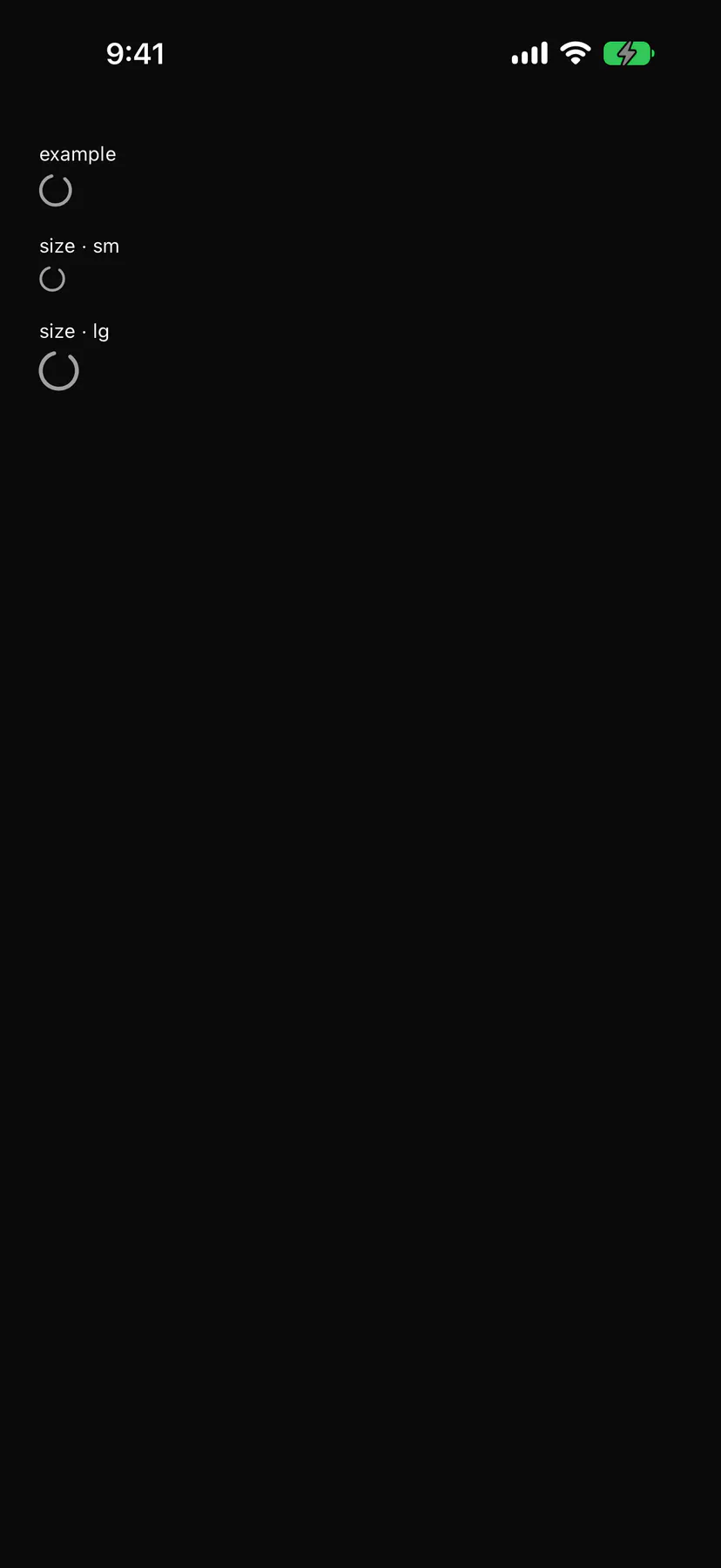
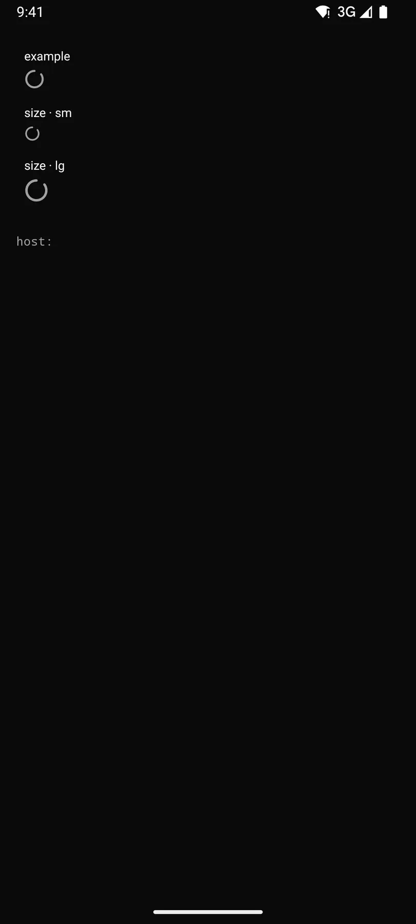
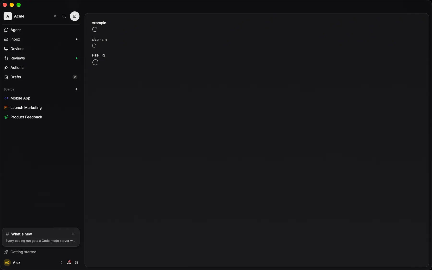
View exponential-ui-spinner, painted by each native renderer.
Variants
size · smsize · defaultsize · lgProps
| Prop | Type | Default | Description |
|---|---|---|---|
size | sm | default | lg | "default" | Diameter class. |
label | string | – | A caption or accessibility label. |
Events and slots
No events, no slots. Children: none.
Accessibility
- Role
progressbar- Semantics
- progressbar (indeterminate) labelled
loadingby default
Not focusable; no keys.
Theming
- Recipe parts
Spinner/root- Keyed by
size:hover:pressed:focus:disabled:checked:open:selected:invalid:dragover