Chart native
A bar, stacked-bar, line, area, pie, donut or sparkline chart with axes, legend and tooltip, as wide as its box.
Preview
Loading the renderer…
createSurface + updateComponents, A2UI v0.9.
json
[
  {
    "version": "v0.9",
    "createSurface": {
      "surfaceId": "preview",
      "catalogId": "https://ui.exponential.at/catalogs/core/v1"
    }
  },
  {
    "version": "v0.9",
    "updateComponents": {
      "surfaceId": "preview",
      "components": [
        {
          "id": "root",
          "component": "Stack",
          "direction": "vertical",
          "align": "stretch",
          "children": [
            "example"
          ]
        },
        {
          "id": "example",
          "component": "Chart",
          "kind": "bar",
          "categories": [
            "Mon",
            "Tue"
          ],
          "series": [
            {
              "name": "Runs",
              "values": [
                3,
                5
              ]
            }
          ]
        }
      ]
    }
  }
]
This surface through a MemoryTransport. Install and transports: React guide.
This surface through a MemoryTransport. Install and transports: SwiftUI guide.
This surface through a MemoryTransport. Install and transports: Compose guide.
This surface through a MemoryTransport. Install and transports: gpui guide.
Platforms
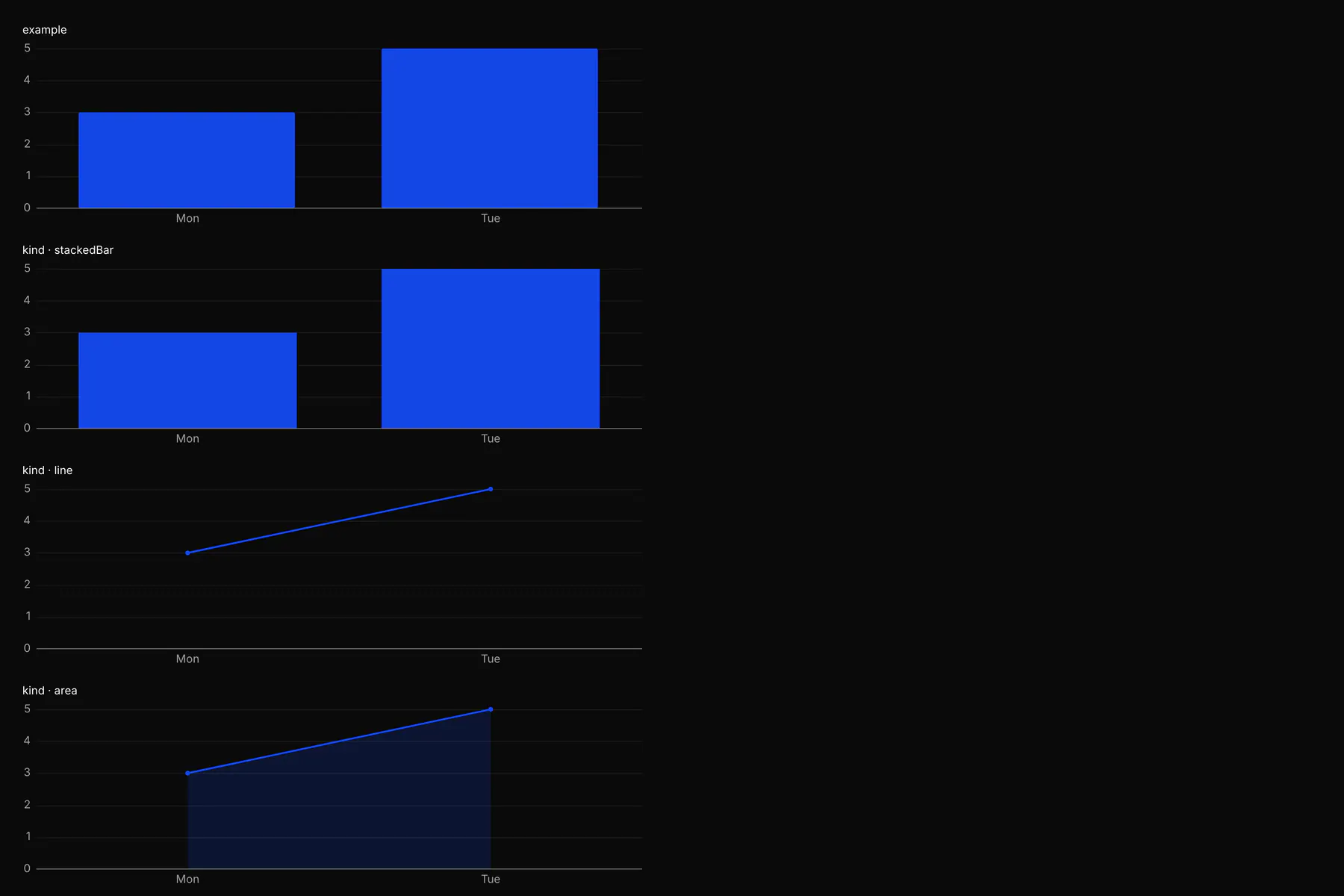
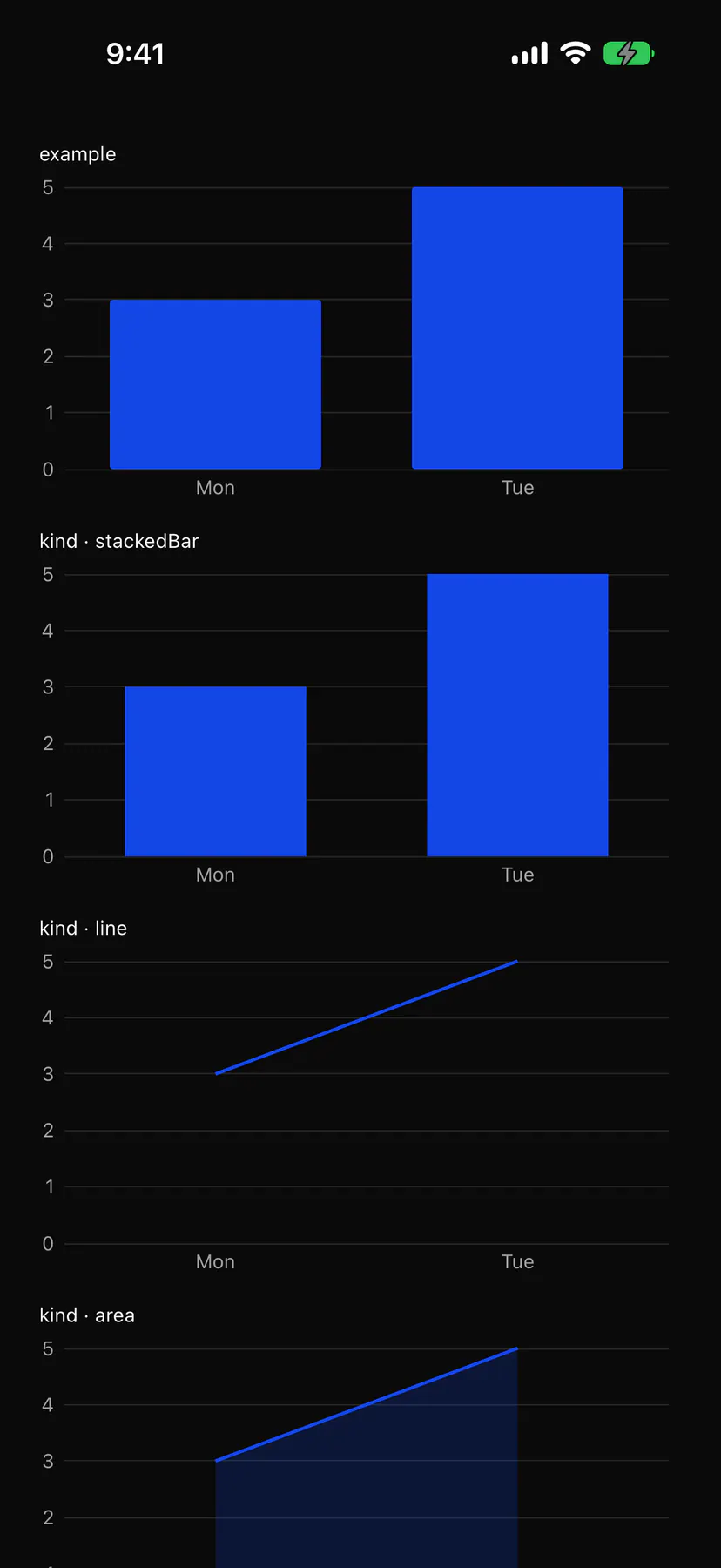
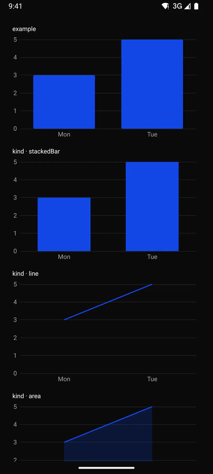
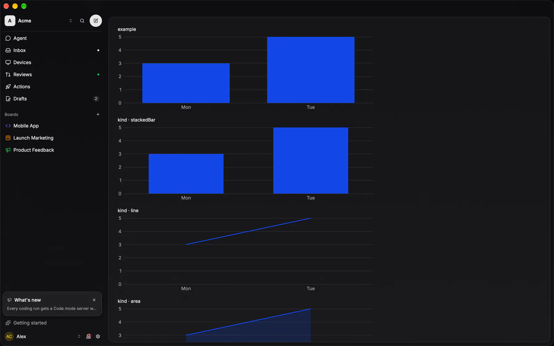
View exponential-ui-chart, painted by each native renderer.
Variants
kind · barkind · stackedBarkind · linekind · areakind · piekind · donutkind · sparklineshowValuesProps
| Prop | Type | Default | Description |
|---|---|---|---|
kindrequired | bar | stackedBar | line | area | pie | donut | sparkline | – | The chart form. |
categoriesbind | [string] | – | The x-axis labels, or the pie slices; omit for a sparkline. |
seriesrequiredbind | [series] | – | One per line, bar group or pie ring; coloured $color.chart1..8 unless toned. |
title | string | – | A title above the chart. |
height | number | 200 | The whole chart's height in px (title, legend, axes inside); the width is the box's. |
xLabel | string | – | A caption under the x axis. |
yLabel | string | – | A caption beside the y axis. |
min | number | – | The y-axis floor; defaults to 0. |
max | number | – | The y-axis ceiling; defaults to the largest value. |
showAxes | boolean | true | Draws the axes with tick labels. |
showGrid | boolean | true | Draws horizontal grid lines at the ticks. |
showLegend | boolean | true | Draws the legend (2+ series or slices). |
showValues | boolean | false | Writes each value on its bar, point or slice. |
Events and slots
No events, no slots. Children: none.
Accessibility
- Role
img- Semantics
- img with a generated summary (kind, series, ranges); a data table fallback for screen readers. The painter names it with
chartSummary(series, min, max) and offers a data table fallback.
| Keys | Action |
|---|---|
| ArrowLeftArrowRight while focused | move the tooltip between categories |
Theming
- Recipe parts
Chart/rootChart/titleChart/axisChart/gridChart/legendChart/tooltipChart/valueLabel- Keyed by
kind:hover:pressed:focus:disabled:checked:open:selected:invalid:dragover