Row macrolite
THE list row: a lead glyph or slot, a mono identifier, a title with a subtitle, trailing meta or a readable value, a slot and a chevron.
createSurface + updateComponents, A2UI v0.9.
[
  {
    "version": "v0.9",
    "createSurface": {
      "surfaceId": "preview",
      "catalogId": "https://ui.exponential.at/catalogs/core/v1"
    }
  },
  {
    "version": "v0.9",
    "updateComponents": {
      "surfaceId": "preview",
      "components": [
        {
          "id": "root",
          "component": "Stack",
          "direction": "vertical",
          "align": "stretch",
          "children": [
            "example"
          ]
        },
        {
          "id": "example",
          "component": "Row",
          "title": "r/selfhosted",
          "meta": "312 posts",
          "pressable": true
        }
      ]
    }
  }
]
This surface through a MemoryTransport. Install and transports: React guide.
This surface through a MemoryTransport. Install and transports: SwiftUI guide.
This surface through a MemoryTransport. Install and transports: Compose guide.
This surface through a MemoryTransport. Install and transports: gpui guide.
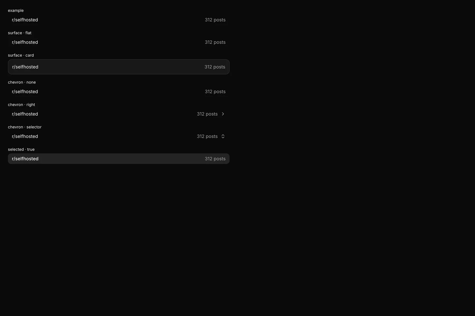
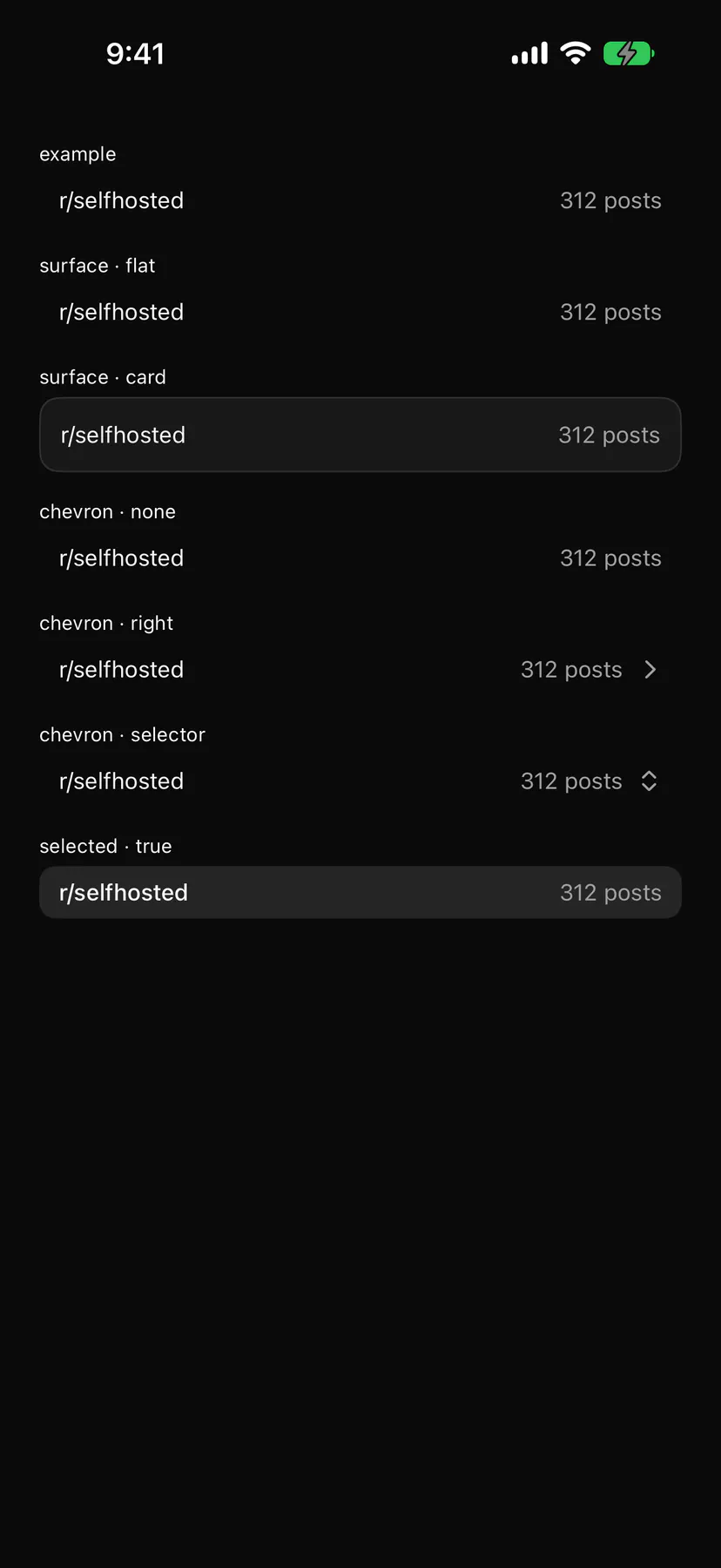
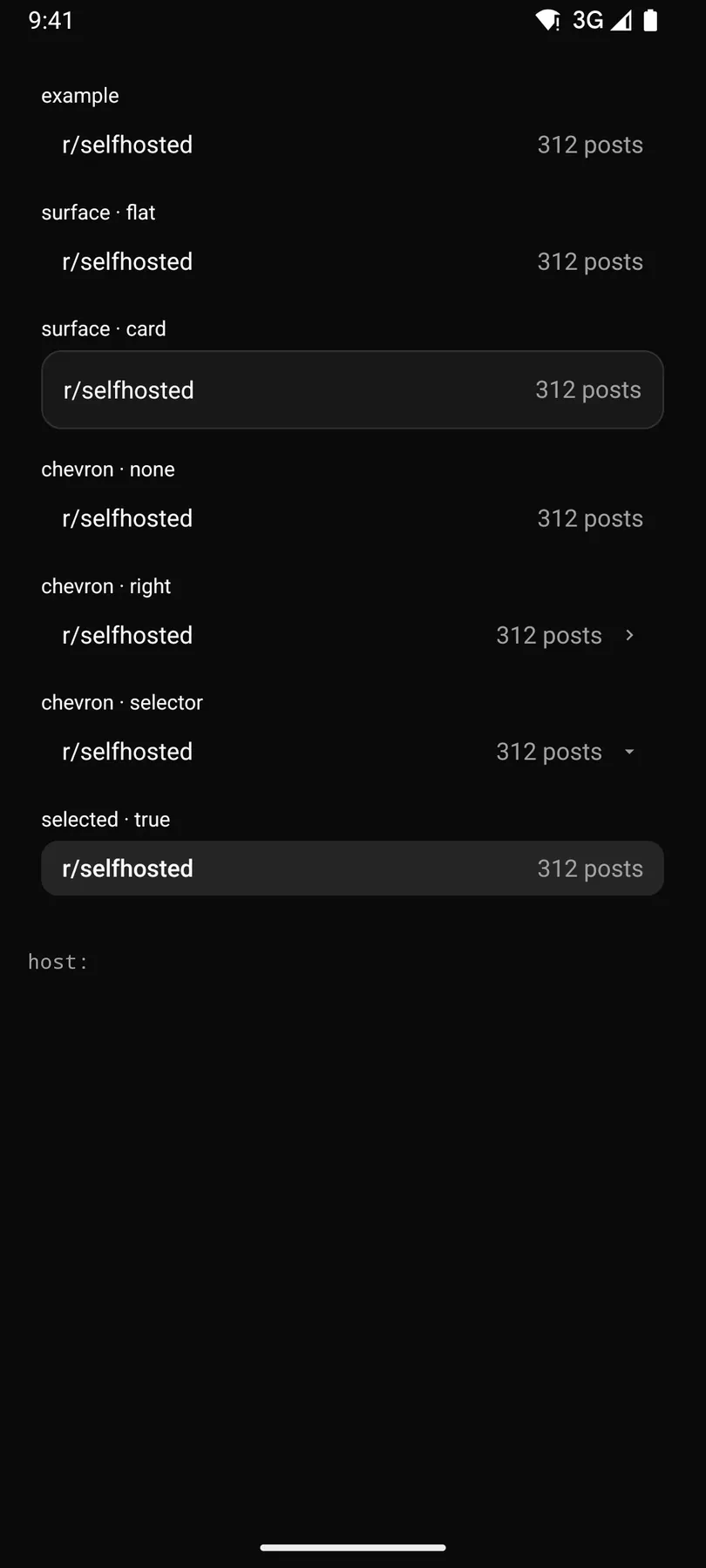
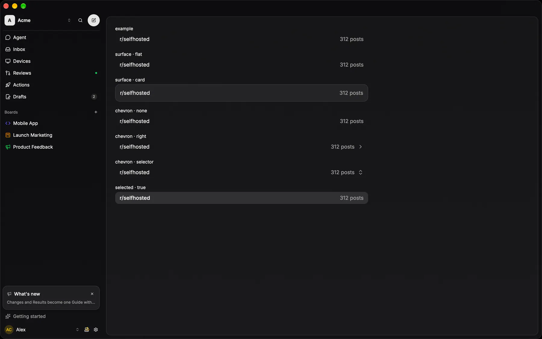
View exponential-ui-row, painted by each native renderer.
chevron · nonechevron · rightchevron · selectorselecteddensity · defaultdensity · compactsurface · flatsurface · card| Prop | Type | Default | Description |
|---|---|---|---|
titlerequiredbind | string | – | The main text. |
identifierbind | string | – | A mono identifier before the title (EXP-12). |
subtitlebind | string | – | A muted second line. |
metabind | string | – | Trailing muted text (a count, a time). |
valuebind | string | – | A trailing readable value (a property, a pick). |
placeholder | string | – | Muted trailing text while value is empty. |
icon | icon | – | The lead glyph (the leading slot replaces it). |
chevron | none | right | selector | "none" | A trailing disclosure (right) or picker (selector) glyph. |
selected | boolean | false | Draws it as the active row. |
density | default | compact | "default" | Row height class. |
surface | flat | card | "flat" | A flat row, or a padded card with its own fill and border. |
pressable | boolean | false | Makes it a press target that fires press (an on.press implies it). |
depth | number | 0 | Nesting depth under a tree Section (0 = root); the guides are computed from the rows around it. |
| Name | Kind |
|---|---|
on.press | event: runs an action |
leading | slot: one component by id |
trailing | slot: one component by id |
- Role
button- Semantics
- button (aria-selected when selected) when pressable, a group of its texts otherwise ($a11y); the guides are decorative
| Keys | Action |
|---|---|
| EnterSpace | press (pressable only) |
- Recipe parts
Row/rootRow/guidesRow/iconRow/identifierRow/bodyRow/titleRow/subtitleRow/metaRow/valueRow/chevron- Keyed by
selecteddensitysurfacedepth:hover:pressed:focus:disabled:checked:open:selected:invalid:dragover
Property row
EXP-1170: THE phone properties sheet row (issue detail + create form, ×3 phones), the list row's VALUE variant (was PropertyRow; the catalog `Row` with a `value`): the label left and muted, the value right and readable with its glyph riding beside it as one trailing unit, 44px, the WHOLE row the target (a Button, so it can be a picker's trigger), no chevron.
More
Rows stack inside a `GlassGroup`. A set-valued property (Labels) shows the picks joined by ", " in the team's order and opens the shared picker sheet, never a cloud of toggle chips; nothing picked reads "None".
PropertyValueRowapps/web/src/components/issue-editor/mobile-properties.tsxthe value variant is ListRow asChild over a Button; ListRow itself has no value prop (the catalog Row's `value` is the contract)
Desktop shows the properties inline as header chips; no sheet rows.
Glass row
The GAPPED card item (the catalog `Row surface: card`): radius 10, row fill, its own hairline border, padding 12.
More
EXP-818/1076 keep it for REAL CARDS only (a transcript's tool output, a diff) — never a settings list: the settings ladder is a `GlassSectionHeader` band over `SETTINGS_LIST_CLASS` + the flat list row below.
List row
EXP-818: the flat list item every list wears — no stroke, no fill, radius 10, padding 12, NO gap between rows under a group band; hover takes the row fill, the selected row the active fill.
More
Rows read as a table, not as cards. EXP-962 gave it a second density: `compact` is the 28px one-line row the narrow column runs at (the sidebar's pinned and draft arms, the compact inbox) — the same 14px type, 8px of side padding, 8px to the glyph — and `SidebarMenuButton density="compact"` is its exact twin, so a nav entry and a list row sitting in the same 17rem slot are the same height.
surface::flat_row / flat_row_compactapps/desktop/crates/ui/src/surface.rsEXP-963: flat_row_compact is the 28px density the rail's entries run at
- apps/web/src/components/team/board-switcher-sheet.tsx: PLAIN_ROW re-derives the mobile picker row
List item
EXP-1248 (fixture `list-item.json`, ×4): THE anatomy every entity row derives from, on a flat list row: [tree guides][lead glyph in a 14px box at x = 12 + 14·depth][mono identifier][title][caption, two-line rows only][trailing meta], which is the catalog `Row` (`depth`, `icon`, `identifier`, `title`, `subtitle`, `meta`).
More
The lead box sits at the same x on every row of a depth, so glyphs and titles align and a child's elbow ends at its own lead. No fold chevron, no trailing chevron, no buttons: a row opens, its menu is a context menu / long-press. Two densities: `compact` (one line, 28-32px: the sidebar's Running, pinned rows) and `list` (36px one-liners, 52px with a caption). Derivations differ only in lead and meta: SessionRow = the run mark + the host device's glyph; an issue row = the status glyph + the assignee; PrRow = the PR ring (a stack swaps the guides for its 1px rail).
SessionRow / PrRow over ListRowpackages/ui/src/session-row.tsxPrRow + StackRail in pr-row.tsx; the issue row is apps/web components/issue-list.tsx
SessionRow / PrRow over .flatRow()apps/ios/ExpUI/Sources/SessionRow.swiftPrRow.swift beside it; caption ExpCore Domain/SessionRow.swift
SessionRow / PrRow over Modifier.flatRow()apps/android/app/src/main/java/com/exponential/app/ui/components/SessionRow.ktPrRow.kt beside it; caption domain/SessionRow.kt
run_rows::run_rowapps/desktop/crates/ui/src/run_rows.rsover surface::flat_row; pr_rows.rs = PrRow, issue_list.rs = the issue row
Tree guides
EXP-965: the connector every NESTED list draws instead of bare indentation.
More
A row used to hang under its parent by left padding alone, so three levels of runs read as three arbitrary margins. The indent stays 14px per level; on top of it a row at depth d draws, in its PARENT's 14px gutter, a 1px vertical from its top edge to its vertical centre, a rounded elbow (radius 5) and a stub out to the gutter's right edge — and the vertical carries on to the bottom edge when a sibling follows (a tee). Every ancestor level whose subtree continues below draws a straight full-height line, so a deep child stays attached to every level above it. One hairline weight throughout (the strong glass stroke); a parent draws nothing of its own. The RULE is pure and shared ×4 — it reads nothing but the visible rows' depths — so only the painting is per-platform. In the catalog the guides are a PART of `Row` (its `depth`, inside a `Section tree`), filled by the core's post-expansion pass and never authored on their own.
TreeGuides / treeGuidespackages/ui/src/tree-guides-view.tsxthe pure rule is tree-guides.ts; drawn as one absolutely positioned SVG inside the row
TreeGuides / TreeGuidesOverlayapps/ios/ExpCore/Sources/Domain/TreeGuides.swiftthe overlay is ExpUI/Sources/TreeGuidesOverlay.swift
TreeGuides / TreeGuidesOverlayapps/android/app/src/main/java/com/exponential/app/domain/TreeGuides.ktthe overlay is ui/components/TreeGuidesOverlay.kt
Guides / guides_forapps/desktop/crates/domain/src/tree_guides.rsdomain::tree_guides; the painter is crates/ui/src/tree_guides.rs
Row shell
The rhythm every grouped row inherits: padding 12/16, gap 12, 14px text.
More
The shell never draws a stroke — the group's hairlines do.
PickerRowapps/android/app/src/main/java/com/exponential/app/ui/components/SheetOptionRows.ktcontrols::rows::glass_row_shellapps/desktop/crates/exponential-ui-gpui/src/controls/rows.rsPicker row
Label left, value right-aligned at 70% foreground, a 14px chevron at 50%.
More
The whole row is the target, never just the value.
Picker triggerVariant="row"packages/ui/src/picker/picker.tsxEXP-958: the row IS the picker — its own Select and sheet are gone
PickerRowapps/android/app/src/main/java/com/exponential/app/ui/components/SheetOptionRows.ktcontrols::rows::glass_picker_rowapps/desktop/crates/exponential-ui-gpui/src/controls/rows.rsPicker surface
The searchable SURFACE every Picker opens (Picker = the only public picker; its Combobox engine is internal since EXP-1249): a popover on a pointer, the bottom sheet on a phone.
More
Selection speaks ONE language: SINGLE marks the picked row with a trailing ui-check, MULTI by the row's own highlight wash (data-picked), and a bulk edit over rows that disagree marks the row mixed; never a checkbox, never a circle pair. `value` is the identity and `keywords` the search text, so two boards may share a name; `noneLabel` renders a row that reports null. Single closes on pick, multi stays open. PickerItem is the row shape; the trigger comes in four `triggerVariant`s, pill | field | row | inline (row = the form ladder's picker row, the catalog `Row chevron: selector`). PickerMenuRows draws the same rows inside a Menu.
Picker / PickerListpackages/ui/src/picker/picker.tsxPickerItem is the row shape; PickerList the body without the popover; PickerMenuRows the rows inside a menu
GlassPickerapps/ios/ExpUI/Sources/Picker/Picker.swiftEXP-1249 retired GlassPickerSheet: every pick outside the typed subjects goes through GlassPicker
GlassSheetRowapps/android/app/src/main/java/com/exponential/app/ui/components/GlassSheet.ktEXP-1021 built the generic picker (Picker, its own entry); this row is what the sheets outside the ten assemble
picker::Pickerapps/desktop/crates/ui/src/picker/mod.rsEXP-1021 retired searchable_picker; the primitive owns its query + cursor, so a host holds no picker entities