Sidebar macrolite
A two-column shell: a navigation column (sidebar slot) beside the children, hidden below a breakpoint or when collapsed.
Preview
Loading the renderer…
createSurface + updateComponents, A2UI v0.9.
json
[
  {
    "version": "v0.9",
    "createSurface": {
      "surfaceId": "preview",
      "catalogId": "https://ui.exponential.at/catalogs/core/v1"
    }
  },
  {
    "version": "v0.9",
    "updateComponents": {
      "surfaceId": "preview",
      "components": [
        {
          "id": "root",
          "component": "Stack",
          "direction": "vertical",
          "align": "stretch",
          "children": [
            "example"
          ]
        },
        {
          "id": "example",
          "component": "Sidebar",
          "side": "left",
          "width": 240,
          "collapseBelow": "md",
          "children": [
            "c0-main"
          ],
          "slots": {
            "sidebar": "c0-nav"
          }
        },
        {
          "id": "c0-main",
          "component": "Text",
          "text": "Pick a board on the left.",
          "variant": "body"
        },
        {
          "id": "c0-nav",
          "component": "Stack",
          "gap": "xs",
          "children": [
            "c0-n1",
            "c0-n2"
          ]
        },
        {
          "id": "c0-n1",
          "component": "Row",
          "title": "Inbox",
          "icon": "nav-inbox",
          "selected": true,
          "pressable": true,
          "slots": {
            "trailing": "c0-n1-count"
          }
        },
        {
          "id": "c0-n1-count",
          "component": "Badge",
          "text": "3",
          "variant": "secondary"
        },
        {
          "id": "c0-n2",
          "component": "Row",
          "title": "Issues",
          "icon": "nav-issues",
          "pressable": true
        }
      ]
    }
  }
]
This surface through a MemoryTransport. Install and transports: React guide.
This surface through a MemoryTransport. Install and transports: SwiftUI guide.
This surface through a MemoryTransport. Install and transports: Compose guide.
This surface through a MemoryTransport. Install and transports: gpui guide.
Platforms


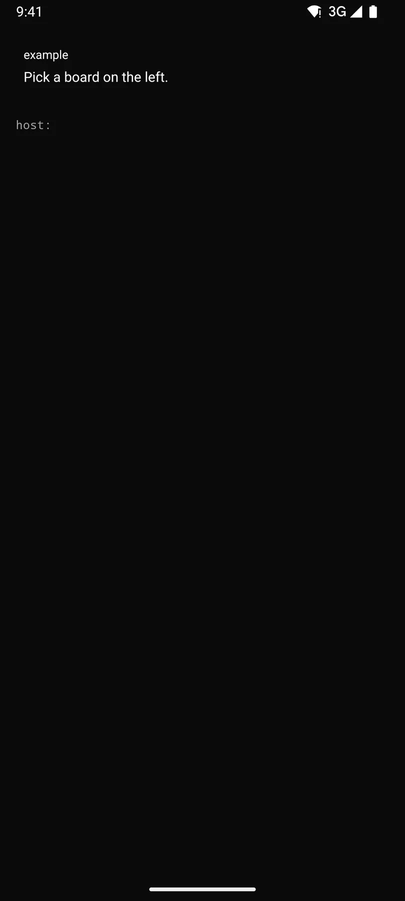
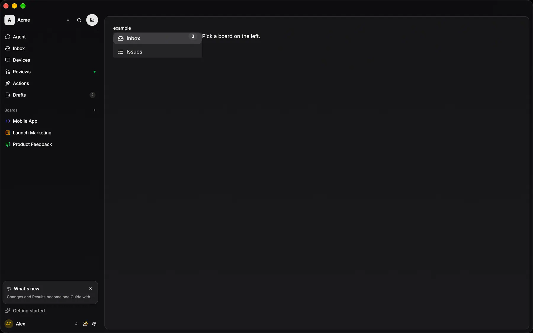
View exponential-ui-sidebar, painted by each native renderer.
Variants
collapsedProps
| Prop | Type | Default | Description |
|---|---|---|---|
side | left | right | "left" | Which edge the column sits on. |
width | number | 240 | The column width in px. |
collapseBelow | never | sm | md | lg | xl | "md" | Hides the column below this breakpoint. |
collapsedbind | boolean | false | Hides the column at any width; bind it to a toggle. |
Events and slots
| Name | Kind |
|---|---|
sidebar | slot: one component by id |
Accessibility
- Role
none- Semantics
- navigation landmark (the sidebar slot) beside main. Layout only; its
sidebarpart is a navigation landmark, itsmainpart the main landmark ($a11y).
Not focusable; no keys.
Theming
- Recipe parts
Sidebar/rootSidebar/sidebarSidebar/main- Keyed by
side:hover:pressed:focus:disabled:checked:open:selected:invalid:dragover