Section macrolite
A band header over hairline-divided rows: a title with an optional caption, count and glyph, foldable, tinted; no title = just the rows.
createSurface + updateComponents, A2UI v0.9.
[
  {
    "version": "v0.9",
    "createSurface": {
      "surfaceId": "preview",
      "catalogId": "https://ui.exponential.at/catalogs/core/v1"
    }
  },
  {
    "version": "v0.9",
    "updateComponents": {
      "surfaceId": "preview",
      "components": [
        {
          "id": "root",
          "component": "Stack",
          "direction": "vertical",
          "align": "stretch",
          "children": [
            "example"
          ]
        },
        {
          "id": "example",
          "component": "Section",
          "title": "In progress",
          "icon": "nav-issues",
          "open": true,
          "children": [
            "c0-r1",
            "c0-r2",
            "c0-r3",
            "c0-r4",
            "c0-r5",
            "c0-r6"
          ]
        },
        {
          "id": "c0-r1",
          "component": "Row",
          "title": "Release 0.18",
          "meta": "4 runs",
          "pressable": true
        },
        {
          "id": "c0-r2",
          "component": "Row",
          "title": "Build the macOS app",
          "meta": "done",
          "pressable": true,
          "depth": 1
        },
        {
          "id": "c0-r3",
          "component": "Row",
          "title": "Notarize",
          "meta": "running",
          "pressable": true,
          "depth": 2
        },
        {
          "id": "c0-r4",
          "component": "Row",
          "title": "Upload the dmg",
          "meta": "queued",
          "pressable": true,
          "depth": 2
        },
        {
          "id": "c0-r5",
          "component": "Row",
          "title": "Publish the release notes",
          "meta": "queued",
          "pressable": true,
          "depth": 1
        },
        {
          "id": "c0-r6",
          "component": "Row",
          "title": "Release 0.17",
          "meta": "3 runs",
          "pressable": true
        }
      ]
    }
  }
]
This surface through a MemoryTransport. Install and transports: React guide.
This surface through a MemoryTransport. Install and transports: SwiftUI guide.
This surface through a MemoryTransport. Install and transports: Compose guide.
This surface through a MemoryTransport. Install and transports: gpui guide.
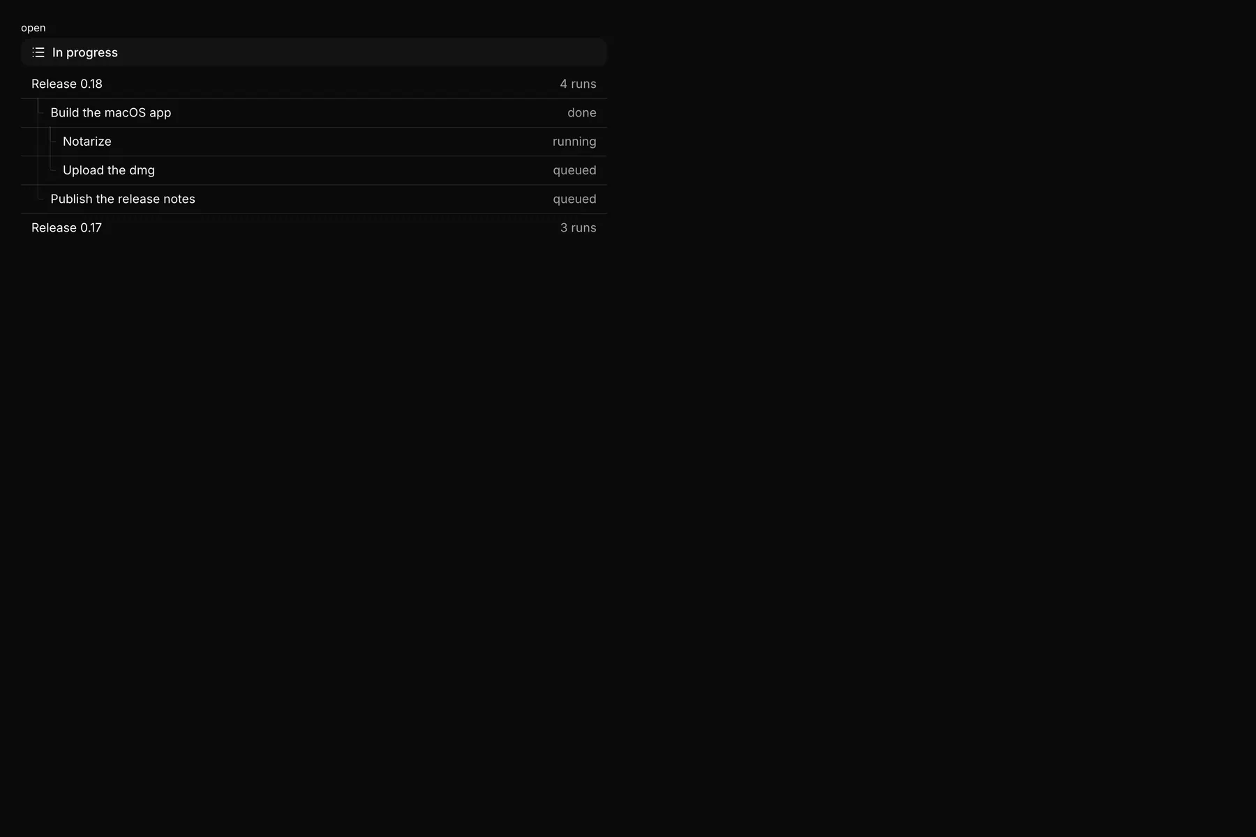
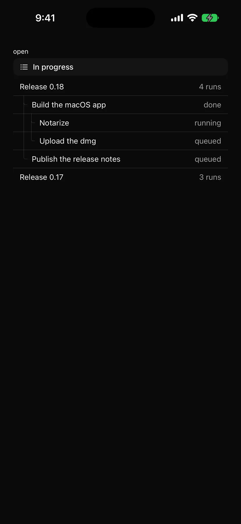
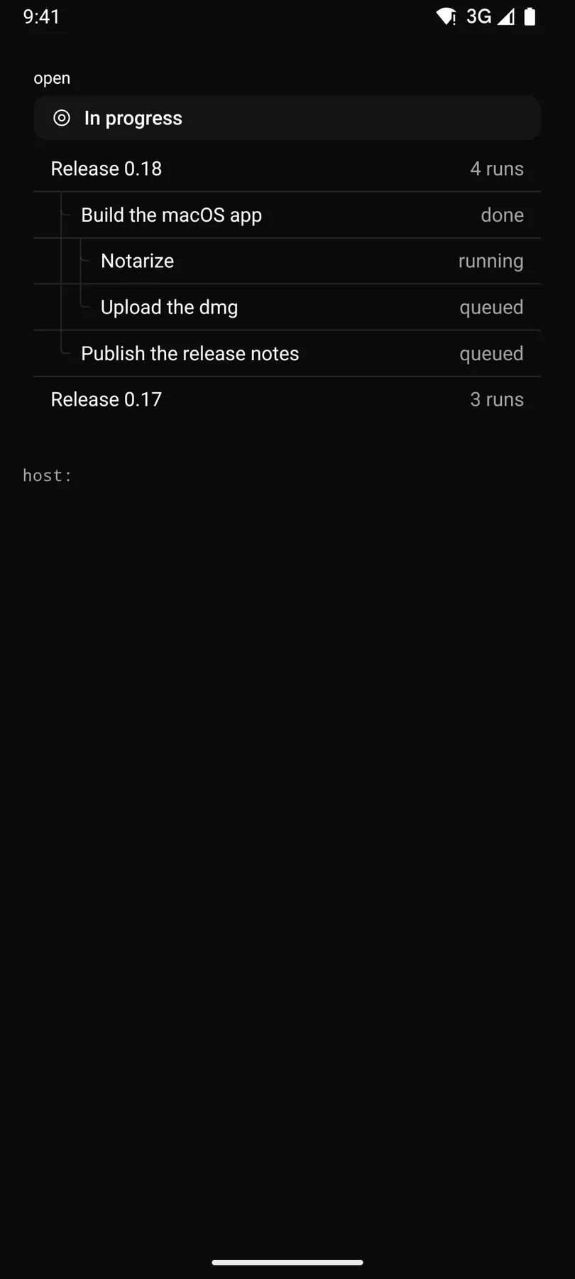
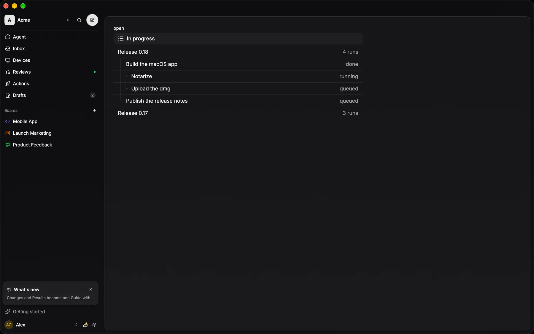
View exponential-ui-section, painted by each native renderer.
collapsibletint · neutraltint · primarytint · successtint · warningtint · dangertint · infotree| Prop | Type | Default | Description |
|---|---|---|---|
titlebind | string | – | The band's label; omit it for a bare run of rows. |
caption | string | – | Muted text after the title. |
count | number | – | A count after the title; off unless given. |
icon | icon | – | A glyph before the title (the leading slot replaces it). |
collapsible | boolean | false | The header folds the rows (chevron, press). |
openbind | boolean | true | Whether the rows show; bind it. |
tint | neutral | primary | success | warning | danger | info | "neutral" | The band's colour tone. |
tree | boolean | false | The rows form a tree: each Row.depth indents and draws its guides. |
style | style | – | Extra Box styles for the frame. |
| Name | Kind |
|---|---|
on.change | event: runs an action |
leading | slot: one component by id |
trailing | slot: one component by id |
- Role
group- Semantics
- group; the header a heading (level 3) with the caption and count in its name, or a button with aria-expanded when collapsible; the rows a list (a tree when
tree) of listitems
| Keys | Action |
|---|---|
| EnterSpace | fold when collapsible |
- Recipe parts
Section/rootSection/headerSection/chevronSection/iconSection/titleSection/captionSection/countSection/spacerSection/body- Keyed by
tinttreeopencollapsible:hover:pressed:focus:disabled:checked:open:selected:invalid:dragover
Group band
EXP-818: the Linear group header — a full-width strip on the section fill, radius 10, padding 6/12, 14/20 at 85% foreground, a trailing slot, 4px over its flat rows.
More
Counts are optional and off by default (the catalog `Section.count`). Never uppercase and never a divider. A band heads a LIST; the bare fold INSIDE a row is the disclosure header below, which draws no strip at all.
GlassSectionHeaderpackages/ui/src/glass-rows.tsxEmoji picker category headers stay uppercase on purpose (shared exception).
GlassSectionBandapps/ios/ExpUI/Sources/GlassTheme.swiftEmoji picker category headers stay uppercase on purpose (shared exception).
Modifier.glassSectionBand()apps/android/app/src/main/java/com/exponential/app/ui/theme/Glass.ktSectionHeader (Scaffolding.kt) wraps it. Emoji picker category headers stay uppercase on purpose (shared exception).
controls::rows::glass_section_headerapps/desktop/crates/exponential-ui-gpui/src/controls/rows.rsEmoji picker category headers stay uppercase on purpose (shared exception).
List row
EXP-818: the flat list item every list wears — no stroke, no fill, radius 10, padding 12, NO gap between rows under a group band; hover takes the row fill, the selected row the active fill.
More
Rows read as a table, not as cards. EXP-962 gave it a second density: `compact` is the 28px one-line row the narrow column runs at (the sidebar's pinned and draft arms, the compact inbox) — the same 14px type, 8px of side padding, 8px to the glyph — and `SidebarMenuButton density="compact"` is its exact twin, so a nav entry and a list row sitting in the same 17rem slot are the same height.
surface::flat_row / flat_row_compactapps/desktop/crates/ui/src/surface.rsEXP-963: flat_row_compact is the 28px density the rail's entries run at
- apps/web/src/components/team/board-switcher-sheet.tsx: PLAIN_ROW re-derives the mobile picker row
Collapsible
The fold BEHIND a disclosure header: Radix Collapsible owns the open state and the content's mount, the header owns the words and the chevron.
More
It never draws chrome of its own, so a fold reads as the surface it sits in (a settings group, a transcript's Show work, a properties section). The natives fold with their own animation primitives under the same disclosure header. In the catalog: `Collapsible`, or a `Section collapsible` when the fold heads a list.
a fold = DisclosureHeader + a conditional view
a fold = DisclosureHeader + AnimatedVisibility
a fold = disclosure_header + the caller's own child toggle