Composer nativelite
The chat input box: a growing text field with a submit button and optional attachments.
createSurface + updateComponents, A2UI v0.9.
[
  {
    "version": "v0.9",
    "createSurface": {
      "surfaceId": "preview",
      "catalogId": "https://ui.exponential.at/catalogs/core/v1"
    }
  },
  {
    "version": "v0.9",
    "updateComponents": {
      "surfaceId": "preview",
      "components": [
        {
          "id": "root",
          "component": "Stack",
          "direction": "vertical",
          "align": "stretch",
          "children": [
            "example"
          ]
        },
        {
          "id": "example",
          "component": "Composer",
          "placeholder": "Ask anything"
        }
      ]
    }
  }
]
This surface through a MemoryTransport. Install and transports: React guide.
This surface through a MemoryTransport. Install and transports: SwiftUI guide.
This surface through a MemoryTransport. Install and transports: Compose guide.
This surface through a MemoryTransport. Install and transports: gpui guide.
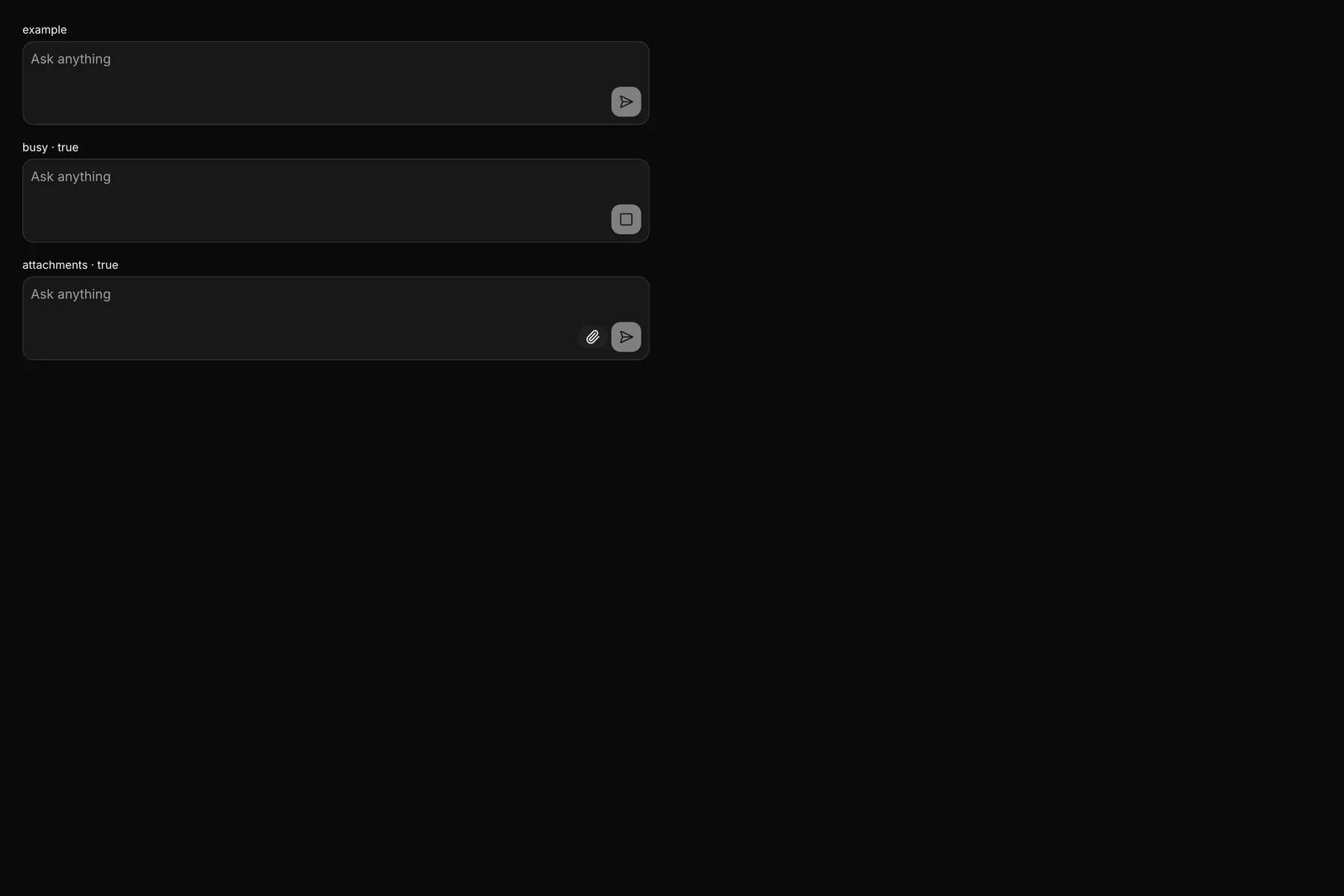
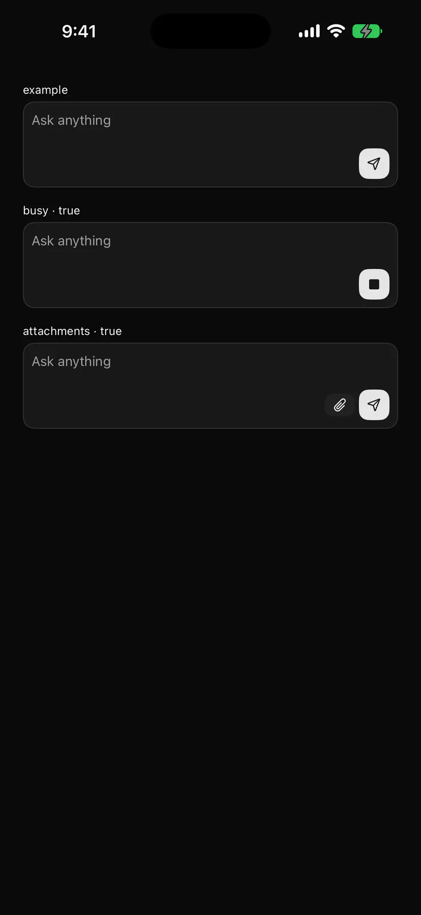
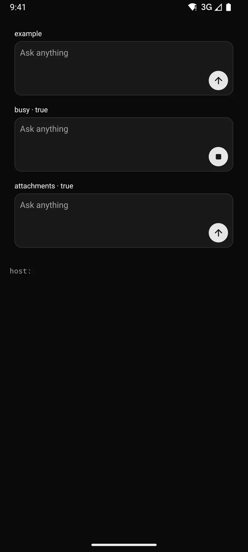
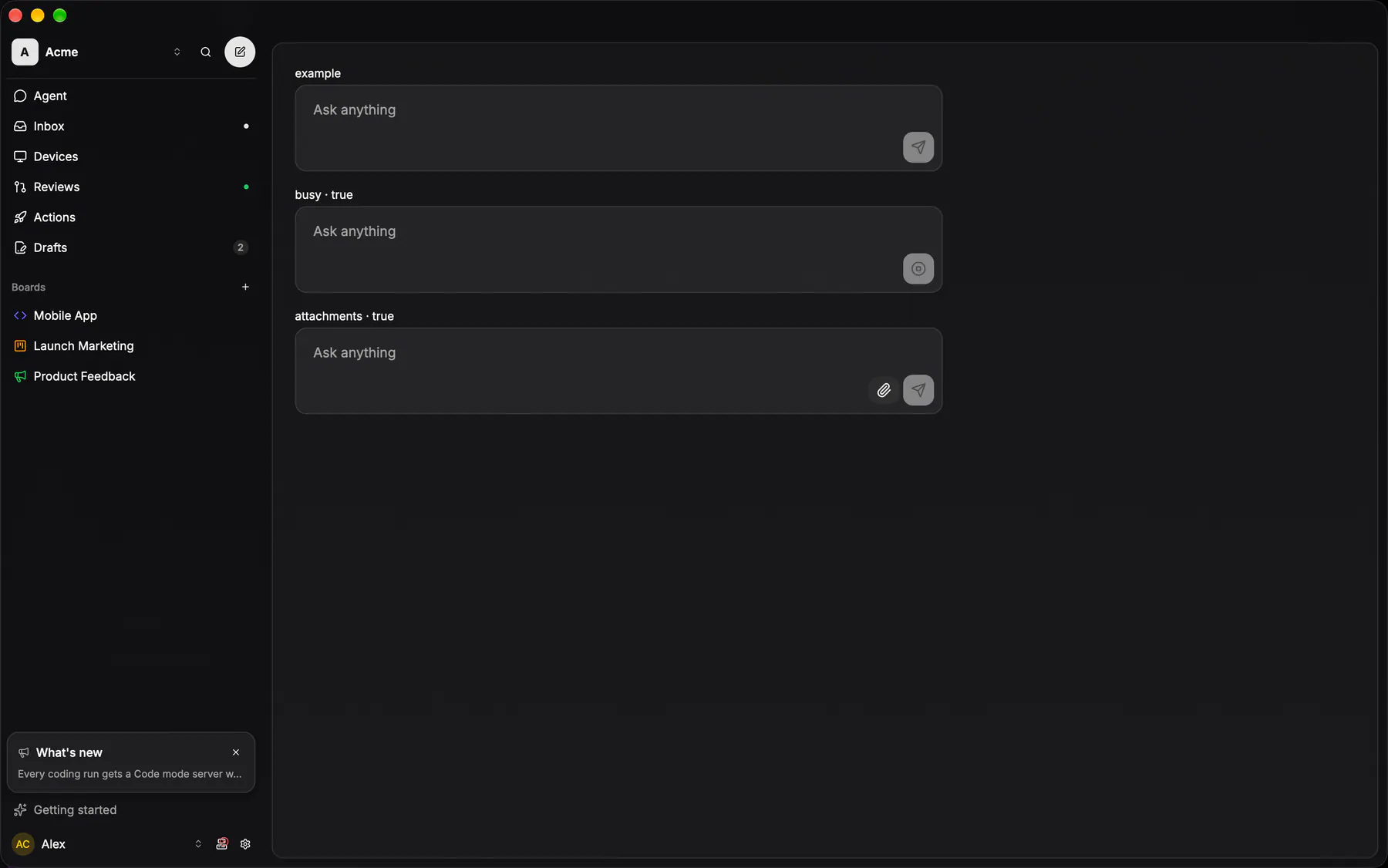
View exponential-ui-composer, painted by each native renderer.
attachmentsbusy| Prop | Type | Default | Description |
|---|---|---|---|
placeholder | string | – | Hint text while empty. |
valuebind | string | – | The draft text; bind it. |
submitLabel | string | "$string.send" | The submit button's accessibility label. |
attachments | boolean | false | Shows the attach control. |
busy | boolean | false | Turns submit into a stop while a reply streams. |
| Name | Kind |
|---|---|
on.submit | event: runs an action |
on.change | event: runs an action |
on.stop | event: runs an action |
- Role
textbox- Semantics
- textbox (multiline) + send button
| Keys | Action |
|---|---|
| Enter | submit; Shift+Enter: newline |
| Escape while busy | stop |
- Recipe parts
Composer/rootComposer/fieldComposer/placeholderComposer/attachmentComposer/send- Keyed by
attachmentsbusy:hover:pressed:focus:disabled:checked:open:selected:invalid:dragover
Composer
ONE composer for comments, steering and reporter replies: a radius-16 card of card fill under a card hairline, holding an optional attachment strip, a borderless 36-min field and a tool row of 24px ghost glyph buttons with a right-aligned submit whose glyph is the primary tint.
More
EXP-877's `inline` arm is the steer card — the round submit rides the field's own row instead of a tool row under it. The opaque variant swaps to the opaque card fill and the strong stroke — it floats over a feed on mobile, and an alpha fill there shows the conversation through it. EXP-961 moved it into @exp/ui: the card owns CHROME AND LAYOUT only, and every caller keeps its own field, upload and send.
GlassComposerapps/android/app/src/main/java/com/exponential/app/ui/components/GlassComposer.kt