Alert macrolite
An inline banner with an icon, a title and a message.
createSurface + updateComponents, A2UI v0.9.
[
  {
    "version": "v0.9",
    "createSurface": {
      "surfaceId": "preview",
      "catalogId": "https://ui.exponential.at/catalogs/core/v1"
    }
  },
  {
    "version": "v0.9",
    "updateComponents": {
      "surfaceId": "preview",
      "components": [
        {
          "id": "root",
          "component": "Stack",
          "direction": "vertical",
          "align": "stretch",
          "children": [
            "example"
          ]
        },
        {
          "id": "example",
          "component": "Alert",
          "title": "Saved",
          "message": "Your changes have been saved.",
          "type": "success"
        }
      ]
    }
  }
]
This surface through a MemoryTransport. Install and transports: React guide.
This surface through a MemoryTransport. Install and transports: SwiftUI guide.
This surface through a MemoryTransport. Install and transports: Compose guide.
This surface through a MemoryTransport. Install and transports: gpui guide.
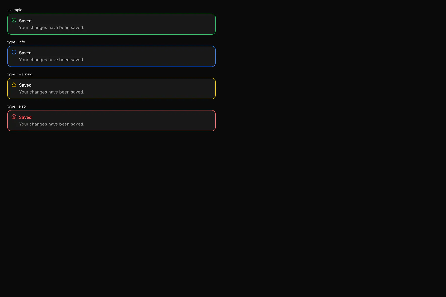
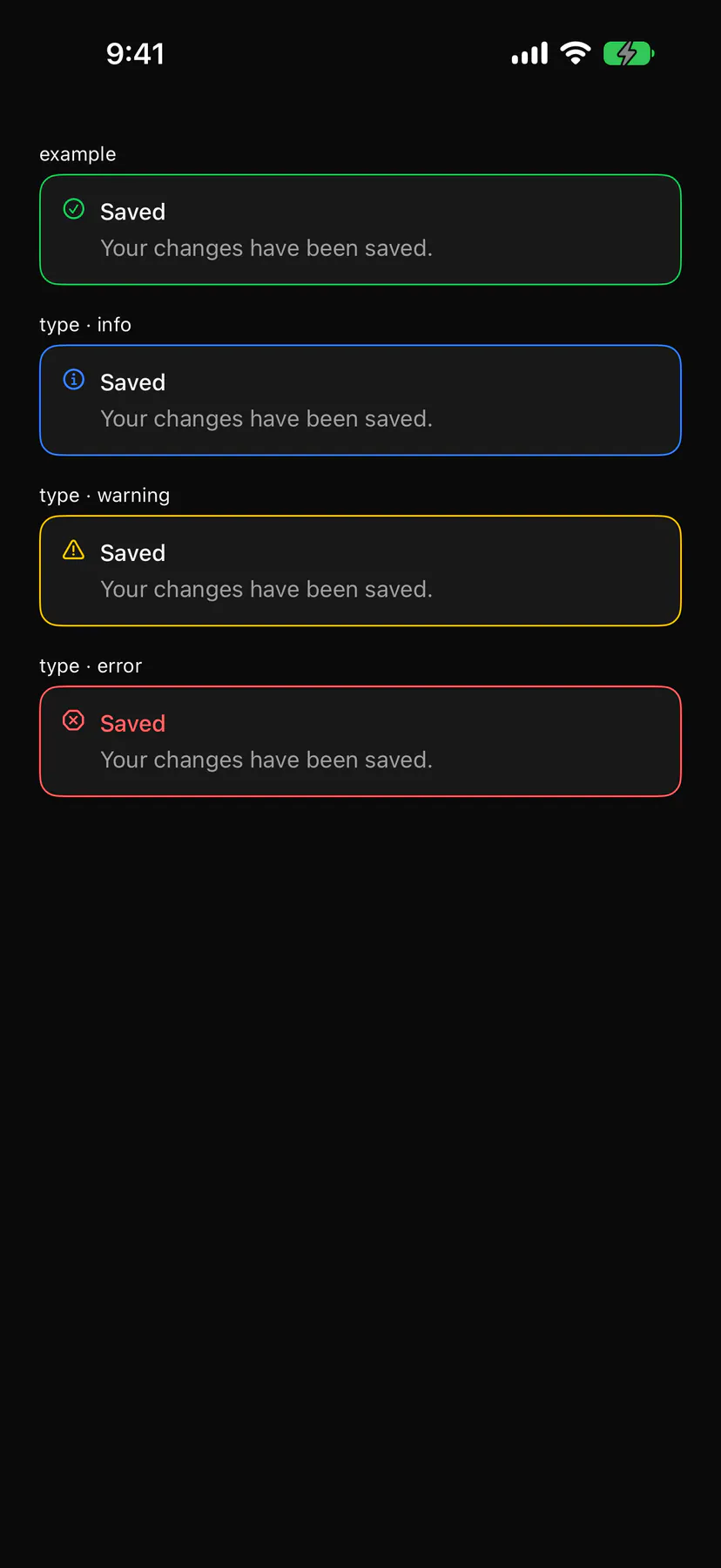
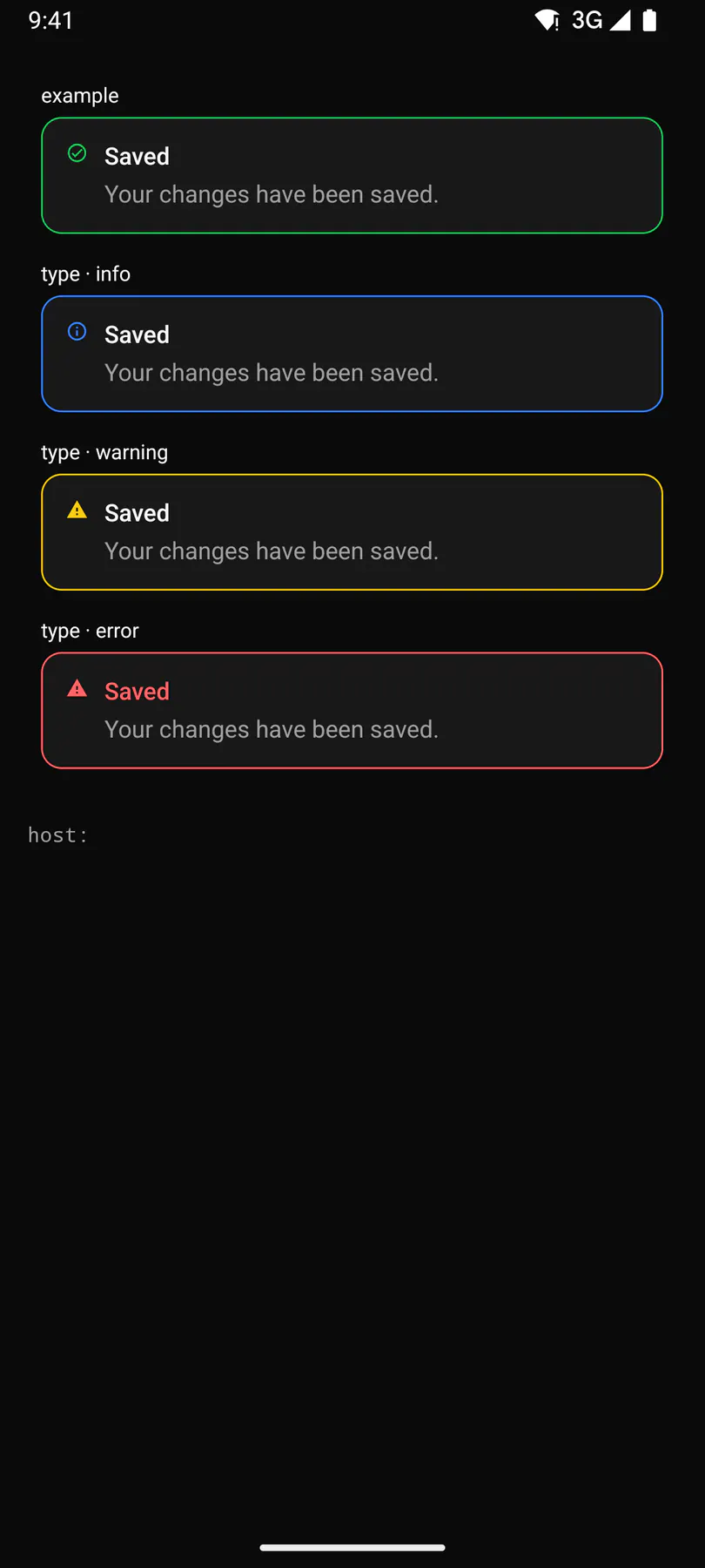
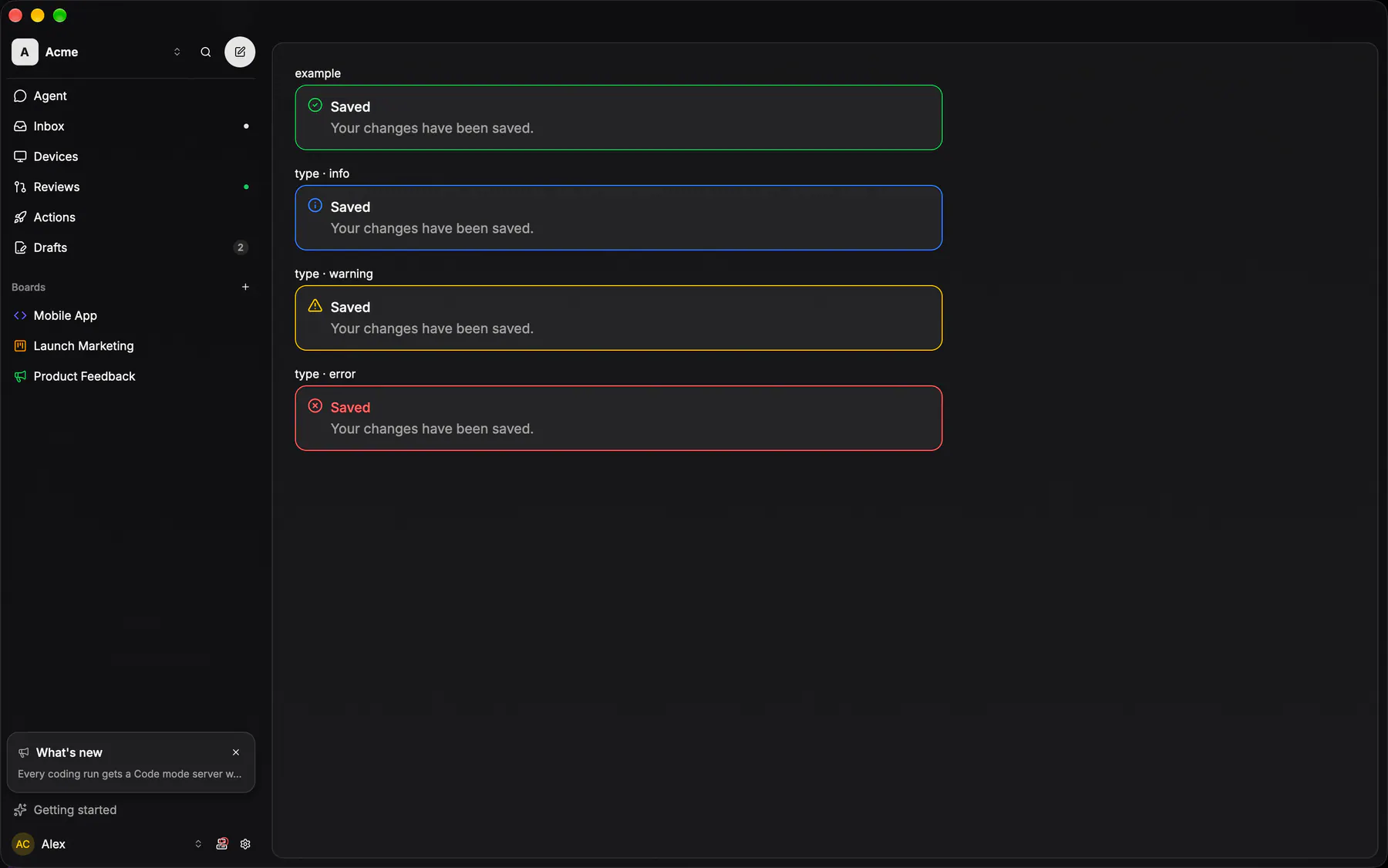
View exponential-ui-alert, painted by each native renderer.
type · infotype · successtype · warningtype · error| Prop | Type | Default | Description |
|---|---|---|---|
titlerequired | string | – | The banner heading. |
message | string | – | The detail under the heading. |
type | info | success | warning | error | "info" | The severity, which picks the icon and tone. |
No events, no slots. Children: none.
- Role
alert- Semantics
- alert for warning/error, status otherwise. alert for warning/error, status otherwise ($a11y).
Not focusable; no keys.
- Recipe parts
Alert/rootAlert/iconAlert/bodyAlert/titleAlert/message- Keyed by
type:hover:pressed:focus:disabled:checked:open:selected:invalid:dragover
Alert
The inline banner: a message that belongs to the page it interrupts, not a toast that flies past and not a dialog that blocks.
More
Two variants only — the neutral card fill for a notice, and the destructive tint for a failure — and the leading glyph earns its own column only when one is passed. The admin console carried two byte-identical copies of the destructive recipe before this existed.
no boxed banner: an error renders as a red Text line on DesignTokens.Semantic.red
no boxed banner: EXP-1249 deleted the caller-less GlassNotice; an error renders as a red Text line
controls::feedback::alert / alert_titleapps/desktop/crates/exponential-ui-gpui/src/controls/feedback.rsdefault and destructive on the glass tokens, a glyph column only when one is passed; the repository dialog banner is one