Chip macrolite
A small labelled token: a pill for a filter, label or state, or a rect naming an entity with a glyph or picture, optionally removable.
createSurface + updateComponents, A2UI v0.9.
[
  {
    "version": "v0.9",
    "createSurface": {
      "surfaceId": "preview",
      "catalogId": "https://ui.exponential.at/catalogs/core/v1"
    }
  },
  {
    "version": "v0.9",
    "updateComponents": {
      "surfaceId": "preview",
      "components": [
        {
          "id": "root",
          "component": "Stack",
          "direction": "vertical",
          "align": "start",
          "children": [
            "example"
          ]
        },
        {
          "id": "example",
          "component": "Chip",
          "label": "Drafts",
          "selected": true
        }
      ]
    }
  }
]
This surface through a MemoryTransport. Install and transports: React guide.
This surface through a MemoryTransport. Install and transports: SwiftUI guide.
This surface through a MemoryTransport. Install and transports: Compose guide.
This surface through a MemoryTransport. Install and transports: gpui guide.
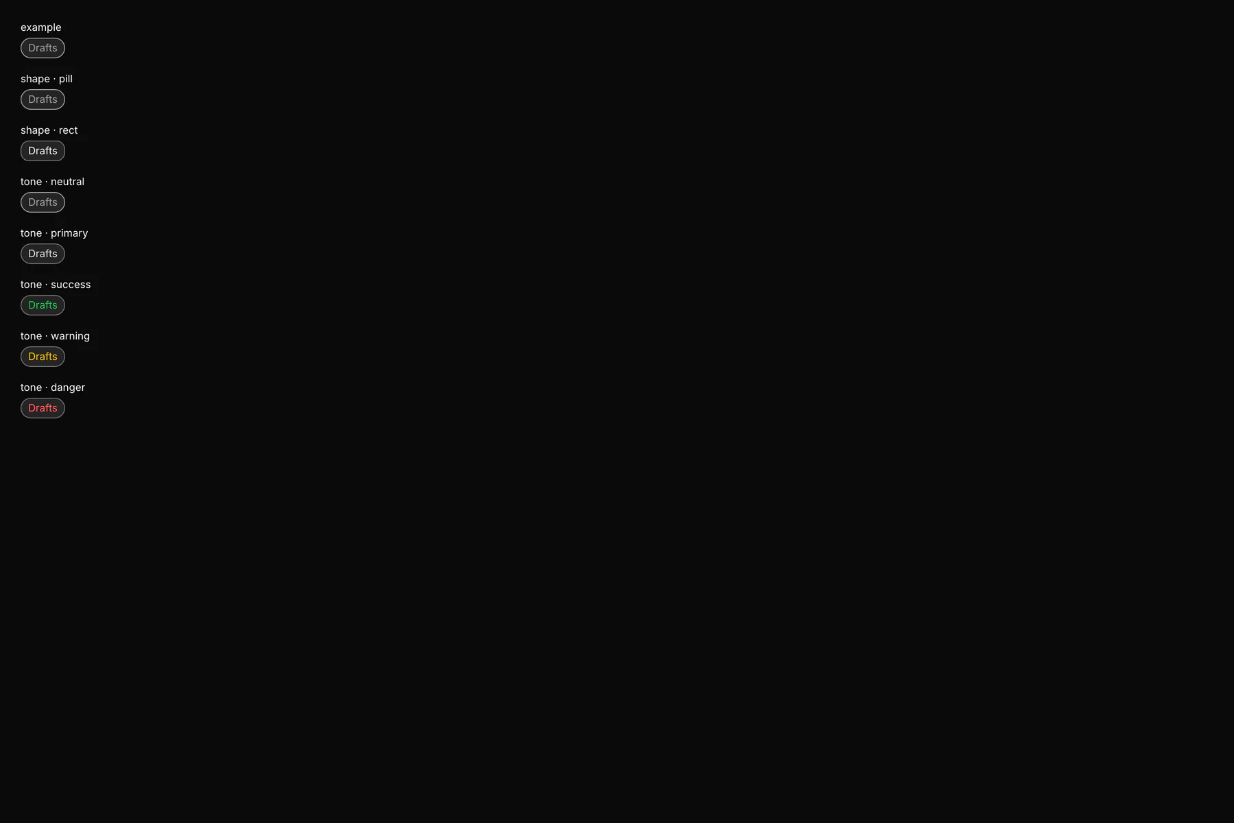
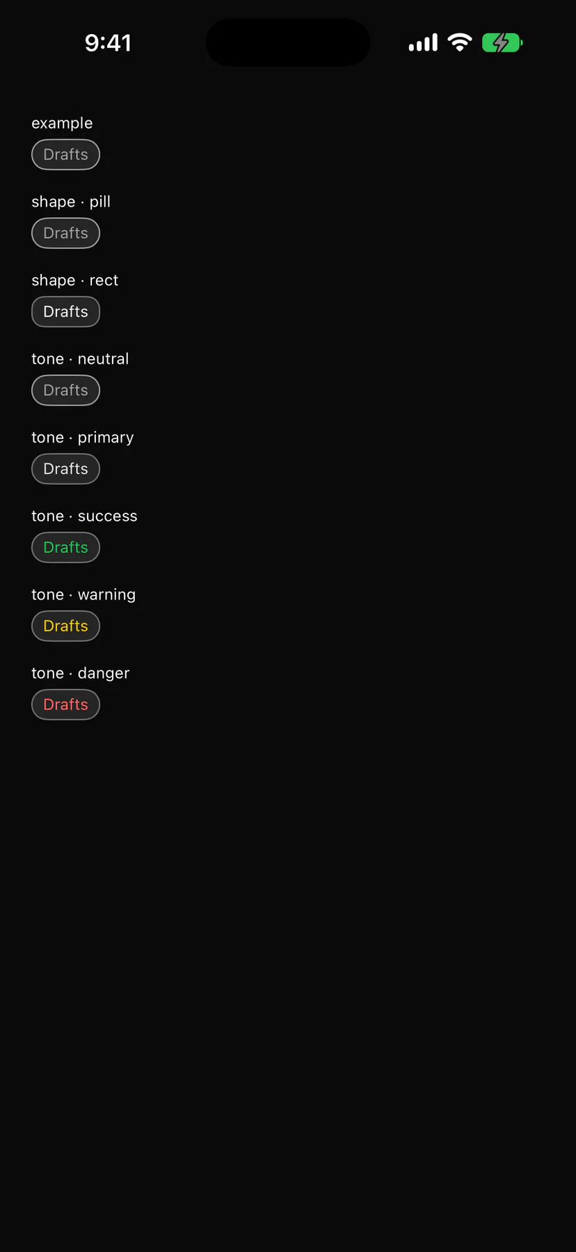
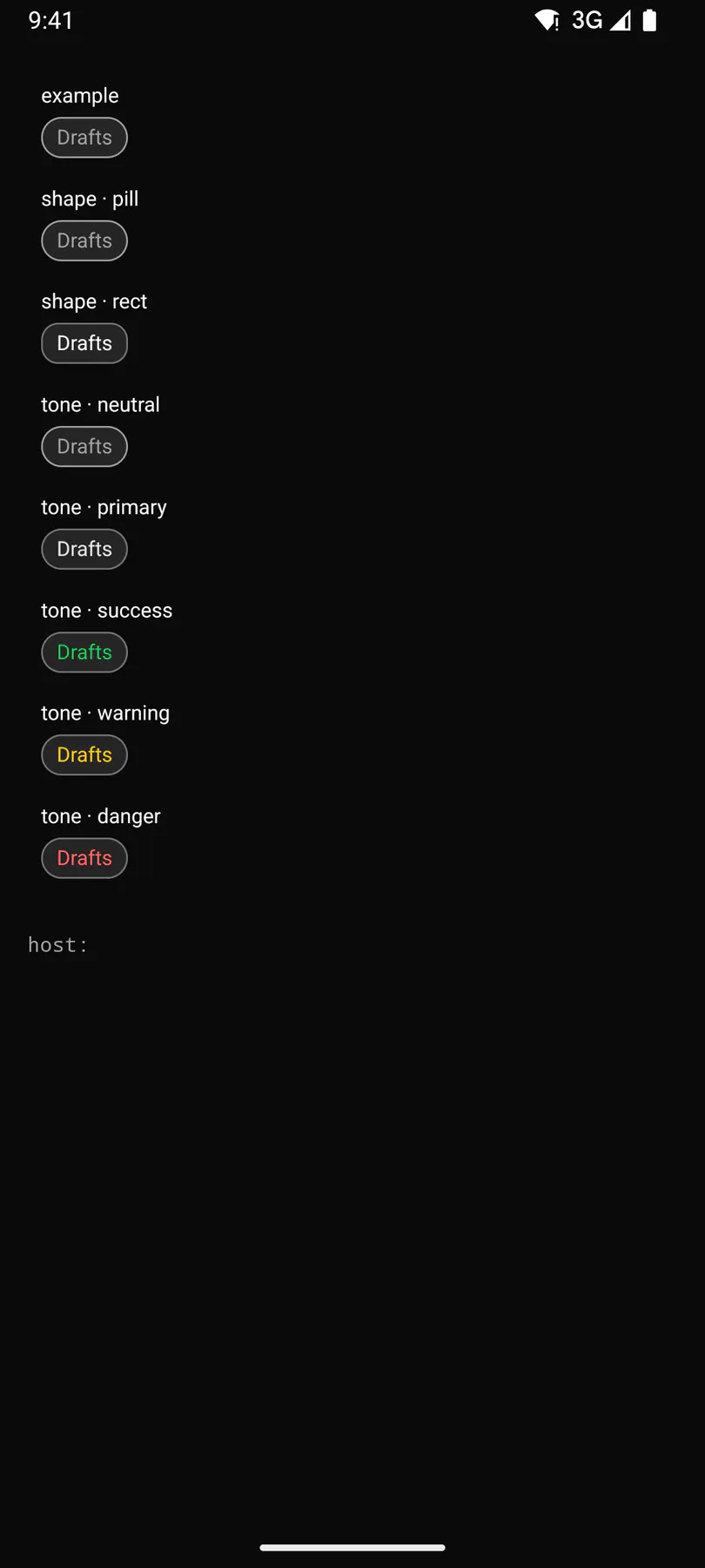
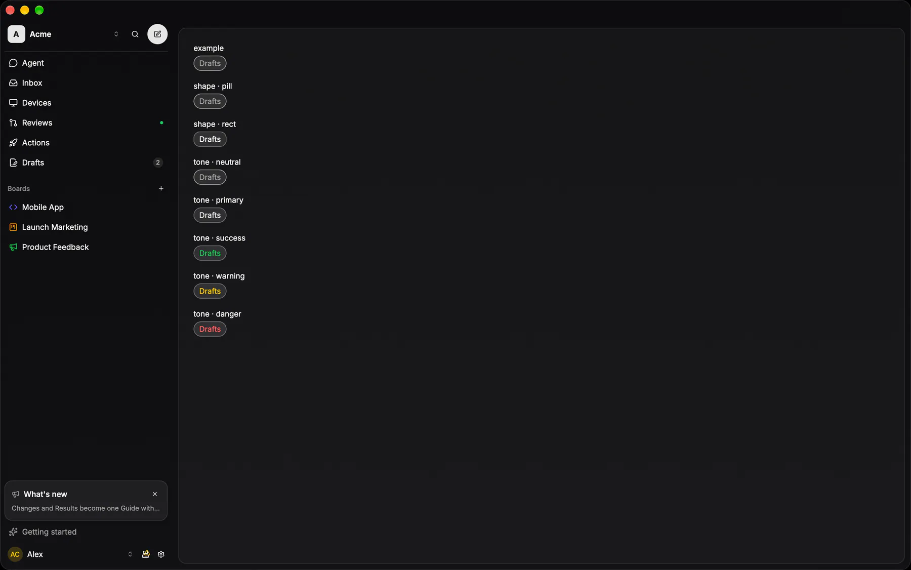
View exponential-ui-chip, painted by each native renderer.
shape · pillshape · recttone · neutraltone · primarytone · successtone · warningtone · dangertone · inforemovable| Prop | Type | Default | Description |
|---|---|---|---|
labelrequiredbind | string | – | The chip text. |
shape | pill | rect | "pill" | A rounded pill or a squarer entity chip. |
selected | boolean | false | Draws it as the active choice. |
tone | neutral | primary | success | warning | danger | info | "neutral" | Colour tone of the chip. |
dot | color | – | A colour dot before the text (a label chip). |
icon | icon | – | An icon before the text. |
image | url | – | A round picture instead of the icon. |
detail | string | – | Muted text after the label. |
removable | boolean | false | Shows a remove control that fires remove. |
pressable | boolean | false | Makes it a press target that fires press. |
| Name | Kind |
|---|---|
on.press | event: runs an action |
on.remove | event: runs an action |
leading | slot: one component by id |
- Role
button- Semantics
- button with aria-pressed (= selected) when pressable, text otherwise ($a11y); remove = button labelled
remove
| Keys | Action |
|---|---|
| EnterSpace | press; Delete, Backspace: remove when removable |
- Recipe parts
Chip/rootChip/dotChip/imageChip/iconChip/labelChip/detailChip/remove- Keyed by
shapeselectedtone:hover:pressed:focus:disabled:checked:open:selected:invalid:dragover
Pill
The ONE capsule, a 2×3 matrix: size md 32 or sm 24, mode action / select / readonly, plus a primary PAINT flag that crosses all six.
More
Card fill under a card stroke, label at 70% — action and select go active on hover, a selected one also takes the active stroke, readonly is metadata and never a target. There is no chip and no header button: those WERE this, under a second name. A conversation or subagent tab is sm select; a members-list role chip is sm readonly, 12px from its neighbours in a row. A bare COUNT is none of the six: a number with no word beside it is the 16px `Badge` below.
Entity chip
The issue chip's box, opened to every kind an Exponential MCP answer can name (EXP-920): a settled tool row in a run transcript draws ONE chip per entity it touched — board, action, comment, run, label, status, workflow, device, member… — as a glyph and a short label in the SAME rounded rect the issue chip owns (the issue chip now renders THROUGH it, so the two cannot drift by a pixel).
More
An issue keeps its three parts (status glyph · mono identifier · title); every other kind draws its icon CONCEPT (`entityRefIcon`) and its name; a LIST answer folds into one chip that counts its members in the product noun (`3 issues`, `1 run`) and never navigates — its card lists them. Label, detail and grouping are the contract's (`@exp/domain-contract/entity-preview`, fixture-locked ×4). A row the viewer has not synced draws the same chip muted with no target and no card.
EntityChippackages/ui/src/entity-chip.tsxThe app's components/entity-preview/ resolves the row, the target and the hover card per kind.